Mushrooms!

Click on this link to view the accompanying Draw With Me tutorial video on YouTube

Today was a day to draw some mushrooms! I do love them, especially the quirky, whimsical and cute ones. These fit the bill, I think, a little resplendent in their autumnal tones.

As far as I’m concerned, I don’t think there is such a thing as too much whimsy or cuteness. Ever. Though I may seemingly stray away from things cute and kawaii from time to time, it’s not long before I feel the pull to add some more whimsy to this worrisome world.

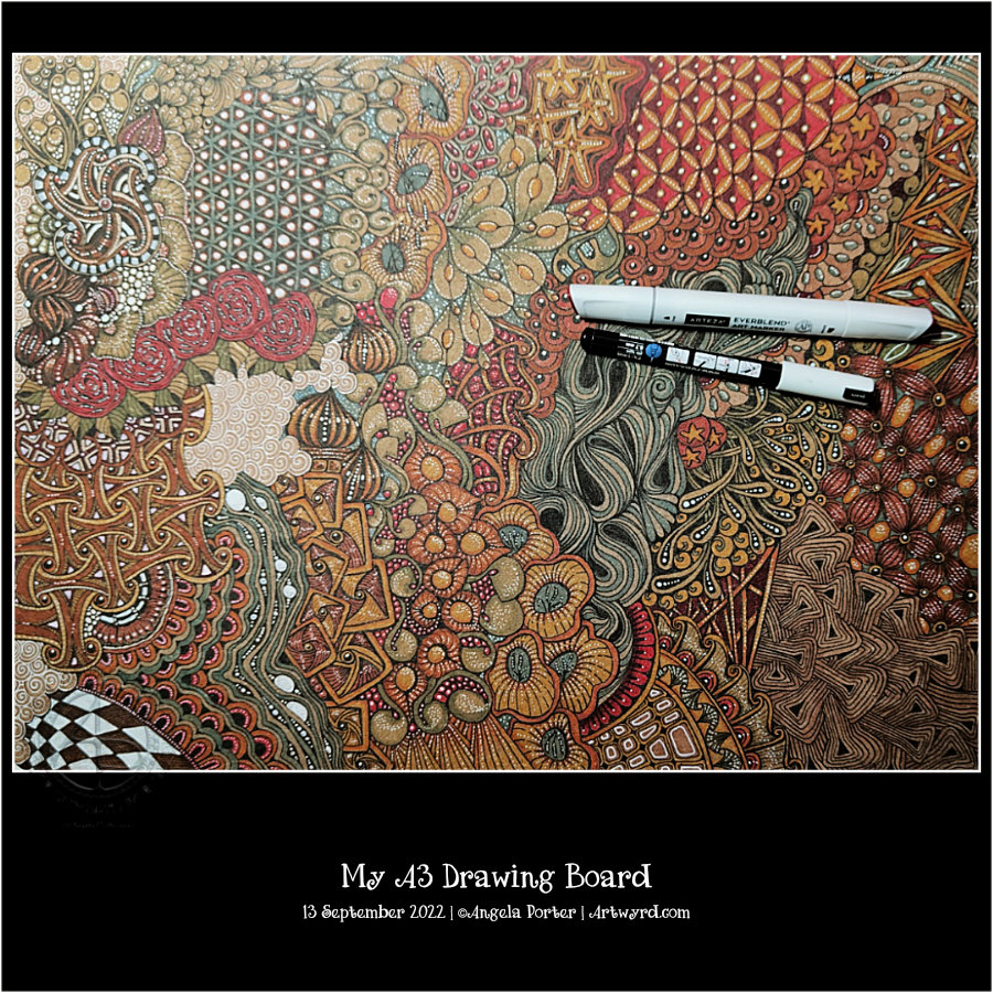
There’s such a huge variety of fungi on the Earth, so much inspiration to draw from. But today, I kept it fairly simple.

To add colour, I used Inktense pencils with a Kuretake Zig water-brush. Oh, and the ‘frame’ was coloured with iridescent gold watercolour paint. And that gave me the perfect excuse, not that I needed one, to scatter some gold dots around the background. Oh, the white dots on the ‘shrooms and foliage were applied with a Sakura white Soufflé pen. Its opaque white ink is perfect for this job, especially as it doesn’t seem to pick up any underlying colours. Must remember to get some more of them.

Zentangle Patterns Aquafleur, Pepper and Dra-wings

View the accompanying YouTube video by clicking on this link.

Today seems to have disappeared. I have been lost in arty pursuits since around 10:30. It’s now 14:49. The video that goes with the drawings has finally uploaded. The three drawings I started in the video are now all completed and shown here.

It’s actually been a lovely way to spend a Saturday. It’s beautifully sunny out, but there’s a coolness in the air that is absolutely delightful and so reminiscent of many early Septembers in the past. All I want to do is curl up in bed and listen to the sounds of the world outside; a car every now and then, the varied sounds of a rugby match, the twitter of birds and the clattering of jackdaws.

All of this has been a lovely soundtrack to do my art to! And I suppose I should talk about that.

Yesterday, I took a look at the tangle pattern Aquafleur. As I was drawing it, the way I made pen strokes reminded me of two other tangle patterns – Pepper and Dra-wings (or Drawings). So, I decided to look at them in today’s video.

One of my YouTube subscribers had left a comment saying they weren’t sure how to get their Aquafleur to spiral inwards like mine did. So, I started the video by showing how to do that.

And it was rather fortuitous that I was asked about that as it meant I had an example of Aquafleur to compare to Pepper and Drawings! The similarity is in how the various segments are shaped. But by some simple adjustments, you end up with three different end results.

Although I left each drawing incomplete at the end of the video, I did show in the Pepper and Drawings tiles how I was planning to add shade and light to them. I wasn’t even sure I would complete the Aquafleur, but I am glad I did.

I’m not sure whether I have a favourite out of the trio of tiles. Each has its own charm and allure.

Zentangle Tangle Pattern “Aquafleur”

To watch the accompanying tutorial video on YouTube, just click on this link.

Aquafleur is a lovely, organic tangle pattern that creates layers as you draw. The result is reminiscent of a flower, coral, seashell or sea plant. It’s also a bold, high-contrast tangle with a lot of dimension. It’s not a tangle pattern I can remember tackling, and the version you see above is actually my second attempt! I misunderstood the Aquafleur deconstruction by Zentangle Inc.

Like most tangle patterns, Aquafleur is quite easy to construct once you’ve made sense of the pattern’s step out (deconstruction).

I used a graphite pencil and a paper stump to add shadow to the purks (nestled orbs). Highlights I added using white charcoal on the purks and a white Gellyroll on the black sections.

But this design needed something a bit more. So, I got a dip pen and a bottle of gold acrylic ink and added stripes of gold to the Aquafleur. Then, I added a few sprigs of golden leafy loveliness to the design and called it done.

I rather like how this has turned out. I particularly like the opulence of the gold against the very graphic black and white. I decided to leave this motif and the sprigs as they were, nothing else added to fill the piece of paper. I could add a drop shadow around the Aquafleur to lift it up. However, I like it just as it is!

Exploring Triangular Zentangle Fragments

Click on this link to watch the accompanying YouTube drawing tutorial.

This morning I just wanted to mess around with some fragments, and triangular ones seemed the way to go! ‘Fragments’ is the Zentangle term for the cells that make up a repeating pattern.

I started with a simple fragment of a circle (orb in Zentangle-speak) inside a triangle. All of these fragments have orbs as part of them, and I’m not sure if I’ve done many of them before.

I’ve written it before, and no doubt will again, that exploring both fragments and tangle patterns is an absorbing activity. No matter how often I look at one particular fragment, there are endless variations that can result. Some may be of use in a ‘reticulum’ (Zentangle-ese for the grid upon which a pattern is formed), others may just be for the experience of being curious and seeing what happens if I do x, y or z…

This is also a great warm-up activity. It gets my hand-eye coordination and fine motor control working well. My creative brain gets flexed and exercised too. It is also an opportunity to try out new drawing tools and media.

Another big benefit of this practice is that there is no pressure to complete a finished artwork. There’s the implied permission to make mistakes, for things to not work out. Indeed, I learn more from those that don’t work out or where a mistake is made than anything that works out well.

I’m always amazed by how many fragments can be made from a simple start. In this case a circle within a triangle.

My A3 Drawing Board, side 1.

Over the past two or three weeks, I’ve been gradually decorating my A3 drawing board. The board is made from compressed wood chips and has a dull, pale brown colour. That means I chose colours that would work well on this brown.

I drew the black lines with a Tombow Fudenosuke brush pen, which is now almost empty of ink! The brush tip is a tad worn but functioning well all the same.

I added colour with Arteza EverBlend marker pens. The white highlights were added with a white Posca pen.

There are only two things left for me to do. Firstly, use a spray varnish on this side to protect the drawing. The second is to decorate the other side too!

It has taken me many hours of work, some of them when I wake in the middle of the night with my mind whirring. Eventually, my mind calms down, and I can get back to sleep. Lying in bed, tossing and turning, is useless to me. I much prefer to do some intuitive art like this. Something I don’t need to think about, just let it happen, and that in itself quietens my mind down.

Narfello – A Zentangle Tangle Pattern Exploration.

Carrying on with the flowy pattern theme, I explore the Zentangle tangle pattern “Narfello” today.

This pattern is based on wavy lines and is easy to construct. The fun lies in all the variations that are possible. The first three steps in setting the tangle pattern up give an unusual grid that can be filled in so very, very many ways.

I always enjoy exploring patterns. It is, for me, a way of practising creativity, giving myself permission to draw without the end product being as nearly perfect as possible. It’s about trying things out to see what happens; if I don’t like what I’ve done, it’s no biggie! I can learn from it or, even better, work on how to change what I’ve done to make it something I like.

It doesn’t matter how many times I explore a pattern or fragment (the basic cell of a repeating pattern); there are always more things to discover and to use. It is quite addictive at times, that’s for sure!

A flowy, abstract pen drawing.

Click on this link to view the accompanying YouTube Draw With Me tutorial video.

I was asked to look at the absolutely beautiful work by Angel_Draws on Instagram, use the work as inspiration, and explain how to create similar texture and volume.

I chose to use an extra fine Twisbi Eco fountain pen. The paper is Moss toned paper by Fabriano, which measures approximately 12.5cm square (approx 5″). For the shade, I used a Prismacolour Ebony graphite pencil. A General’s white charcoal pencil was my choice for the highlights.

I’ve had a go and done it my way, that’s for sure. I enjoyed creating lines that give the illusion of volume in the drawing. Adding shade and light really brought the appearance of folded space out.

It’s also complex, intricate, convoluted, and maelstrom-like, reminding me of roiling, billowing clouds. The textures of clouds are fascinating to me at this time. I’ve seen some amazing ones recently.

I’m not sure if this drawing is finished or whether I’ll add more of the frilly stuff around it. Only time and a good night’s sleep, or several, will tell!

Exploring Stylised Flower Motifs

This morning I wanted to do something fairly simple, soothing and relaxing. So, I chose to look at some variations of a stylised flower motif.

The version I started with is in the centre bottom of the design.

I used various Distress Watercolour Pencils and a water brush to add colour.

The white and gold highlights and patterns were added using gold and white acrylic ink and a dip pen.

Finally, the more intense shade was added using a graphite pencil and a paper stump. I even put some graphite around the gold foliage surrounding the design.

Overall, I’m quite happy with this one. I like the mostly monochrome blue/teal colour scheme on the grey tile. I wasn’t sure bout the gold patterns, but now it’s finished, I think It’s turned out just fine.

Exploring Zentangle Pattern ‘Bucky’ and some organic motifs

Click on this link to watch the accompanying #DrawWithMe video on YouTube.

This morning I had no idea what I wanted to draw, so I visited the random tangle generator on tanglelist.com, which suggested Bucky.

Bucky is an official Zentangle pattern that I’ve never drawn before. I had to look up the deconstruction, which you can find on Zentangle.com. So, in typical Angela style, I threw myself in at the deep end by using a ‘crazy’ asymmetric grid (the middle section in the artwork). It worked out fine in the end, but not with a few mis-strokes!

I thought I’d add some organic patterns/motifs to balance out the rather geometric Bucky pattern.

To add shade, I used an Iron Green Inktense pencil with a water brush to produce some colour gradients. I really wasn’t at all tidy and controlled about this. And you’d never really have known that if I’d not said it! I tried embracing the fluidity and random nature of a watery medium and it worked out just fine.

I used a white charcoal pencil and a paper stump/tortillon for the highlights. That meant I had to re-ink the black hexagons, but that was fine.

Finally, I drew Bucky in a more regular grid at the bottom. I didn’t film this part, but it worked out just fine, I think.

Indeed, I’m fairly happy with the overall result. I like the monochrome colour scheme; it gives coherence. The one thing I haven’t done is add shadow and highlight to the narrow bands between the sections.

Zentangle Fengle variations, Pokeleaf and Mooka

I enjoyed drawing this design, though I wasn’t sure of the grubby-looking graphite and white charcoal on the big leaves. However, I persevered and am now fairly happy with this design.

I started with the Zentangle pattern Fengle and drew it in two different ways. The Fengles are stacked on top of each other.

Rather than try to squash another Fengle in, I elected to add some large, furled Pokeleaves, and of course, some Mookas had to grow with them.

The paper I used to draw on was a piece of Fabriano Toned paper in sand. The paper becomes the mid-tone of the design, so it’s perfect for using both graphite and white charcoal to add shade and highlight. Which I did, and the leaves ended up looking rather grubby.

So, while the video was uploading and processing, I completed adding all the shades and highlights. Then, I re-drew all the black and brown lines. Next, I added dotted highlights using white Gellyroll and Posca pens. Finally, I used a brown Arteza Everblend marker pen to fill the background gaps and draw around the design.

I’m so glad I added so many white dots to the pokeleaves and mookas. They just lifted the colour so much. The richer brown background also helped with this, though I think I need to tidy up the edges somewhat.

For someone who really doesn’t like using graphite/white charcoal in this way, I’m quite pleased with how this has turned out. I’m so glad I remembered I had this toned paper in my stash!

Oh, the patterned background is actually my drawing board! I decided to decorate it with all kinds of patterns and motifs. I’ll finish this side, seal it with some tough spray varnish, then start on the t’other side! Inspired by Zentangle’s Maria Thomas’s suede mat.