
May each day of this year have many moments of peace and contentment, happiness and love, and fond memories too. May you also have all that you need. Wishing each of you the very best for the next 365 days, and beyond.
May each day of this year have many moments of peace and contentment, happiness and love, and fond memories too. May you also have all that you need. Wishing each of you the very best for the next 365 days, and beyond.
This was a lovely way to spend this morning and some of the afternoon. It’s all sparkly and intricate.

Well, I have been a bit busy with variations on the simple flower motif in the bottom left corner of the image!
I’ve said (typed?) it before; I really, really enjoy taking a simple motif and seeing how I can vary, alter and create patterns with it. There is something fascinating in doing this. Some explorations don’t work out and need amending, others lead my thoughts to unexpected versions.

Today, I felt the need to play around with a simple flower motif. I had planned on doing a page showing how to draw my current favourite patterns/motifs. Instead, as I started to draw this flower, I wanted to explore variations and patterns I could create with it.
There’s only about one third of an A5 page filled with such line drawings, and that took about an hour or so to do. But there’s so much in there already!
If you’d like to watch me draw these variations, then click on this link to today’s video!
Being able to just lose myself, guilt free, in drawing over the past couple of days or so, has been a pleasure. ‘Adorable Dogs’ is almost done, just three templates to add colour to remain. I have a break before I start work on the next colouring book for Creative Haven from Dover Publications Inc.
That doesn’t mean I won’t be working on another project or two. But for the next few days I’m just going to indulge myself in drawing for the sheer pleasure of drawing! And that includes a New Year template for the facebook group Angela Porter’s Coloring Books Fans.


This drawing was completed over two sessions.
The first one involved line drawing and adding shadows with a graphite pencil.
Part 2 involved adding some colour and shimmer, and plenty of ‘hiding the crimes’ too, with the gold border.
I rescued the drawing, but looking back, I wish I’d stopped at the end of the first video and just added some gold highlights to the berries. I also think that adding hatching, broken contour lines and stippling may have been much better than adding colour. Or, scanned the image in and added shadow and colour digitally!
I filmed these processes, and the two videos are below.

I wish each and every person the very best blessings of the season, not just for today, but for each and every day ahead of each.

Link to today’s video on YouTube.
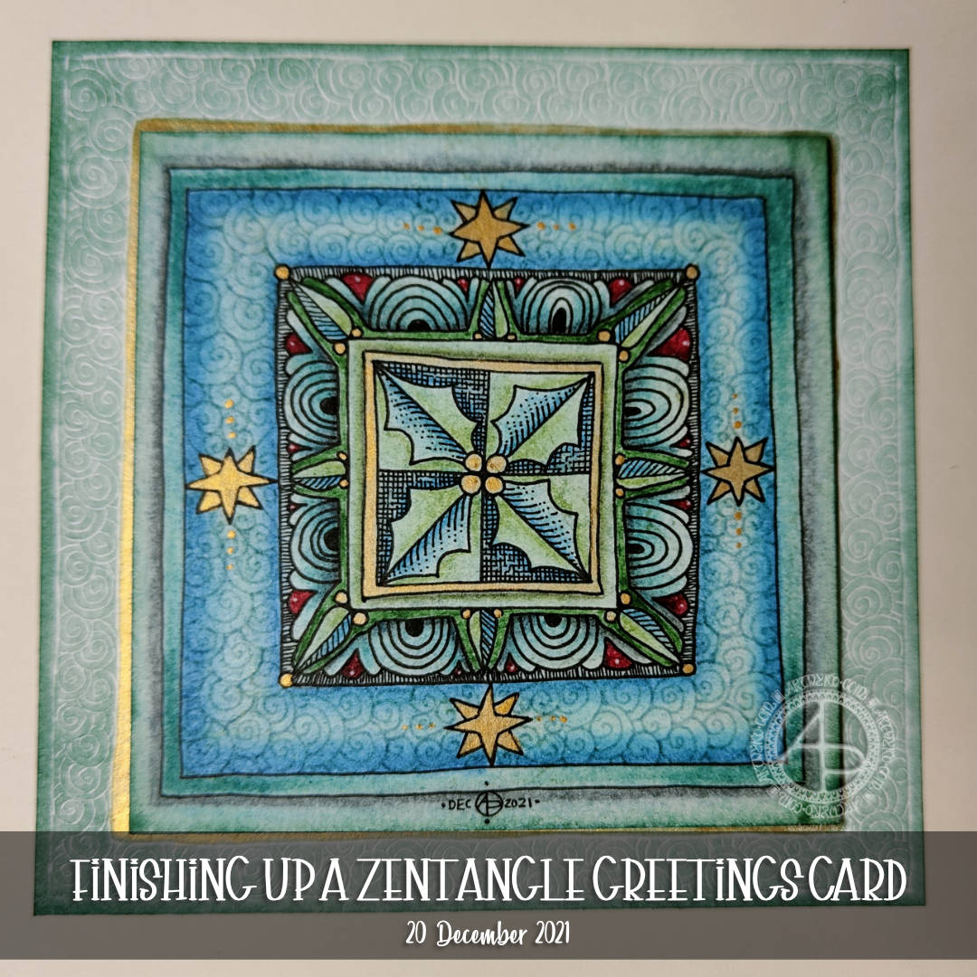
This card is now almost finished. I have learned some things from yesterday’s debacle. Mainly that I’d make a much wider border for the embossed background.
I did add Speckled Egg Distress ink to this embossed background, but it’s such a lovely, subtle colour the camera hasn’t picked it up well.
The embossed layer is so tactile! I used some Micro Glaze to seal it so that being touched won’t affect the distress ink.
Actually, I used Micro Glaze on the top layer too!
I could only find cream coloured card blanks and envelopes, and these layers really didn’t look too good on them. So, hopefully I’ll remember where my card blank stash is, or I’ll make a blank and envelope.
In the video I try embossing an envelope – a case of ‘envelope art’. I’m glad I did. The embossing works well. However, the areas where the flaps are glued together on the back of the envelope make indents in the front. Distress Ink brings these out so much. So, I’ll be sure to emboss the front of the envelope, and colour with Distress Ink, before I glue it all together!
All in all, I’m much happier with this card. Mind you, I do have ideas for others! Probably too late for Christmas now, but … there’s always lots of other reasons for sending greetings cards, including ‘just because I can’.

Winter Solstice Greetings and Wishes to you all to the north of the equator! Summer Solstice Greetings and Wishes to you all south of the equator!
Some sunshine on a chilly, dull Winter Solstice day here in the Valleys of South Wales, UK.
Link to today’s video/vlog on YouTube.
Actually, the title should be ‘How Not to finish up…’. I had a bit of an accident. More about that in a minute.
This morning, I decided to work on finishing up one card design. I knew I wanted to add another layer beneath the panel already finished before gluing it to the cream-coloured card blank.
I dug out some scrapbook paper from my stash. Nothing felt right. The colours were just ‘off’. That’s when I realised I needed to use Distress Inks to colour the lower panel.
I could have used them to colour the panel, then use pens (black, fineliner or metallic) to draw a pattern on it. Instead, I decided to try to emboss the pattern into the paper using a dotting tool / parchment craft ball tool / embossing tool.
Before I did this, I experimented on some scrap paper to see how I could colour the paper (more on this in today’s video).
I decided to emboss the paper first, then add Distress Ink (pine needles) with the black side of a piece of Cut ‘n Dry foam. That kept the embossing white. I found that if I used a blending brush (aka make-up brush!) more ink settled in the embossing. That is also a lovely look, but not what I wanted.
Inside this border, I added some gold ink to create a gold border around the upper panel.
That looked fine and dandy. The horror story came with the next step…
I added some foam tape to the back of the upper panel to add some dimension to the card, along with some glue so I had some wiggle time to make sure I got the panel centred.
The glue was the mistake I think. I had the panel nicely centred until I turned it over to add some pressure to get it to stick firmly. It must have wiggled and become de-centralised.
And when I noticed it was very firmly stuck.
I was so annoyed with myself as I know this is something that nearly always goes wrong when I try to make cards.
The only way I can ‘fix’ things is to cut out that central panel and re-make the embossed border and reassemble the card once again. This time I’d consider having the embossed pattern going under the central pattern so that if it is a little off it won’t be quite so noticeable.
I’m not, however, going to do that. This time, I’m going to make notes in the card about what I did, the media used, what I like, what I don’t like, and what I need to be very, very mindful of the next time I make a card.
I know I’m fairly happy with the design. I like the central motif of holly leaves. The sutble pattern in the border around it is nice too, as is the embossed border.
I do wish I’d not used chalk pastels to add colour to this panel. There’s something dusty and muted about it that I’m not at all sure of. I think that keeping things mostly monochrome on a coloured background works best for me, with touches of gold and white, with some shading perhaps.
It’s that thing again. I love colour, but making use of it always has me feeling that it’s where I mess things up, unless I keep the colours really simple. Simple as in black, white, the background colour, and a shadow colour, and maybe touches of metallics for some sparkle and shine.
I do better with colour when I work digitally, but in traditional media I always feel like I struggle.
It’s always a learning experience, more so when things don’t go as planned or when I’m not entirely happy with what I produce. My problem is I try the same kind of thing over and over and expect it all to improve. I think I’m hoping that I’ll work out how to make the various media work for me at some point.
I say, often, I’m going to stick to monochrome, and then go and try working with colour, often with the same kind of feeling at the end. The feeling I like the pen drawing, but the colour/media isn’t what I’m looking for.
Perhaps time for me to make use of this colour printer and add colour digitally and print it out!
Click this link to see today’s video on YouTube.
I was awake way too early this morning, but just couldn’t get back to sleep. So, what am I going to do? Art of course, after a while of tossing and turning that is.
I spent some time yesterday adding colour with various chalk pastels. I finished off the last few areas with fineliner pens. Then, I added another layer of gold to the stars and inked around their outlines again.
To finish the holly design, I wanted to seal the surface. I’d done some experiments to see how a multi-media gloss finish and micro-glaze would work. With both, there was very little shift of any of the media I’d used on my test pieces – chalk pastels, graphite pencil, tinted charcoal, and Ecoline watercolour inks. The only difference was the gloss medium was a bit glossy, while the micro glaze lacked any brush strokes.
I decided on the microglaze. It helped to bring out the colours, as well as stop them being rubbed off. There’s also less chance of me making a total mess of things too.
All in all, I’m fairly happy with this panel for a card. Despite all my doubt and misgivings during the process of drawing the design, it’s turned out quite OK.
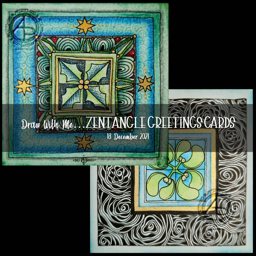
For this design, I decided to create a separate centre panel. I also painted a square of gold beneath where this panel would go.
I used Ecoline watercolour ink to add colour to the drawing on the Distress Ink coloured panel. Then I attached it to the base ’tile’.
Next, it was time to decide what to do with that big border around the mistletoe. I went with the tangle pattern Diva Dance Rock and Roll.
I knew this tangle pattern would add a lot of black to the border, but I think I wanted that to be the case. The black helps the central panel to stand out, I think.
I still have some work to do on this panel, but I to focus on inking in more of the last couple of templates for Adorable Dogs.

This morning, I thought it was time I made a start on this year’s batch of cards. You can see the video by following this link.
I know, I know, I’m really late, but … so much else seems to have got in the way this year. Still, I thought I’d share the drawing process of one design today.
I just started with the idea of having a small focal area on the 4″ square ’tile’. I also had decided that holly would be the motif I’d use. The rest was really not thought about, until I started working.
In the video I share not only how to draw the card, but my thoughts and reflections. I start with a plain piece of paper and end up with this design.
This isn’t finished yet. Colour, shadow, highlight, and, perhaps, more gold need to be added to really lift the design. That’s for another arty session.
For now I need to work on the last few templates for ‘Adorable Dogs’ and get them nailed before the weekend is out!


