Inktober Tangles 2022, Day 10 “Finery”

It’s just one of them days…

I’m having one of those days, it seems. You know, the kind of day when you’re careless in deleting files, thinking that the video that’s processing is today’s. The reality is different. I managed to delete today’s video, and reprocess yesterday’s video as today’s!

I’m not going to repeat what I called myself when I discovered that… but at least I discovered what I’d done before I uploaded it to YouTube!

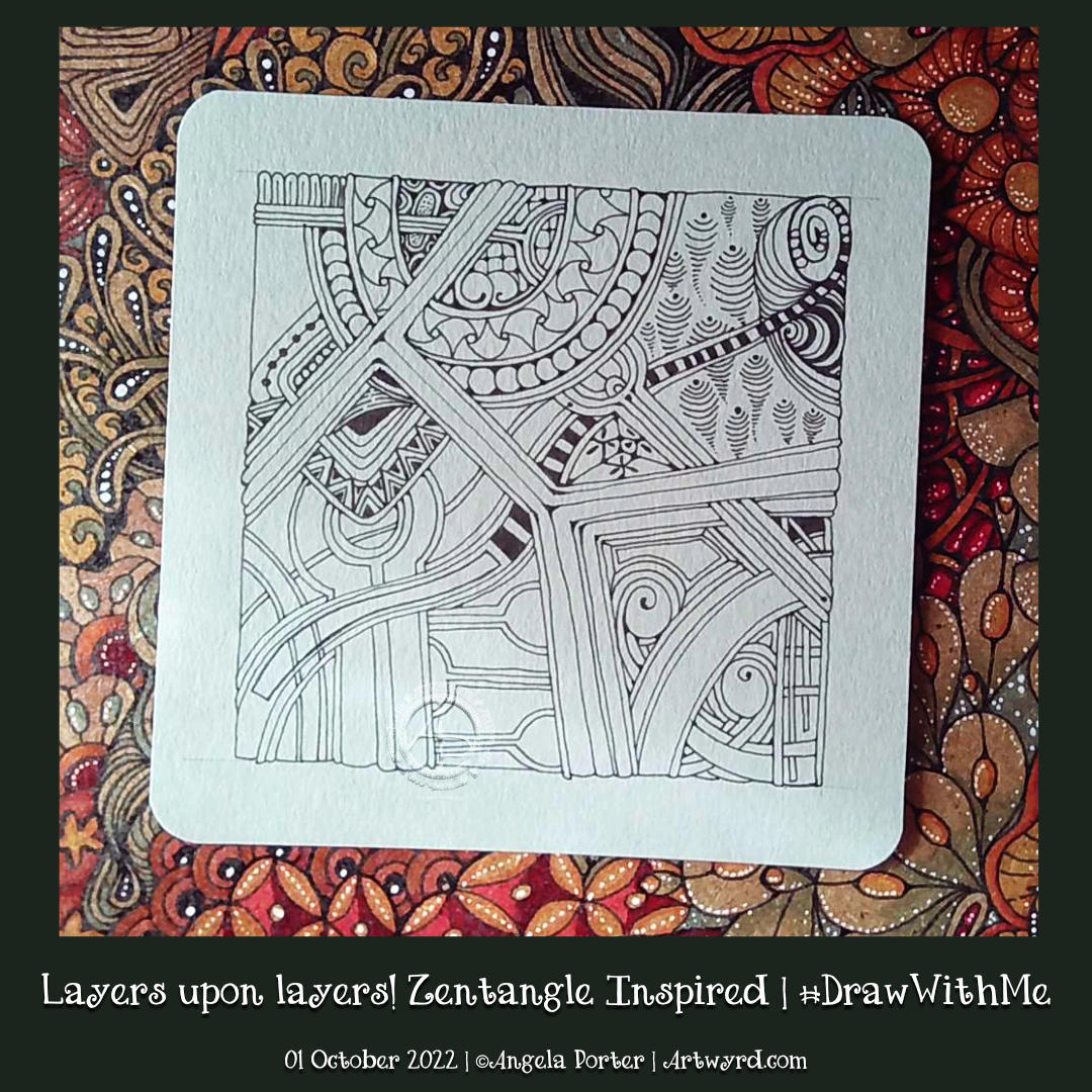
Inktober Tangles Day 10

I added ‘Finery‘ to the top right of my Inktober Tangles ‘sampler’ today, using its sections as a ‘reticulum’ to contain other patterns. To fill one part of Finery, I used Isea-u from day 3. I also used Well and B’tweed for two other sections. The last one is one that is a bit of a nod to one of the sections of ‘Souk‘, the tangle pattern for day 4.

I used Finery as a kind of reticulum (grid or net for a repeating pattern of fragments) as I, yet again, struggled with this tangle. I don’t know what it is about it, but I always mess it up somehow! However, if I hadn’t messed up this time, I may not have got the idea to fill the spaces with other tangles! So, it worked out fine(-ery) in the end!

It’s a shame I managed to send the file into the netherworlds of the recycling bin, never to be recovered or seen again. I realised my mistakes (yes, there were more than one!), but persevered saying that I had to trust I could recover from it(them). I think I did. As Adam Savage would say, I managed to ‘hide the crimes’!

#Inktober #InktoberTangles2022, Day 9 “Sumu”

Click on this link to watch the accompanying YouTube drawing tutorial for ‘Sumu’.

Suma (to the bottom and left of the drawing) is a lovely, lovely pattern, deconstructed by Lin Chiu CZT. It very much reminds me of Medieval manuscripts and architectural sculpture. So, it was a given that I’d love it, just like Tomàs Padrós’ “Snack” in Day 8 of the Inktober Tangles 2022 challenge.

Although Lin Chiu has given many possible variations, just as Tomàs did for Snack, I kept it simple, repeating the basic form around the bottom and left of the Heartfully ‘rug’. It also had to have that architectural, sculptured, carved ‘feel’ to it. Not sure I’ve quite managed it, but it’ll do!

My design is looking a bit higgledy-piggledy at the moment; I’m just going to trust the process and see how it works out at the end of Inktober.

Inktober Tangles 2022 – Day 8 – “Snack” by Tomàs Padrós CZT

Please click on the “Watch on YouTube” button.

Snack is a lovely pattern and Tomàs Padrós CZT has created a great step out for it, which includes lots of suggestions and variations.

I have to say, it is a motif I’m familiar with, probably early Celtic art or architecture. It was great fun for me to draw, and in keeping with my rather higgldy-piggldy arrangement I chose to use it in that way. As a nod to the architectural origins of this pattern, to me anyway, I’ve worked with shadow and highlight to practically ‘scuplt each ‘snack’ element. I particularly like the ‘half snack’ versions; again, they are familiar to me but not connected to Zentangle, and there’s nowt wrong with that at all!

#Inktober Tangles 2022, Day 7 “FluxEcho”

Click on this link to view the accompanying #DrawWithMe video tutorial on YouTube.

FluxEcho, a lovely floral tangle pattern by Lynn Mead CZT, was a delight to draw this morning. you can see my variations of the pattern to the centre-left.

I had decided to stick to a monochrome colour scheme for my Inktober Tangles, but today I decided to go a bit analogous! I’ve added some purple and blue to the design. Analogous colours are next to each other on the colour wheel – so green, blue and purple work well together. Even more so as the background is a grey-green colour.

Something had to be done about the hand-lettered panel. I’d added some colour with Inktense pencils and a water brush, but I wasn’t happy with the finish. So, I filled the panel with black ink and added the hand lettering using a white gel pen. I’m happier with this.

Inktober Tangles 2022, Days 1 to 3

Click on this link to view the accompanying tutorial video in YouTube

It’s Inktober! The annual month of ink drawing and other challenges of an arty crafty kind!

Last year, I did the #InktoberTangles2021 challenge. I explored each day’s pattern, often with an accompanying YouTube video. This year, however, I’m adopting a different approach. I’ve decided to look at each pattern and combine them into one big design!

The first three tangle patterns are Rain, from Zentangle Inc, Delwhy by Stephanie Jennifer CZT and Isea-u by Dory Peeters CZT. You can see my attempts at them from left to right.

Layers upon layers! A Zentangle Inspired #DrawWithMe

Click on this link to watch the accompanying YouTube drawing tutorial.

One of my lovely YouTube subscribers asked if I could look at some zentangles by Patrica Aragon (myzenarts.ctz on Instagram) and see if I could do some artwork inspired by her work. As a YouTube drawing tutorial, of course, he asked.

Well, I looked at the artwork and then did my own version. It took a little over an hour to get to where it is in the drawing above. And there it remains until I decide how to complete the picture. If I’m going to, that is.

It was an excellent way to spend Saturday lunchtime.

William Morris Inspired Botanica

Click on this link to view the accompanying Draw With Me tutorial video on YouTube.

William Morris, one of the primary founders of the Arts and Crafts Movement, is one of my favourite artists. I love the ornate botanical and nature-inspired designs of quite stylised motifs. I also love the way that colour is used simply in them. That is definitely something I can learn from!

It can take a while for pennies to drop with me, and I don’t know how it has taken so long before I took a look at Morris’s work.

Like myself, Morris was inspired and influenced by Medieval manuscripts. That explains a lot!

I use some motifs from Morris’s designs in this drawing. I applied colour with chalk pastels to the pen drawings, with subtle white highlights from white charcoal. I’m quite happy with the result; I’ve not decided what to do about the background.

Where is this study going to take me? I don’t really know! But I know it’s going to be an interesting one. I’m particularly interested in how Morris used colour, and I hope that will make me comfortable with my own simple way of adding colour to my art.

Taiga and Elm Seeds

Click on this link to watch the accompanying video tutorial on YouTube.

I do love seeds! There’s such a huge variety across the globe. Today, I chose some elm seeds to stylise for this drawing.

I also had a hankering to tackle, once again, Tomos Padros’ beautiful Zentangle pattern “Taiga”. It took me two attempts to work out how to do it, but I got there in the end. It is a beautiful woven pattern with so much volume when high contrast shade and light are used.

Seed Pods and Flying Seeds

Click this link to view the accompanying drawing tutorial on YouTube.

I love seed pods, and here is a small selection of my favourite ones, just pen sketches with some light washes of Inktense added to some.

I don’t know what it is about seed pods and flying seeds that I love so much. Maybe it’s their shapes, or the association with autumn, or the architectural and aeronautic nature of these seeds. Or it could just be they appeal to my sense of aesthetics!

Either way, they are fun to draw, adapt and use as focal points in drawings.

Swirly gourdgeousness WIPs

These are my current works in progress. They’re full of swirly curvy loveliness, along with a smattering of the Zentangle tangle Gourdgeous too, amongst a couple of others.

I’ve drawn the designs on clay-toned paper from Fabriano. It’s a warm grey, just a bit darker than in the scanned image. The soft grey does tone down the Inktense colours a tad, making them feel more vintage or metallic in some way. Although the paper isn’t designed for water, I find I can get away with a barely damp brush to activate and spread the Inktense to create gradients. The white Inktense is opaque enough to add highlights, and even to colour the grey white!

Part of me thinks that monochrome or analogous colours are the way to go. I’m not all that keen on the orangey-rusty colours. Sticking to the greens and blues would feel more coherent perhaps. But as I’m learning more about my art, toned papers, adding colours, then it’s all a process of learning!

And I do love working on the toned papers for sure. There is something fascinating about starting with the a page full of the mid-tone colour and then adding dark and light to it.