Carrying on with the theme of pumpkins and gourds, today I tackled the Zentangle tangle pattern “Gourdgeous” and drew this cute pile of pumpkin-ish gourds.
Of course, as they are drawn with a Zentangle pattern, it was only right that I filled them with some Zentangle patterns – Purk, Sattuck, Crescent Moon, and B’tweed.
I drew the design on a 6″x3″ piece of grey-green mixed media paper. Tombow Fudenosuke and Zebra flexible nib pens were used to draw the main black sections of the pattern. Then, I added the patterns with 0.1 and 0.4 fineliner pens.
To add shade and light, I used some Inktense pencils – Light Olive, Madder Brown, Iron Green and Iron Blue. Oh, and Antique white for the highlights.
The white dots were added with a Sakura Soufflé pen.
This was a lot of fun to do, especially playing with light and shadow to create volume! There’s some bits I’m not happy with – the tendrils are a bit clumsy looking, some of the highlights could be brighter. But on the whole it’s not too shabby!
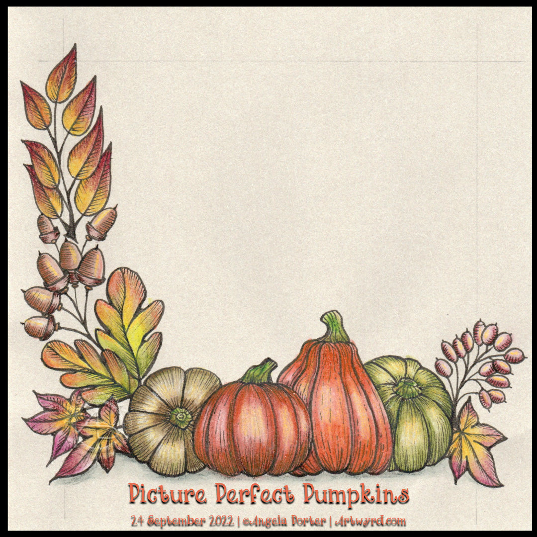
You can tell I love autumn! I just couldn’t resist another drawing with pumpkins and assorted autumnal motifs. In the video accompanying this picture, I get all the drawing done and start adding colour. This photo is of the completed drawing so far. There’s plenty of space for some more autumnal goodies!
As I worked on some warm, grey paper (‘Clay’ Toned Paper from Fabriano), the colours are muted and feel a bit washed out. Usually, Inktense pencils with a light wash of water are bright and vibrant, but the grey tones mute them somewhat. But I like that. It gives a vintage and nostalgic air to the artwork.
From time to time, I can circle back to drawing styles that I’ve not done for a long time. This kind of drawing, which has an etched ‘feel’ to it, is an example of something I’ve not done for what seems an age. I am, however, enjoying it very much. Exploring working on toned paper with various colouring media is fascinating for sure.
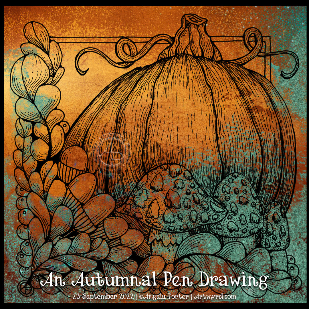
This morning, the first one of astronomical autumn, I felt the need to draw things autumnal. What better than oak leaves and acorns, mushrooms and pumpkins and a smattering of berries.
This wasn’t quite what I expected to flow out of my pen. Although the elements are stylised, there’s also a lot of contour line work and stippling to bring some volume and texture to the design. It’s a bit like an etching, lino cut or woodcut. A bit.
I can see where I started adding precise contour lines, but then they became much more expressive.
I’ve just added a coloured background to my drawing for now. I’m not sure about how to add colour yet. Do I risk messing it up by using traditional media? Or do I play safe and add colour digitally? At the moment, I don’t know. But there’s no rush. The image is scanned in and saved safely on my hard drive.
All I will say, for now, is that I really enjoyed drawing this. And I quite like it, even when considering the yeuchier areas of stippling.
I really enjoyed drawing this tiny tile this morning. I love the soft, muted green tones of the paper and the the way the Inktense pencils I used to add colour, shade and light work so well with it. The bright white touches of a Sakura Soufflé pen shine so bright against everything else.
The paper is a 6cm x 6cm (approx. 2.4″ x 2.4″) piece of grey-green ClaireFontaine PaintON mixed media paper.
My first step was to draw a single cell, or fragment, of the Zentangle pattern Well. and I added a variation to that pattern. To fill in the sections created, I used the tangle patterns Purk and B’tweed.
This will eventually be one of my little Random Acts of Kindness cards, once I work out what message to put on the back and whether I’m going to hand letter it or print it out. I have not practiced my hand lettering much lately, and I think it shows. But maybe I’m just being overly harsh on myself, I don’t know for sure. What I do know is that I love creating these tiny drawings as much as I do my larger ones. I love the cuteness of the size very much.
I had an idea. It may not be a great idea. It may not be executed in the best way today. But it’s a start, but first, some background as to how this idea came about before I explain myself.
Last week, I went to a local café for a late lunch. So late that it was almost tea time! The first time I’ve been out for lunch by myself since the start of the Covid pandemic. I’ve had lunch out three times with a friend in this time, but I still rarely leave my home for such things.
It was a lovely lunch, broccoli and stilton soup with a large pot of tea. The people working in the cafe were lovely and helpful. The food was delicious and beautifully presented. I was made to feel very welcome there.
So, it took a few days, but yesterday I woke with an idea. Why don’t I do some tiny artworks to leave for people to discover. Little notes to thank those who run a café or restaurant. Little notes of kindness, inspiration, or compassion are on the back for strangers who may need to read them. Little notes to brighten up someone’s day. And maybe put my email address/blog address on there. Maybe. I’ve not decided if that will be a thing, yet.
So, the first step was to see what sizes of little envelopes I could buy. I really wanted glassine ones, so the tile is protected but visible. But the only tiny ones I could find were 6.5cm square (that’s 2.5″). So some have been ordered, and some watercolour card has been cut into pieces 6cm square, ready to use! The tiles in the image are 6cm square in size. So quite tiny!
The others I found are so sweet. They have a heart fastening on the rear flap and are made of kraft paper. Perfect! That way, what’s inside will be a surprise and, hopefully, a pleasant one for those who find it. These are a bit bigger at 10.5cm x 7 cm (approx 4.13″ x 2.75″), which is about the size of a gift card, business card or credit card. So, I cut paper to 10cm x 6.5 cm to fit these envelopes.
For this morning’s video, I decided to use two of the small squares. I started by colouring one side with Distress Inks. Then I drew the designs with various black fineliner pens. Next, I added more colour with Inktense pencils and a water-brush. Finally, highlights were added with white gel pens and a gold gel pen on the Aquafleur design. Not sure the gold pen was a good idea; I might have been better off using a dip pen and gold ink. It’s all a learning process!
Then, it was time to hand-letter a message on the back and decorate. This is where I think things went a tad to pot. In hindsight, I wish I’d coloured the reverse of the tile too, as, the white looks so stark. But they’ll do. My hand-lettering isn’t the best, but again it will do. My biggest problem is not letting the ink dry fully before erasing pencil lines and/or adding Inktense pencils. But they’re not too shabby…possibly.
What I may try doing, as these are test pieces, is using some Microglaze to seal them. Not only will it seal the Distress Ink, but will give a glossy finish that will bring out the colours more. The problem with Micro glaze is that it smears the black pen lines. But as these are test pieces, if that happens, I’ll learn not to do it again in the future, or use different kinds of pens. I wonder how the Dokumentas in the Twisbi’s will react to Micro glaze? That is an experiment I need to try out!
My only problem once I’m happy with this, apart from learning how to take better photographs of my work, is finding the courage to leave these things. The intense embarrassment and shame I know I’ll feel will be great. That will come out of the old fear that no one will like what I do or appreciate it or understand that it comes from a place of unconditional love and gratitude for our connections. And this is the reason why I’m dithering about whether or not to include my email.
I’ll work it out. I usually do, eventually! Until then, I have a small pile of tiles to decorate, Micro glaze and different pens to experiment with, and how to put messages on the back… part of me thinks printing them out and glueing them on could be a way to go. I have actually turned one of my hand-lettering styles into a font! Something else for me to think about.
Today seems to have disappeared. I have been lost in arty pursuits since around 10:30. It’s now 14:49. The video that goes with the drawings has finally uploaded. The three drawings I started in the video are now all completed and shown here.
It’s actually been a lovely way to spend a Saturday. It’s beautifully sunny out, but there’s a coolness in the air that is absolutely delightful and so reminiscent of many early Septembers in the past. All I want to do is curl up in bed and listen to the sounds of the world outside; a car every now and then, the varied sounds of a rugby match, the twitter of birds and the clattering of jackdaws.
All of this has been a lovely soundtrack to do my art to! And I suppose I should talk about that.
Yesterday, I took a look at the tangle pattern Aquafleur. As I was drawing it, the way I made pen strokes reminded me of two other tangle patterns – Pepper and Dra-wings (or Drawings). So, I decided to look at them in today’s video.
One of my YouTube subscribers had left a comment saying they weren’t sure how to get their Aquafleur to spiral inwards like mine did. So, I started the video by showing how to do that.
And it was rather fortuitous that I was asked about that as it meant I had an example of Aquafleur to compare to Pepper and Drawings! The similarity is in how the various segments are shaped. But by some simple adjustments, you end up with three different end results.
Although I left each drawing incomplete at the end of the video, I did show in the Pepper and Drawings tiles how I was planning to add shade and light to them. I wasn’t even sure I would complete the Aquafleur, but I am glad I did.
I’m not sure whether I have a favourite out of the trio of tiles. Each has its own charm and allure.
Aquafleur is a lovely, organic tangle pattern that creates layers as you draw. The result is reminiscent of a flower, coral, seashell or sea plant. It’s also a bold, high-contrast tangle with a lot of dimension. It’s not a tangle pattern I can remember tackling, and the version you see above is actually my second attempt! I misunderstood the Aquafleur deconstruction by Zentangle Inc.
Like most tangle patterns, Aquafleur is quite easy to construct once you’ve made sense of the pattern’s step out (deconstruction).
I used a graphite pencil and a paper stump to add shadow to the purks (nestled orbs). Highlights I added using white charcoal on the purks and a white Gellyroll on the black sections.
But this design needed something a bit more. So, I got a dip pen and a bottle of gold acrylic ink and added stripes of gold to the Aquafleur. Then, I added a few sprigs of golden leafy loveliness to the design and called it done.
I rather like how this has turned out. I particularly like the opulence of the gold against the very graphic black and white. I decided to leave this motif and the sprigs as they were, nothing else added to fill the piece of paper. I could add a drop shadow around the Aquafleur to lift it up. However, I like it just as it is!
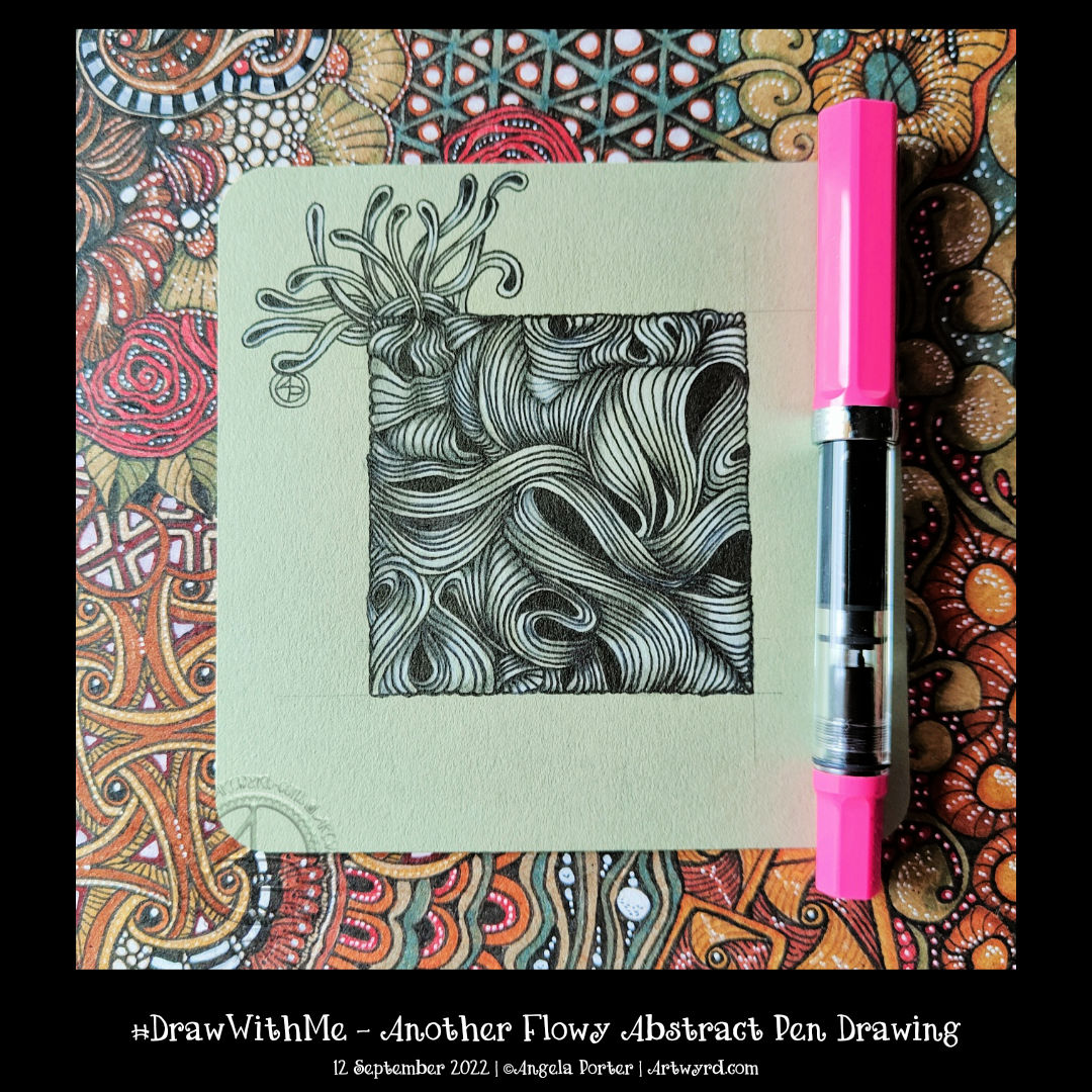
Carrying on with the flowy pattern theme, I explore the Zentangle tangle pattern “Narfello” today.
This pattern is based on wavy lines and is easy to construct. The fun lies in all the variations that are possible. The first three steps in setting the tangle pattern up give an unusual grid that can be filled in so very, very many ways.
I always enjoy exploring patterns. It is, for me, a way of practising creativity, giving myself permission to draw without the end product being as nearly perfect as possible. It’s about trying things out to see what happens; if I don’t like what I’ve done, it’s no biggie! I can learn from it or, even better, work on how to change what I’ve done to make it something I like.
It doesn’t matter how many times I explore a pattern or fragment (the basic cell of a repeating pattern); there are always more things to discover and to use. It is quite addictive at times, that’s for sure!
I was asked to look at the absolutely beautiful work by Angel_Draws on Instagram, use the work as inspiration, and explain how to create similar texture and volume.
I chose to use an extra fine Twisbi Eco fountain pen. The paper is Moss toned paper by Fabriano, which measures approximately 12.5cm square (approx 5″). For the shade, I used a Prismacolour Ebony graphite pencil. A General’s white charcoal pencil was my choice for the highlights.
I’ve had a go and done it my way, that’s for sure. I enjoyed creating lines that give the illusion of volume in the drawing. Adding shade and light really brought the appearance of folded space out.
It’s also complex, intricate, convoluted, and maelstrom-like, reminding me of roiling, billowing clouds. The textures of clouds are fascinating to me at this time. I’ve seen some amazing ones recently.
I’m not sure if this drawing is finished or whether I’ll add more of the frilly stuff around it. Only time and a good night’s sleep, or several, will tell!
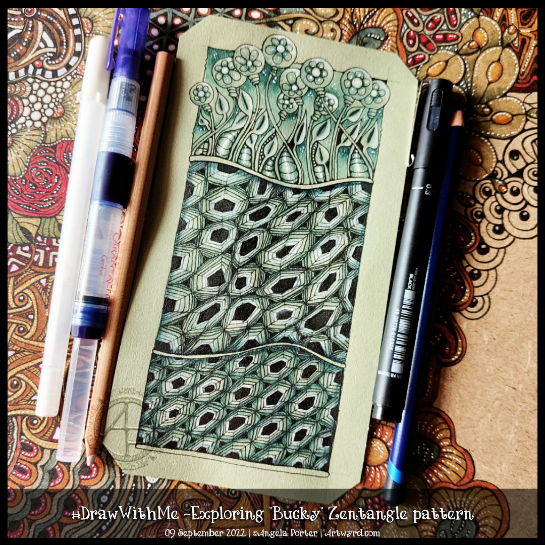
Bucky is an official Zentangle pattern that I’ve never drawn before. I had to look up the deconstruction, which you can find on Zentangle.com. So, in typical Angela style, I threw myself in at the deep end by using a ‘crazy’ asymmetric grid (the middle section in the artwork). It worked out fine in the end, but not with a few mis-strokes!
I thought I’d add some organic patterns/motifs to balance out the rather geometric Bucky pattern.
To add shade, I used an Iron Green Inktense pencil with a water brush to produce some colour gradients. I really wasn’t at all tidy and controlled about this. And you’d never really have known that if I’d not said it! I tried embracing the fluidity and random nature of a watery medium and it worked out just fine.
I used a white charcoal pencil and a paper stump/tortillon for the highlights. That meant I had to re-ink the black hexagons, but that was fine.
Finally, I drew Bucky in a more regular grid at the bottom. I didn’t film this part, but it worked out just fine, I think.
Indeed, I’m fairly happy with the overall result. I like the monochrome colour scheme; it gives coherence. The one thing I haven’t done is add shadow and highlight to the narrow bands between the sections.