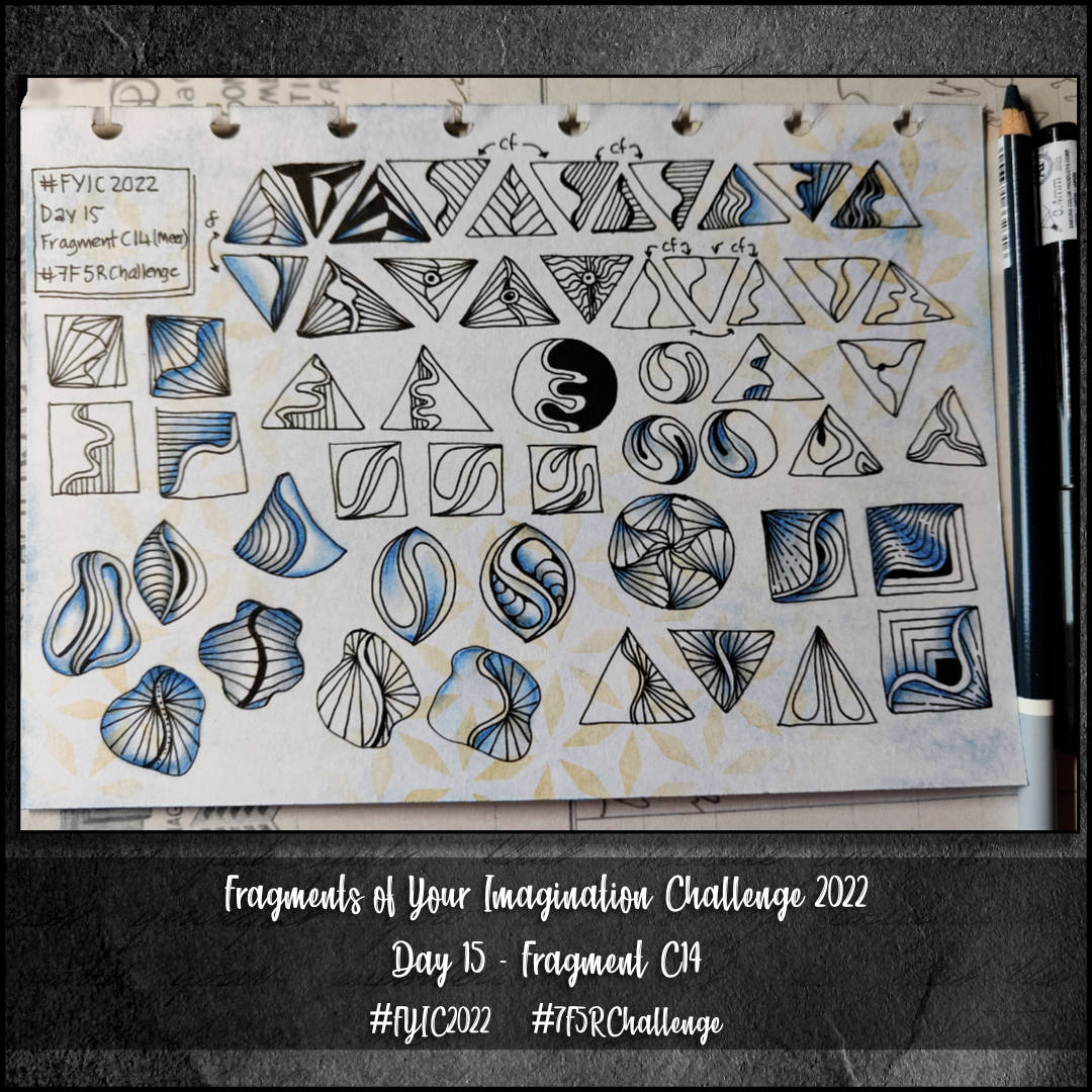
Another coddiwomple on a page in my sketchbook today. The aim to fill a sketchbook page with variations of Fragment C14, though I have no idea of what that would look like.
C14 is a curious fragment. Actually, all the fragments so far have been curious ones in different ways. My usual approach to creating variations is to work out what are the essential features of the fragment, then do my best to keep the essence of these present.
For me, the curvy dividing line is what defines this tangle, and so that is what I worked with…mostly.
Some surprising twists and turns along the way, some rather tangled, and fruitless dead ends too. Yet even with them there is something to learn.
Creating shadow and highlight brought the fragments alive and gave the illusion of volume.
These daily arty coddiwomples are adding ideas to the store of patterns, variations and understading in my subconscious storehouse of such treasures. They’re also increasing my confidence in creating variations, which is spilling over into my other drawings.
I have no idea what impact all of this will have on my artistic style, but it can only be a positive one for sure.
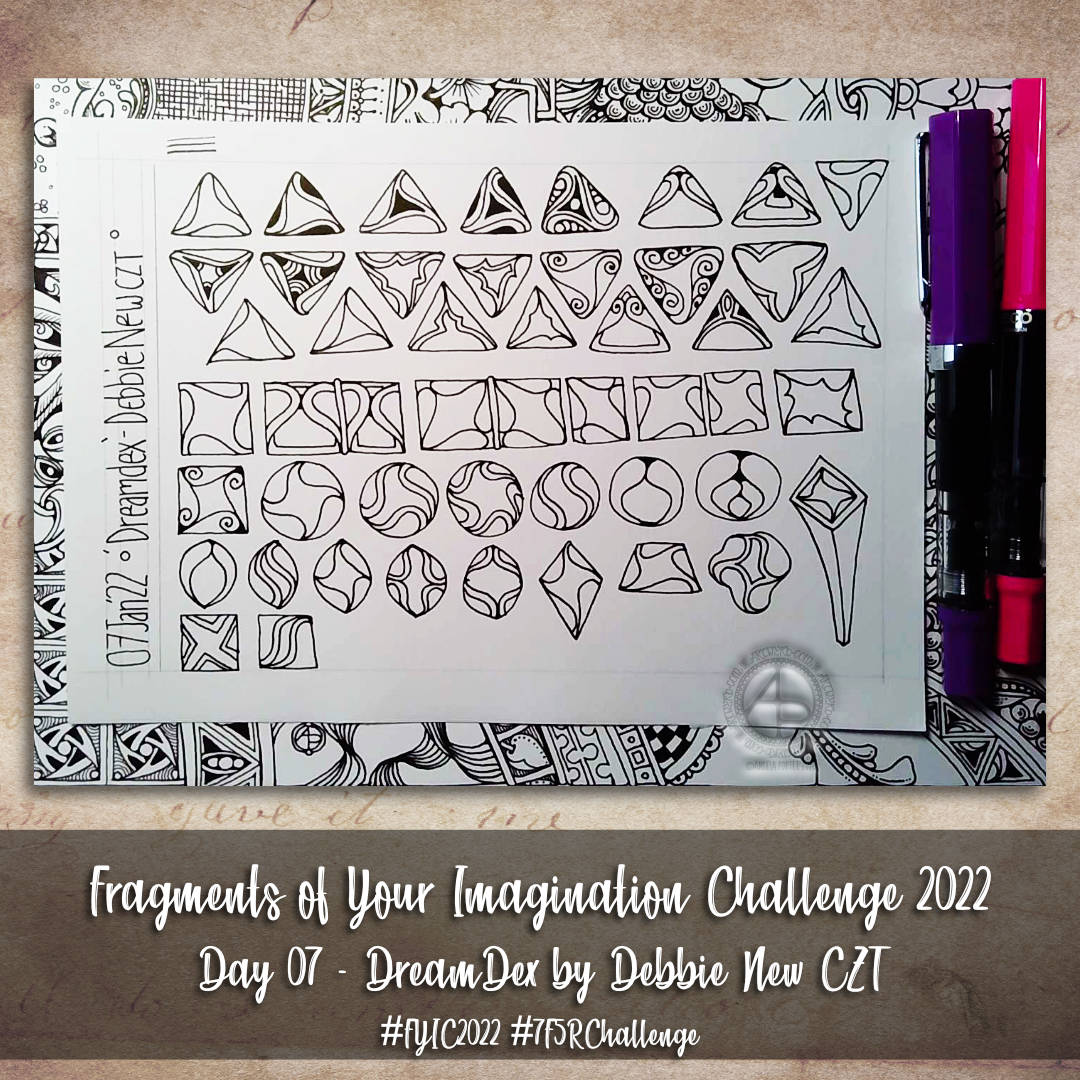
Oh, DreamDex turned out to be a bit of a dream fragment for me. So many variations ended up reminding me of La Tene / Early Celtic / Anglo-Saxon designs, which are probably my most favourite of all.
Again, I’m sure I’ve only scratched the surface of the variations that are possible. But it’s a start!
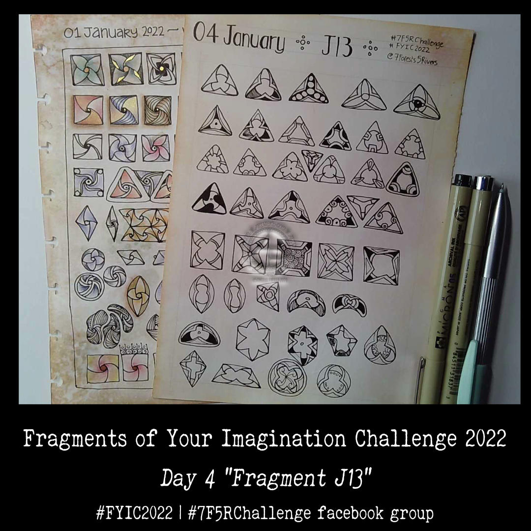
J13 is a fragment that is so full of possibility that I’ve barely touched the surface! This was fun to do and, no doubt, I’ll be re-visiting this fragment at some point.
I managed to get all the days muddled up in the challenge. That’s not a problem, I’ve been told, just work with a fragment a day, follow the list, ignore the list, all is fine and good!
Today, I chose to do fragment X7, which can be found in the Zentangle Primer book. It’s the circular version that is suggested today. But of course I had to work with other shapes and forms too! So much so I fairly quickly filled a page up.
The second sheet was done in today’s video. I had recorded the process of drawing the first sheet, but forgot to check that I was in frame. I wasn’t for way too much of the time. So, I just recorded a different video, including some other variations of the fragment.
Once you start exploring, you just can’t stop! Or so it seems in my case.
This is the first time I’m taking part in this particular month-long challenge. It’s being run by 7Forests5Rivers on facebook. Each day, there’s a different tangle pattern fragment to work with. And, with me being me, that means I’m most likely to create a page of lots of variations on a theme!
A fragment is a small, self-contained pattern-cell that can be repeated to create a grid pattern. The grid is called, in zentangle-speak, a reticulum. Within the reticulum, the fragments can be placed all in the same way, or they can be rotated and/or mirrored to create a pattern.
So, with just one simple fragment – the basic ‘cell’ of a repeating pattern – a whole host of patterns can be created. If the basic cell is changed by simple variations, then even more patterns can be created!
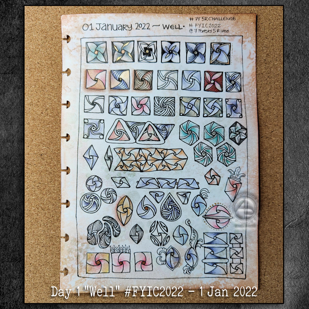
With me being me, I’ve created a page full of variations of the basic fragment for “Well”, which happens to be one of my favourite tangle patterns.
Some of the variations are different shapes for the fragment and ways of spacing and joining them. I couldn’t resist a few of my medieval-style flourishes too.
I needed to add shadows to the drawing completed and given a colour wash yesterday. As I so often regret my choices of how I do this, I decided to make a test page of various methods for my sketchbook.
They all have their own charm and feel. However, putting them side by side so I can compare and contrast gave me a better idea of what I really like.
To add shadow/highlight to a drawing, I really like the hatching/contour lines created by a micron pen or a biro. The biro I particularly like as it is much softer and I’m able to get a tone variation with the lines.
I also worked out that for using gradations of colour, they just feel a bit … plain. So, like in the drawing of medieval flowers and leaves, the combination of lines and colour works for me.
I found when I was adding shadow below the drawings that using Distress Inks like watercolours just wasn’t going to work. The use of water results in weird boundary lines that I’m not fond of. Of course, if I’d not coloured the background in Distress Ink, a gradated wash of colour may have created a lovely shadow.
So, I think I’d prefer to use chalk pastels for adding shadow. The ability to blend them out gradually, with no harsh line, is a great advantage. It’s also easy to add more of the pastel if a darker colour is needed.
So, that’s what I chose to do. Not just with the drop shadows, but with darker areas on the leaves etc. I even found that the pastel can tint the gold I’d added in places, which is a really interesting twist.
Bit by bit, I’m working out colour, shadow, highlight and what works for me.
It’s also no bad thing to spend time trying out techniques with various media. Mixing and matching. Making a reference page for my sketchbook / zibaldone has proven to be a very valuable exercise.
When I’m quite happy with the drawing. I will do my best to take a good photograph of it. It’s worked out much better than I thought it could.
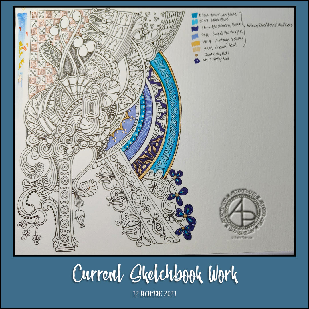
Today, I focused on getting coloring templates inked in. I’m taking a break now, until tomorrow, and my attention turned to what I could do.
I tried some stuff out, disastrously. So, I thought I’d turn to adding colour and embellishments to this sketchbook drawing.
Not sure how well it’s turning out; it’s deuced difficult for me to capture the golden and white highlights/embellishments on this drawing. But, it is what it is now.
I decided to use Arteza Ever Blend alcohol markers, along with gold and white Sakura Gelly Roll pens for this.
The paper’s not the best for alcohol markers – they bleed just a bit. I’d prefer a more opaque white for the details, and a much finer gold. I have that in hand, possibly.
I’ve been looking at Illuminated manuscripts lately, at the patterns used and how colour was made use off too. That’s what’s inspired me to experiment in the way I have done today, not all that successfully to my mind. This gives me food for thought though, and perhaps pushes me in a different direction for the use of colour.
Colour, the thing I love and that which vexes me most in my arty expression! Still, I do persevere, even if I keep going down a road that leads to a similar dead end. It may be that monochrome-ish work is my forte and I need to accept that.
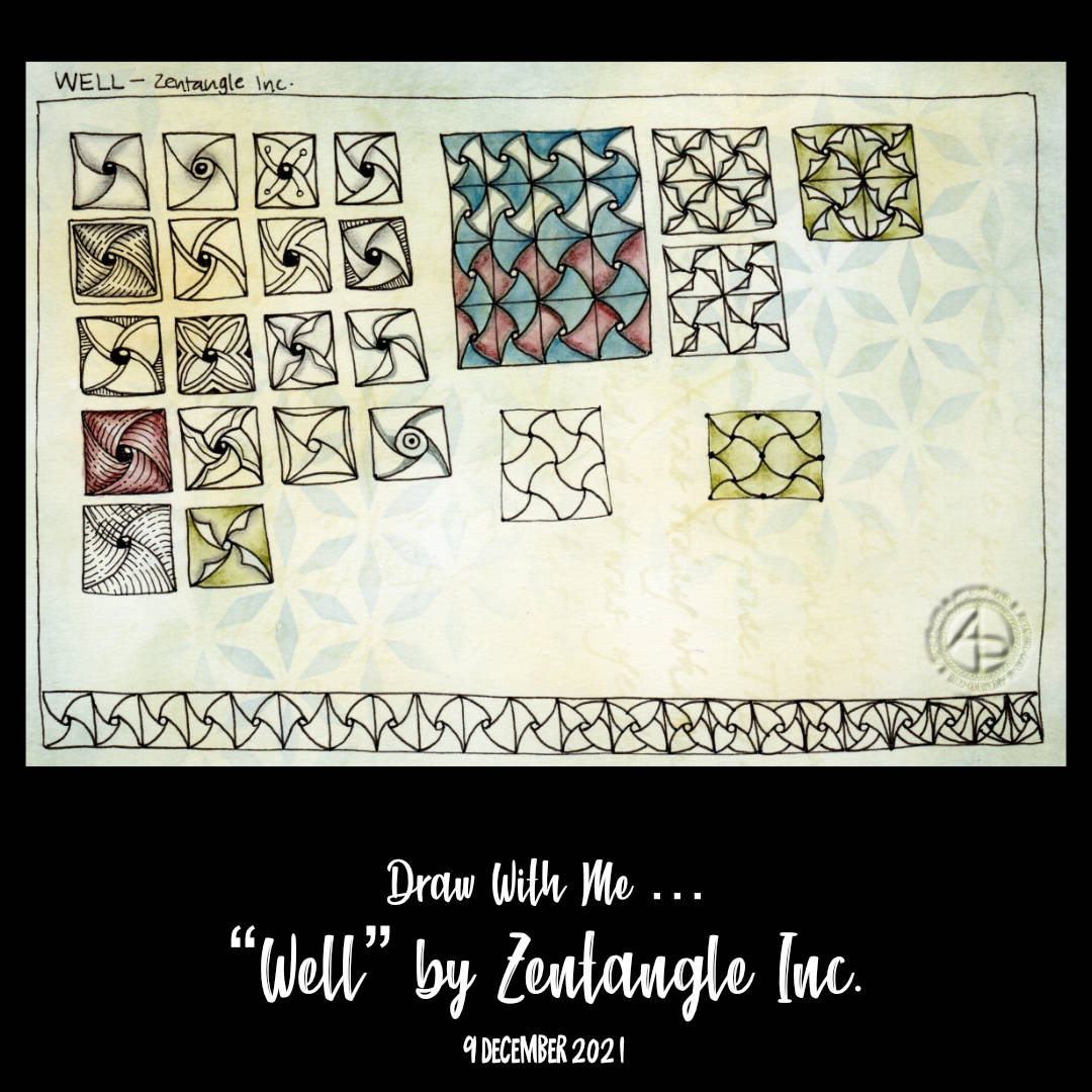
Today, I continue the exploration of “Well”, a tangle pattern deconstructed by Zentangle Inc.
Some of the variations work out well, others not quite so, and a couple I’m just a tad confused about too. I also decided to create a 4″ square Zentangle “tile” using Well as the main pattern. I slipped up on one of the sections and now I have a dilemma – do I try to work with it and make it part of the whole design, or do I re-draw the tile so far.
In the realms of Zentangle, there are no mistakes. Whatever you do you work with. The hyperperfectionist (which is edging closer to just being a perfectionist!) in me is getting rather antsy about that though. Perhaps I’ll just do two tiles!
I started my arty day by drawing variations of the pattern “Well” deconstructed by Zentangle Inc.. I filmed it for today’s vlog, and you can see it by following this link.
This is one of my favourite patterns (I have many !). It is one I’m familiar with from Early Celtic art, and possibly Anglo-Saxon. Also, it’s not a pattern that I’ve tackled as a pattern exploration. But I have now, in part. I have the feeling there is a lot more I could do!
But not today. I now need to focus on getting today’s coloring template done. Then, inking templates for Adorable Dogs.
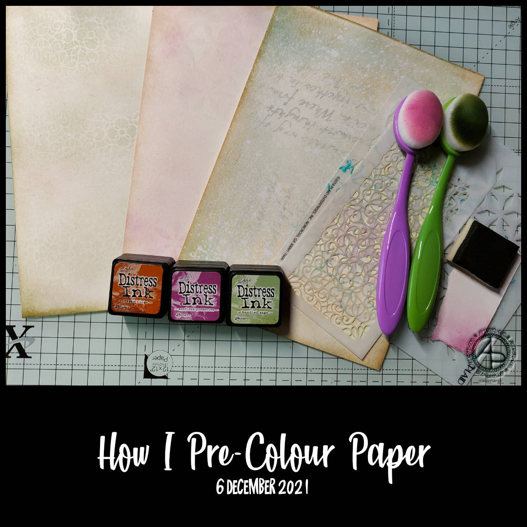
Today’s vlog is a little bit different. I had a query about the coloured paper I use for my pattern explorations sketchbook. When I said I coloured it myself with Distress Inks, I was asked if I’d make a video of the process, so I did today.
Here’s a list of the materials I use: * Distress Inks, though you could use any other ink pads * Cut ‘n’ Dry foam and blending/make-up brushes * Stencils * Paper – today I used Canson Imagine mixed media paper, A5 in size * A spray bottle of water if you want to create a bleached, grungy kind of finish.
The video shows, far better than I could put into words, how to colour the paper. And the techniques I show are but a start!
Why do I colour the paper?
White paper is just fine for drawing on, but it can be a tad stark, clinical. I think having a background colour, with some texture to it either from the unevenness of colour or stencils, gives some life to the drawing right from the off. I find it a more visually appealing way to start drawing.
It’s also a fun and fascinating thing to do. You never quite know how it’s going to turn out. Each colour combination gives a different ‘feel’ to the background, as do the stencil patterns that are used, or stamps, or methods to further distress or increase the texture.
The colour from Distress Ink can be subtle or more intense. I prefer the more subtle, mostly. What tool you use to apply the ink can help with this, but it’s all still a bit random, and I like that! Mind you, that randomness may be my way of applying the inks; I’m not interested in a perfectly even application – I want the variation!
I do find it easier to get a more subtle effect with the blending brushes. They pick up less ink than the cut ‘n’ dry foam. The cut ‘n’ dry foam is useful for adding ink around the paper edges to create a darker border.
Do I have to use Distress Inks? What about other media?
No, of course not! There are many other ink pads available. I personally prefer the dye-based inks for paper I’m going to draw on.
The only pigment inks I’ve used are Distress Oxides and the powdery nature of the pigment particles clogs my pens up quite quickly. I’ve not used other pigment inks to know whether this happens with them. I know pigment inks can take a goodly while to dry, though you can speed this up using a heat tool specifically for craft work, though the heat can warp the paper.
Other media? Of course! You can colour the paper with whatever media you have in your stash or that appeal to you. Watercolours or watercolour pencils would work brilliantly! I would, however, consider the paper you use for this. You’d need one that wouldn’t be damaged by the quantity of water you’re planning on using.
There’s many other media that could be used, I’m sure. The supplies available to both mixed media artists, card makers, paper crafters as well as artists are multitudinous!
I stick to Distress Ink, with the occasional very controlled spritz of water, because I don’t like working messily. I like the color palette available and the more grungy, aged, vintage, distressed effects that can be achieved with them.
Does it affect other media used later?
Yes, and no. It all depends on the coloured media you’re using and also how much ink you’ve used to colour the paper.
If you use watersoluble media, the Distress Ink is likely to dissolve in the water. That means you may get a blended colour, particularly if there’s a lot of Distress Ink on the paper or it’s one of the darker colours. This isn’t a problem for me, generally.
If you’re using dry media or alcohol markers then the Distress Ink isn’t affected. However, as alcohol markers are transparent, there will be some visual colour mixing.
Are Distress Inks Archival?
Distress Inks are acid-free, so they don’t affect the paper. However, they are not light fast and will fade/discolour in time when left in bright light. This doesn’t worry me as this is for sketchbook work, kept out of the light in book form. Even when I use this kind of paper for other artwork it’s fine as I tend to scan the artwork to use in a digital format.