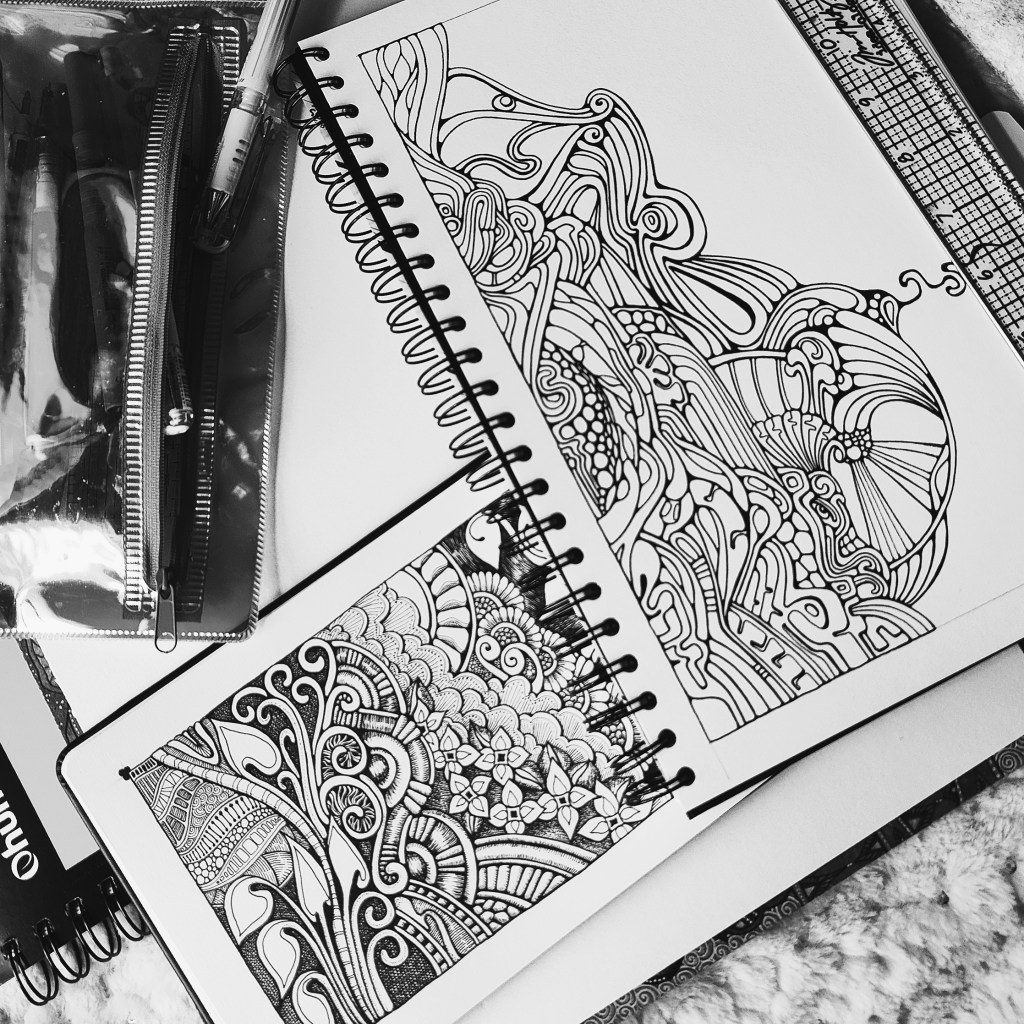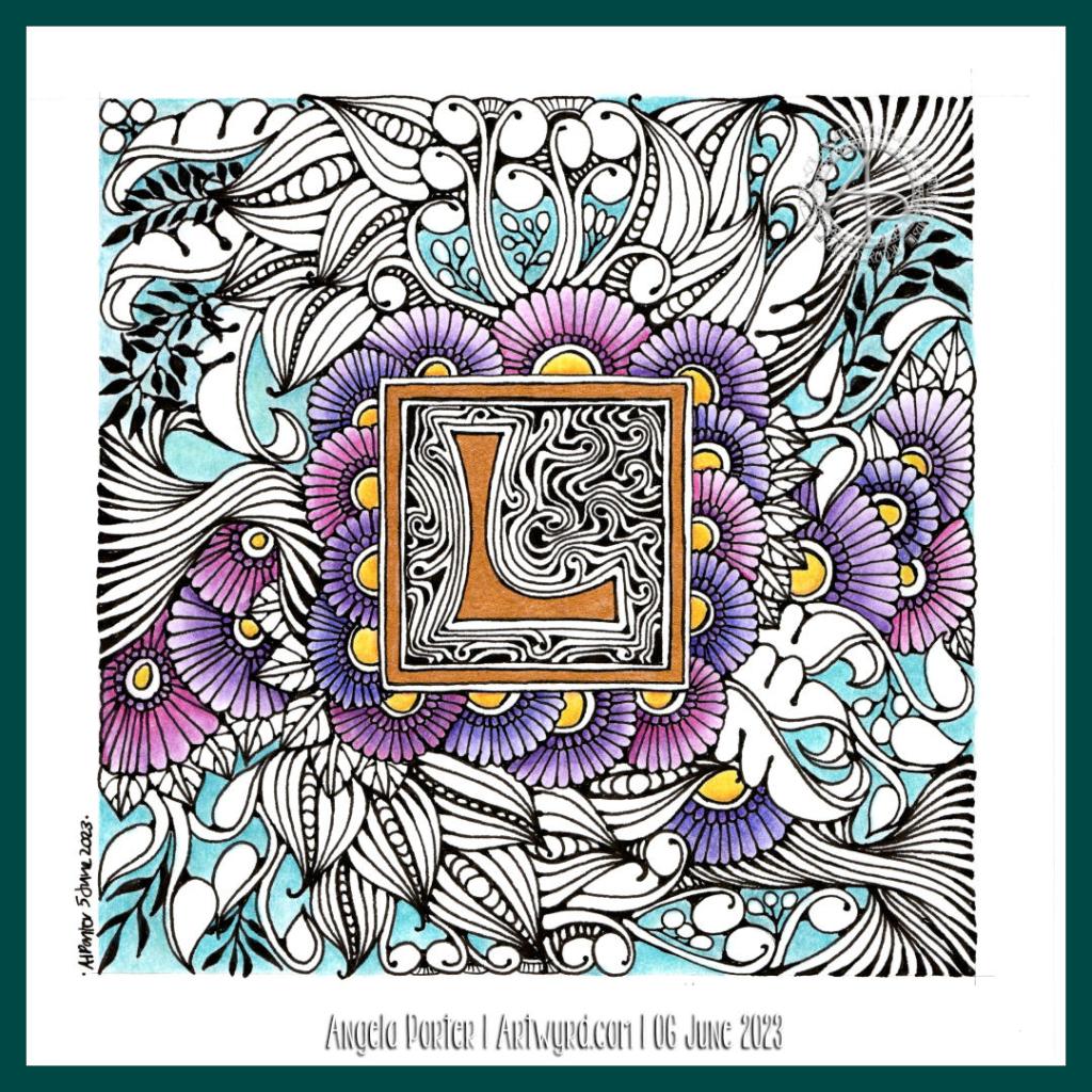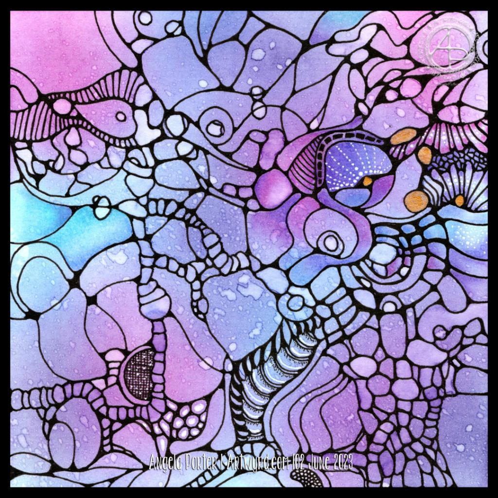
This is a drawing I started three weeks ago for a series of YouTube videos. Today’s video is part 4 of the series.
I finished the basic drawing in part 3. It’s all about colour and contrast now before I add the final detailed textures/patterns.
To add colour and contrast, I used Chameleon markers.
Adding colour/shade is always a nervous time for me. Surprisingly, I’m not really confident with colour. I prefer to work with a limited palette of monochrome or analogous colours, maybe with a sprinkling of a complementary colour here and there.
That’s the case unless it’s one of my Doodleworlds, whimsical, colouring book page designs. Then the more colours, the better! But, for this kind of entangled art, I prefer a more limited and elegant colour palette.
I always seem to use grey undertones for the shadows. I think I may have to try complementary colours to see how they work to add shadows.
My Chameleon markers have been rather neglected for a long while. However, I remembered I had them last week, and in using them in limited palettes, I’ve found them pleasurable to use, more so than all the other marker brands I have and have tried. Also, I’ve not been tempted to return to watercolours, Inktense, watercolour markers, pencils or pastels all the time I’ve used them. That has surprised me!


