An intuitive, abstract, entangled piece of small art

Link to the accompanying Draw With Me video on YouTube

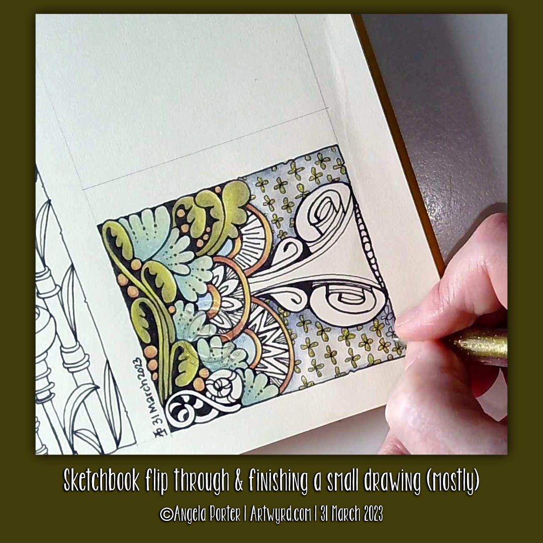
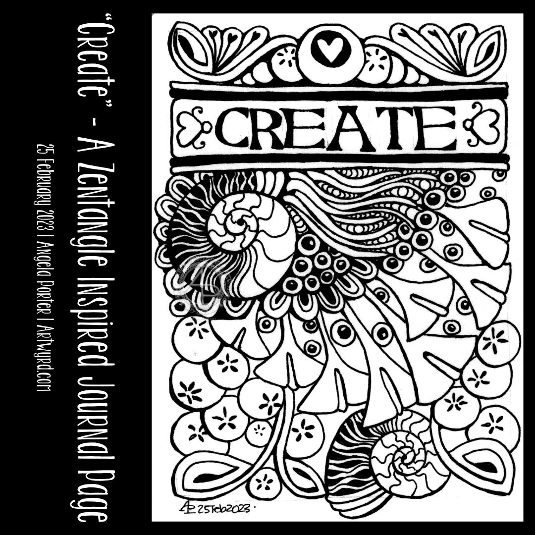
I had a lovely couple of hours this afternoon drawing and then adding colour to this small artwork. And small it is; the paper I used is an approx 10cm x 10cm (about 4″ square) piece of Canson Imagine mixed media paper.

I chose this paper as I enjoy drawing on it with a fountain pen. Today’s pen was an extra fine nibbed TWISBI Eco pen filled with black Documentus ink. This particular ink is archival and waterproof. Perfect as I had decided to add colour using Inktense pencils and a waterbrush.

The more muted, earthy tones do suit my present mood. I’m feeling rather tired, flat and disconnected from everything. Perhaps the earthy tones represent a need to spend more time with the physical world rather than in my head, imagination and creativity?

I do know what has caused this mood – too much adulting, people-ing and a couple of other things that I’m not going to share (sorry!). Out of sorts is what I am and have been for a while. I know it’s a temporary thing for me, a readjustment to changes that are ongoing.

The daily dose of anti-depressant/anti-anxiety meds keep me from sliding down into a dark pit of despair and tsunamis of tears. I know they only mask the anxiety I feel when I’m around people, whether one or many. My hands shake, my vision is different as the hypervigilance kicks in. Getting home means time relax and rest and it can take me days to recover from each people-ing.

All I’ve wanted to do for the past couple of weeks (or even few months) is to lose myself in art, audiobooks, music, and interesting tTV.

And, to circle back, my art tends to reflect this in one way or another.

I am learning to embrace the imperfections that appear as I use Inktense pencils and a water brush to add colour. I’m starting to accept that the imperfections create intriguing textures.

Discovering interesting shapes and patterns in my drawings is also fascinating to me. I need to remember to use a ‘viewfinder’ as I did two decades ago when my art journey began. Isolate a section of a drawing to re-draw on a bigger scale and work on developing it as a new work.

Hanging on my walls are three oil paintings I did about twenty years ago. They are abstracts of patterns from the robes of a Romanesque angel sculpture, the cogs from a diesel locomotive and the worm screws from a steam locomotive. I used a view finder to isolate the sections of my photographs/drawings to enlarge and recreate as abstract paintings. The colours I used for each painting reflected my emotional response to the original items and places where I found them.

Each of these oil paintings have a lot of contrast and trick the eye into thinking they are three dimensional. I didn’t realise I’d done that until the art exhibition at the end of my AS course. People kept touching these paintings and I didn’t know why. So, I asked a friend. She said she expected to feel ridges and valleys and was surprised to find they were totally flat and the illusion was purely optical.

Once she’d pointed it out to me, I could see what she meant!

That love of using high contrast to bring out dimension hasn’t left me. I’m not sure I’ve achieved a great level of contrast in this small drawing; there are some areas where shapes appear to curve up or down and where layers are more apparent. I may revisit this little artwork to increase the contrast at some point in the future. Maybe.

Tangle Pattern Sampler

YouTube #DrawWithMe Video Part 1
YouTube #DrawWithMe Video Part 2

About the pattern sampler

This little pattern sampler has been fun to do! I’ve used patterns inspired by the work of Rebecca Blair, some Zentangle style tangle patterns, and possibly some variations of my own too.

I do love Rebecca’s work. I can see the influence of medieval manuscripts on her work and her love of pattern, texture and a wonderful use of textured lines too! The simplicity of her colour palettes and the myriad of ways she combines her signature patterns/textures is wonderful! I really do suggest you take a look at her work on Instagram.

I used a piece of Ohuhu marker paper that measures 4″ x 7″ ( approx 10cm x 1.7cm) and marked out the basic sections with a Uni Kuru Toga 0.3 mechanical pencil (and a ruler for the straight lines). The pencil lines were just a guide for me.

In the first video, I did most of the black line work using an 03 Sakura Pigma Micron pen. In part 2, I added colour using Winsor and Newton Promarkers in Ivory, Sandstone and Caramel.

After that, I added some fine line work and some colours using three Stabilo Point88 0.4 fine pens. These had olive-green kind of tones to them that worked well with the soft browns of the Promarkers.

I also added some black lines in places using a 0.1 UniPin fineliner pen.

Finally, I added highlights using white gel pens.

I really like the more monochrome, subdued colours of this finished drawing. The various panels really do have the feel of a needlework or cross-stitch sampler; hence the name!

I spoiled myself with a set of Promarkers last week, and I don’t feel a bit guilty about it! I was getting frustrated with the Ohuhu markers – way too many bright, in your face, vibrant colours and not enough subtler, less saturated colours.

I’ve also found that as nice as the Ohuhu marker paper is (and it is lovely and smooth and fab to draw on), I much prefer Winsor and Newton, Daler-Rowney or Canson Marker paper for my alcohol marker work; the ink doesn’t sink into the paper as much and the colours are more vibrant. Also, you use less ink in creating the artwork!

Organising a new pattern, texture and motif ‘repository’ and a bout of illness

I keep faffing about with this. After getting frustrated with a six-ring A5 ringbinder and the limited number of pages that can be stored within, I discovered there’s such a thing as A5 landscape lever arch files! So one was bought post haste! I still can’t draw/write directly in it, but it makes it so much easier to store paper and finished pages. So, I’m one happy bunny.

I’ve spent quite a bit of time in the last couple of weeks starting to put together my collections of patterns etc. Especially as I’ve not been too well. I had been in contact with some people who subsequently tested positive for Covid. I had a nervous few days wondering whether I’d get it. I didn’t. Instead I had runny nose, slight cough, and a mild case or tonsillitis!

I’ve not had tonsillitis for the best part of twenty years. The last time I was getting it 4 times a year and was referred to an ENT surgeon. Let’s just say he didn’t need to use the tongue pressor thing to see my tonsils – they’re permanently large and have lots of tunnels (crypts) inside them from all the tonsillitis I’ve had from a young age. Seeing the surgeon seemed to scare the tonsillitis away; I elected not to go through with surgery to remove the tonsils. There are potentially serious complications that can arise in an, ahem, older person.

Anyhoo, It was a mild case. All covid tests for over a week were negative. But I’m left feeling run down from being ill. I’ll recover gradually!

Losing myself in reorganising and redrawing patterns etc was just what I needed. I’ve barely made a dent in my collection, especially as I’ve added loads more variations as I go! I know it’s going to be a long term project, for sure.

Other arty stuff

I have done other arty projects since my last post here. But the fatigue has been strong and my concentration and focus weak. I will post a gallery of them in the next day or two!

An Artsy Catch-up

Link to YouTube Video “Stylised Flower and Diva Dance Background WIP”

Link to YouTube Video “Tangle Pattern Bellah as a string”

Link to YouTube Video “Tangle Pattern Bellah as a string – Part 2”

It’s been a while. First, here are three images of the videos I’ve made since my last post. They’re all exploring how I can make colour and colour pens work for me. There’s also been some exploring of filler or textural patterns too; some are zentangle patterns, others are more classic pen drawing textures, and others are inspired by the work of Rebecca Blair.

I’m not quite sure where this is leading…yet. But I do know I’ll work things out.

I do like drawing a design all in one colour ink, such as a rich red-brown, or olive green, or blue-grey. But I also like drawing in black over a coloured background (like the stylised flower drawing).

Figuring out what medium I like to use to add colour is a tricky one. Of course, tradigital art (design traditionally drawn on paper with pen, colour added digitally) is a way I love to work. However, I do enjoy working in sketchbooks on ideas.

Today, I settled on Karin Brushmarker Pro pens and a Kuretake Zig waterbrush. I like to use a waterbrush. There’s a steady flow of water to the brush. I find it much easier to achieve a nice gradient with this brush. I love the vibrancy of colours in the Brushmarker Pro palette, and there are enough earthy ones to keep me happy too!

As well as working in my sketchbooks, I’ve started to sort my collection of patterns, tangles, textures and motifs into an A5 six-ring binder. I thought it was time to make sense of it all and to have a more systematic way of organising them to help in finding inspiration.

And I’ve been sleeping…lots. I’m not sure if the sleep is part of the healing process from the burnout earlier this year, the antidepressant/antianxiety medication I’m taking. My emotions are more stable, my mind is calmer, in the greater part; that is a good thing for sure.

So, thank you for bearing with me while I’m managing the changes with me at this time.

Sketchbook flip through & finishing a small drawing (mostly…)

In today’s video on YouTube, I share a look at one of my current sketchbooks. Then, I finish drawing this little design and start to add colour to it.

The drawing is only teeny – a little less than 3″ from side to side – but that makes it fun to do! The tiny floral background pattern just needed to have glittery shimmery gold pen added to the petals; it’s so reminiscent of medieval illuminated manuscripts.

It’s unusual for me to work on such a small scale, but when I do I really enjoy it! I think it’s something I need to do more often. Especially so as I’ve been watching videos showing mixed media grid journal/sketchbook spreads.

Mixed media really isn’t my kind of thing … usually. However, these videos are sparking off some ideas in my noggin. I’ll see how that pans out over time for sure.

As to other things… I’m doing OK. I’m feeling less off with the fairies for sure. A number of ‘peopley’ days last week left me exhausted and needing a lot of quiet time this week. My emotions and thoughts are much more even too, which is a good thing. Fortunately, I can still feel emotions, unlike my last periods of burnout when I had the same meds. So all’s looking better on that front.

I still have an interesting journey to make in knowing and understanding myself better. Slowly is the best way to do that after the confusing and unsettling revelation at the end of last year, yet it was a relief for sure too.

The longer hours of daylight are helping too, though some more sunshiny days would really help! It feels like it’s been raining here in Welsh Wales forever! It hasn’t, but some sun would be welcome for sure.

Until that time, I shall enjoy my times of art and creativity for sure.

Entangled Samplers Cover Page – Part 3

Link to the #DrawWithMe YouTube drawing tutorial.

Entangled Samplers Cover Page

I’ve finished adding all the main patterns on the cover page for my Entangled Samplers collection. I’m happy with the result, which is something I rarely say!

However, I needed a regular grid pattern to contrast with the more organic patterns and motifs. So, I added the gridded tangle to the top right.

At the bottom right is a variation of the Zentangle tangle pattern ‘Rixty’. The plain white paper behind it was crying out for some texture. So, I added some ‘Printemps’ spirals using a 0.1 light grey Unipin pen. As a subtle reminder to use colour and line thickness variations to bring interest into a drawing, this was a good idea.

I have a couple of things to decide before fully finishing the page. Firstly, how do I want to add shade/highlight/contrast to the drawing? Secondly, do I want to add a pattern to the wide border around the title text?

There’s no rush for me to decide. What’s the saying? ‘Act in haste, repent at leisure’? I can let these issues wander around my noggin until the perfect methods come forward.

Exploring ‘Lunaria’ by Ute Andresen and a wavy leafy pattern

I had some time and energy left to do some more drawing. So, I grabbed (gently) a fresh sheet of A5-ish paper and used some patterns from last Tuesday’s Tea and Tangle With Tracy.

The first one is based on waves with leaves. I like the very graphic, high-contrast leaves, for sure. Adding colour between them helps to make sense of the pattern as well.

The second one is my take on a tangle pattern by Ute Andresen called ‘Lunaria’. I like branching and organic patterns. In this drawing, I wanted to explore variations on the ‘fruits’ at the end of each branch. This is always a fun thing to do! No doubt I’ll do another branch of Lunaria explorations in the space beside this one at some point.

“Entangled Samplers” – Cover Page WIP, Part 2

YouTube drawing tutorial

‘Create’ – A Zentangle Inspired Journal Page

Click on this link to view the #DrawWithMe video on YouTube.

Today was a day to just draw for the pleasure, joy and contentment the process of creativity brings.

I knew I wanted to include some hand lettering in the design, and that’s where I started. The rest just flowed from there as it needed to. I put no pressure on myself to be perfect, nor did I have a design in mind. It was pure, intuitive art.

And that intuitive process let me relax and enjoy being able to just create for the sake of it.

An Entangled Sampler (page 3, WIP)

I’m really enjoying creating pages in what I had been calling an illustrated journal. But, in today’s video, it came to me that they are akin to a needlework sampler, so Entangled Samplers the collection will be called!

In the video, I drew a couple of elements but focused on using texture patterns to fill the spaces. And that was when the idea of a sampler came to mind.

I’ve yet to decide what goes in that awkward central space. Journaling? More patterns or motifs? I really don’t know at the moment. I will figure it out though!

Abstract Flowers for an Illustrated Journal

Link to draw with me video on Youtube for the flower to the left.

I have decided to keep an illustrated journal full of my favourite patterns and motifs, accompanied by some words of encouragement and, perhaps, advice.

I’ve kept a collection in a dot grid notebook for a few years. However, some people have asked if I’d share it. I thought it was high time to create something similar instead of sharing a battered and dog-eared book. So, that’s precisely what I started in today’s video.

So, I purchased a Talens Art Creation A5 landscape sketchbook for this purpose. I like the paper in it; it’s creamy in colour, so it’s more soothing on my eyes. The scanned page in the image above doesn’t show the cream colour; the struggle with scanners is real! The paper is 140gsm (90lb). It will take a very light wash of water, but I like the fairly smooth surface to draw upon.

For this page, I used a selection of pens:
A micro Uniball Eye for most of the drawing
01 and 03 Sakura Pigma Microns for details
0.38 Uniball Signo DX for the writing.
Faber-Castell Pitt Artist Brush Pens in Cold Grey 1 and Cold Grey III

I’m fairly happy with how the page looks. However, my handwritten notes are a bit … untidy. Hey ho, they’ll do!

I only drew the flower on the left in today’s YouTube video. I couldn’t find the first drawing for this new journal. Stupidly, I’d done that on a loose sheet of A5 dot grid paper and didn’t put it into a folder for safe keeping. I have no idea where I’ve put it. So, that was another good reason to get a sketchbook; it’s harder for me to misplace a sketchbook, though it has been known to happen. So the arrangement from the centre to the right is a replication of the motifs from the lost page.

As I typed that, my mind thought of the Moody Blues album title “In search of the lost chord”. I’m forever in search of my lost artwork!

This is going to be another interesting project. I do seem to pick up and drop projects a lot. The reason is I need variety in what I’m focusing on. Sometimes, I need a bit of a break from a particular project or focus. At other times, I’m just not well enough to do anything more than some challenging ‘comfort art’.

I now need to decide if I’m going to add some colour to this page. I have shadows in place, so transparent/transluscent media will work with that. I’ll think on it. For now, I need tea and something to eat!

Starting to draw some motifs/patterns for a reference book/journal/zibaldone

I’ve been asked several times if I’d make my visual dictionary, pattern and motif collection, journal or art zibaldone available for others. I’ve shown it a few times in videos. It’s my go-to reference when I need some inspiration for my art.

So, today, I thought I’d take some elements from a current WIP and start to put a page together.

I used a piece of A5 dot grid paper with holes punched in it for a six-ring binder. However, I may use an A5 dot grid notebook. To draw the design, I used an 05 Sakura Pigma Micron Pen. Shade was added with a 2B matt Pitt graphite pencil and paper stump/tortillon.

I enjoyed doing this. It was fun to add alternative ways of approaching various elements. That’s how I like to work in my visual zibaldone. And, of course, the variations are not exhaustive! No doubt more will appear in time, either in the zibaldone or in some artwork.

That is what I love doing. Varying and shifting the pattern or motif into something new and different.

Of course, I have filmed myself drawing this page so far, and you can draw along with me by clicking this YouTube video link.