This was one of those fragments where I thought there wouldn’t be much I could do with. I wasn’t sure if it would transfer to other shapes and so on.
Turns out I need not have worried at all. Admittedly, some shapes and variations work better than others. Also, I’m aware I’ve barely scraped the surface.
This page also gave my TWSBI Eco fine nib fountain pen a work out. Treating Canson Imagine mixed media paper with Distress Ink does make it a bit more absorbent and the pen ink does result in a broader line. Such an effect wasn’t noticeable on the ClaireFontaine Paint On paper coloured with Distress Inks. It’s going to be a bit of trial and error process going on until I get the hang of it!
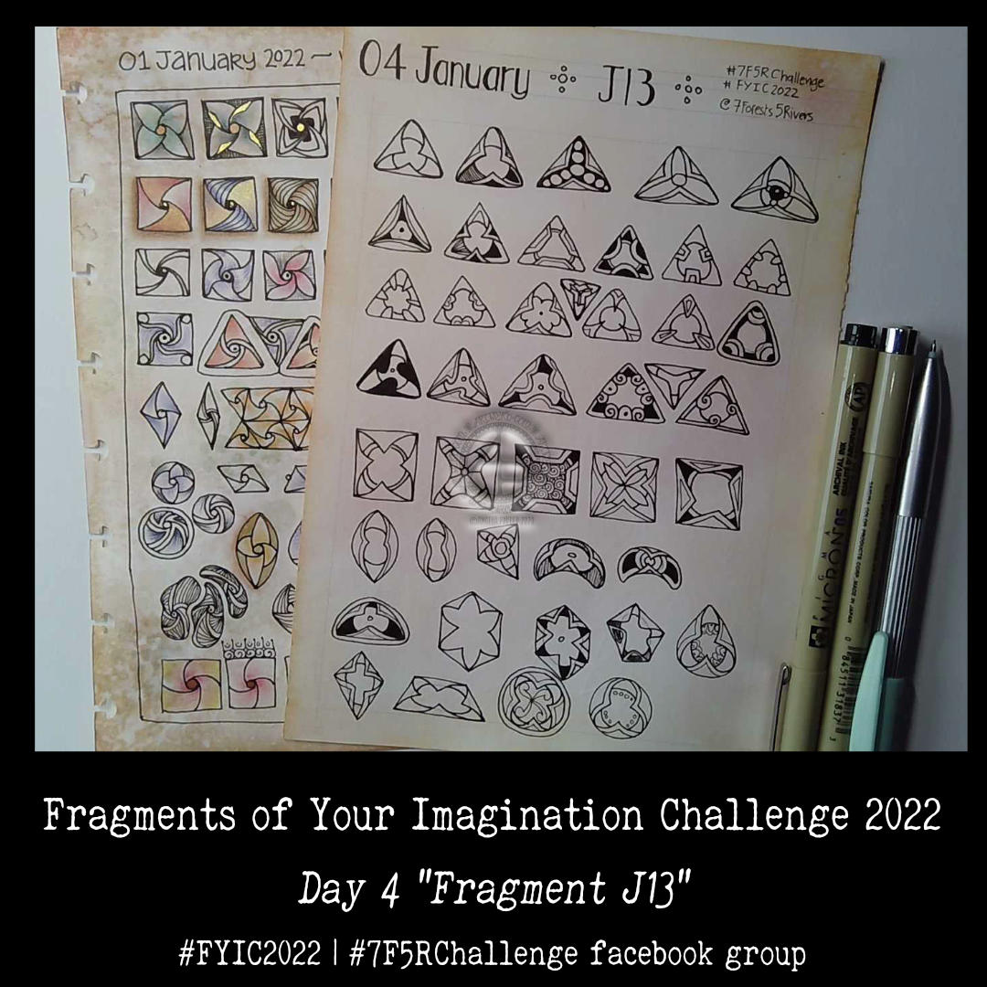
J13 is a fragment that is so full of possibility that I’ve barely touched the surface! This was fun to do and, no doubt, I’ll be re-visiting this fragment at some point.
I managed to get all the days muddled up in the challenge. That’s not a problem, I’ve been told, just work with a fragment a day, follow the list, ignore the list, all is fine and good!
Today, I chose to do fragment X7, which can be found in the Zentangle Primer book. It’s the circular version that is suggested today. But of course I had to work with other shapes and forms too! So much so I fairly quickly filled a page up.
The second sheet was done in today’s video. I had recorded the process of drawing the first sheet, but forgot to check that I was in frame. I wasn’t for way too much of the time. So, I just recorded a different video, including some other variations of the fragment.
Once you start exploring, you just can’t stop! Or so it seems in my case.
Today, I show how I create the backgrounds I use to draw on. Although I use Distress Inks, there are many other ink pads on the market that can be used for ink blending.
I needed to add shadows to the drawing completed and given a colour wash yesterday. As I so often regret my choices of how I do this, I decided to make a test page of various methods for my sketchbook.
They all have their own charm and feel. However, putting them side by side so I can compare and contrast gave me a better idea of what I really like.
To add shadow/highlight to a drawing, I really like the hatching/contour lines created by a micron pen or a biro. The biro I particularly like as it is much softer and I’m able to get a tone variation with the lines.
I also worked out that for using gradations of colour, they just feel a bit … plain. So, like in the drawing of medieval flowers and leaves, the combination of lines and colour works for me.
I found when I was adding shadow below the drawings that using Distress Inks like watercolours just wasn’t going to work. The use of water results in weird boundary lines that I’m not fond of. Of course, if I’d not coloured the background in Distress Ink, a gradated wash of colour may have created a lovely shadow.
So, I think I’d prefer to use chalk pastels for adding shadow. The ability to blend them out gradually, with no harsh line, is a great advantage. It’s also easy to add more of the pastel if a darker colour is needed.
So, that’s what I chose to do. Not just with the drop shadows, but with darker areas on the leaves etc. I even found that the pastel can tint the gold I’d added in places, which is a really interesting twist.
Bit by bit, I’m working out colour, shadow, highlight and what works for me.
It’s also no bad thing to spend time trying out techniques with various media. Mixing and matching. Making a reference page for my sketchbook / zibaldone has proven to be a very valuable exercise.
When I’m quite happy with the drawing. I will do my best to take a good photograph of it. It’s worked out much better than I thought it could.
Well, I have been a bit busy with variations on the simple flower motif in the bottom left corner of the image!
I’ve said (typed?) it before; I really, really enjoy taking a simple motif and seeing how I can vary, alter and create patterns with it. There is something fascinating in doing this. Some explorations don’t work out and need amending, others lead my thoughts to unexpected versions.
Today, I felt the need to play around with a simple flower motif. I had planned on doing a page showing how to draw my current favourite patterns/motifs. Instead, as I started to draw this flower, I wanted to explore variations and patterns I could create with it.
There’s only about one third of an A5 page filled with such line drawings, and that took about an hour or so to do. But there’s so much in there already!
Being able to just lose myself, guilt free, in drawing over the past couple of days or so, has been a pleasure. ‘Adorable Dogs’ is almost done, just three templates to add colour to remain. I have a break before I start work on the next colouring book for Creative Haven from Dover Publications Inc.
That doesn’t mean I won’t be working on another project or two. But for the next few days I’m just going to indulge myself in drawing for the sheer pleasure of drawing! And that includes a New Year template for the facebook group Angela Porter’s Coloring Books Fans.
The first one involved line drawing and adding shadows with a graphite pencil.
Part 2 involved adding some colour and shimmer, and plenty of ‘hiding the crimes’ too, with the gold border.
I rescued the drawing, but looking back, I wish I’d stopped at the end of the first video and just added some gold highlights to the berries. I also think that adding hatching, broken contour lines and stippling may have been much better than adding colour. Or, scanned the image in and added shadow and colour digitally!
I filmed these processes, and the two videos are below.
This card is now almost finished. I have learned some things from yesterday’s debacle. Mainly that I’d make a much wider border for the embossed background.
I did add Speckled Egg Distress ink to this embossed background, but it’s such a lovely, subtle colour the camera hasn’t picked it up well.
The embossed layer is so tactile! I used some Micro Glaze to seal it so that being touched won’t affect the distress ink.
Actually, I used Micro Glaze on the top layer too!
I could only find cream coloured card blanks and envelopes, and these layers really didn’t look too good on them. So, hopefully I’ll remember where my card blank stash is, or I’ll make a blank and envelope.
In the video I try embossing an envelope – a case of ‘envelope art’. I’m glad I did. The embossing works well. However, the areas where the flaps are glued together on the back of the envelope make indents in the front. Distress Ink brings these out so much. So, I’ll be sure to emboss the front of the envelope, and colour with Distress Ink, before I glue it all together!
All in all, I’m much happier with this card. Mind you, I do have ideas for others! Probably too late for Christmas now, but … there’s always lots of other reasons for sending greetings cards, including ‘just because I can’.
Winter solstice 2021 Mandala
Winter Solstice Greetings and Wishes to you all to the north of the equator! Summer Solstice Greetings and Wishes to you all south of the equator!
Some sunshine on a chilly, dull Winter Solstice day here in the Valleys of South Wales, UK.