And Another …. Pen Drawing and Witter!

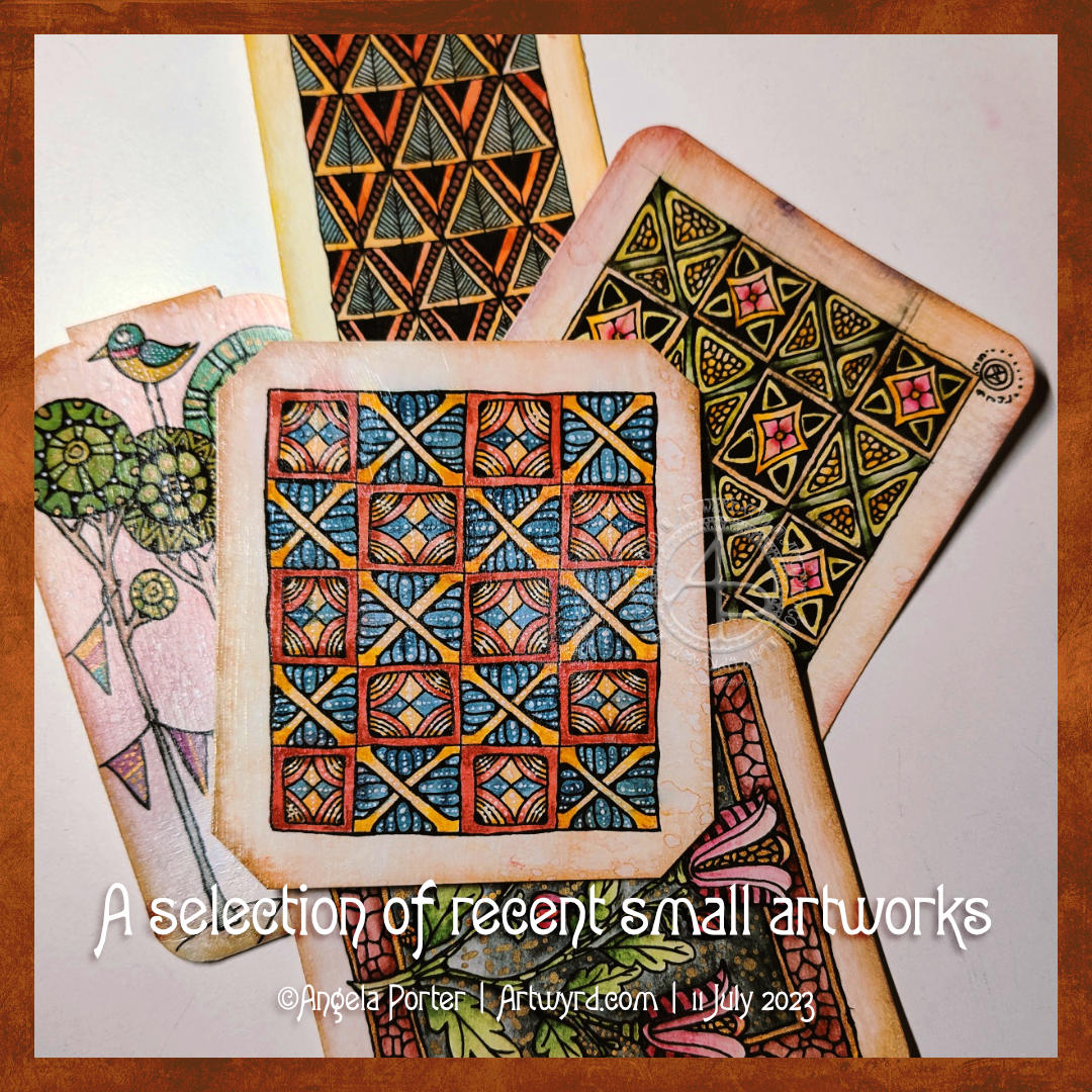
YouTube Video showing the creation of this drawing.

This afternoon was sunny and gusty-breezy. The shiny leaves on some rose bushes sparkled and shimmered as the wind danced with them. The wind was noisy as it blew the branches and whistled past buildings, yet the sound was soothing. The energy of the wind and sun uplifted my spirits, and I felt it was time to do an impromptu YouTube livestream.

I knew I wanted to do something similar to my previous video—a pen drawing, graphite shading, and a watercolour background in the ‘white spaces’. So, I did that, and I shared my thoughts and joy with those who found their way to the livestream.

I can’t remember what I wittered about during the 2 hour or so livestream, but I know it mentioned finding joy in small things, a childlike wonder of the world and life, taking breaks from the pressures and responsibilities of adulting wherever possible.

One thing I can say is that even in the darkest times of my life, I’ve always been able to find joy and wonder in nature, books, films and more. It may only give me a sparkle of light for a moment, but that sparkle is a reminder that it will fully return and hasn’t gone anywhere – it’s merely clouded by the dark and low mood that gathers around my heart and mind.

If anything, the darkness allows me to enjoy the sparkles more; they are more vibrant when surrounded by gloom. It would be hard to recognise the sparkles and joy if all was bright. Contrast is needed.

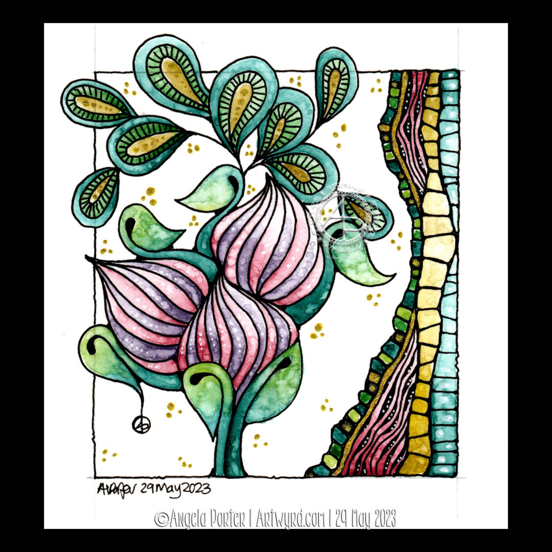
Perhaps that’s why I love using high contrast in my art. In today’s drawing, the darkness of the watercolour background really lets the pen drawing almost glow. The texture in the watercolour reminds me of the subtle patterns seen in glowering clouds or the ripples in a darkling sea. Either description works for the constantly shifting and changing emotions and thoughts; not all are gloomy, as the lighter areas show.

The birds in the left-hand column were a surprise! I certainly didn’t plan that. In fact, I didn’t plan any of this drawing. I just let it grow, one line at a time. Sometimes, a line, or combination of lines, suggests a recognisable motif, and I go with that.

Working intuitively always surprises me; though I may make some decisions along the way, they are instinctive. Speaking out what I’m doing just expresses in words what my hand/eye want to do next.

Turquoise is definitely the colour of the moment with me. This time, however, I added rich indigo to it to intensify the colour and depth of shadow. I let the watercolours play with each other as they will, just allowing the end result to be what it will be.

It’s not easy for me to let go of control in this way, but watercolour is showing me that it is possible. And when I let go, the results are always a wondrous surprise!

It’s Been A While…

About the drawing…

I’ve been away from social media for quite a while (I’ll tell you a little more later in this post). So today, I had the energy and time to record a YouTube video in which I drew the design in the photo. The video is due to be available to view at 20:00 UK time today, 14 June 2024.

I started with a 6.75″ x 5″ piece of Ohuhu Mixed Media paper. For those of us who prefer metric, that’s 17.5 x 12.7 cm. I like this paper. It takes watercolour nicely enough for my limited ability to use it. It’s also nice to draw on with a pen or pencil, with its light texture.

The next step was to draw a square, approximately 4″ x 4″ (10 cm x 10cm), in pencil. I like to frame my drawings as if they’re a small glimpse into a much larger imaginary world of abstract and stylised wonders.

Then, it was time to wield my UniPin pens (0.5, 0.3 and 0.1).

I knew I wanted to leave some empty space for watercolour. I also knew I wanted to use a 4B graphite pencil with a tortillon to add shade. Other than that, my mind was empty of any plan. Working intuitively called to me, so I followed that calling.

So, I started with a bit of a wibbly wobbly circle. Then, I just let the design flow and grow using my favourite lines and shapes. I added details as I went, starting to bring the design to life using the density of ink to add some shadow and highlight.

Once the penwork was finished, it was time to add shade. My aim was to bring out a feeling of dimension to the drawing. I’ve long loved playing with contrast more than numerous colours in my work. My goal was to give the appearance of the design floating above the background.

The graphite shadows partly completed that goal. I used turquoise watercolour to add intense colour to the empty spaces. It also allowed me to play with the magic blooming of watercolour dotted into the damp areas to provide more texture.

I love to watch watercolours bloom and spread in this way. Having no control over this blooming and spreading is good for me; I can be too controlling about how I draw and create.

Little by little, I’m learning to allow a little more imperfection into my art to make it more ‘human’ It becomes not wrong but charmingly imperfect. At least, that’s how I like to think of it, and perhaps myself too. Maybe learning that I’m charmingly perfectly imperfect is a personal goal.

I really enjoyed the hour or so I spent creating this small piece of art. I did think about adding some gold, black, or white pen to the turquoise parts to bring out some of the beautiful textures that are there. I’ve decided, however, to err on the side of caution and to leave well alone.

Overall, I had a lovely time, and I hope you enjoy watching the video if you choose to do so.

Why have I been missing for a while?

For around 18 months, I’ve been struggling with my health – nothing serious. Between anaemia (iron and B12), peri-menopause, and IBS, I’ve been so tired a lot of the time. My concentration hasn’t been what it could be. All the energy I had needed to be put into my latest book for Creative Haven – Haunted – and is full of creepy cute characters.

I thoroughly enjoyed doing the book, even though I got tired quite quickly.

Then, my main computer, a Microsoft Surface Studio, unexpectedly died. So, after much thought, I switched to using a 24″ XP-Pen graphics tablet and my new-ish laptop to do the same job. I had a lot to learn and a way to set up Clip Studio Paint that would work efficiently for me on this new device, But I got there.

In the process of using the new gadgets, I’ve realised how much I love to draw on pen and paper. I think I’ll be doing much more of that going forward for my work on colouring books and moving more towards tradigital working.

That was a bit of a meandering journey through what happened. It’s not the only stuff. I needreevaluate my view of myself as being ‘broken’ to being ‘different’ and accept these revelations. There are a lot of ‘OH!’ moments as I recognise things in my past that point to my differences. There’s also some grieving for what could’ve been if I’d only known sooner about them, But it really does help me accept myself and adjust the wrong beliefs I’ve held about my life forever. It’s an acceptance of who I really am, not what I’ve been led to believe. That’s progress for me, for sure. I ama always amazed by the feeling of some tension in my body being released as I recognise a memory for what it is-a new understanding of myself with the new information I have.

All of this has been both exciting and draining in many different ways. It has been totally necessary. This self-acceptance is working its way into my artistic style, too.

A collection of some of my recent ‘small art’

I’ve been doing smaller pieces of art lately, and here a just a small selection of them.

The top design is one I drew and started to add colour and highlight to in a YouTube #DrawWithMe video.

Small artworks are just the thing needed when I don’t have the energy or brain power to do anything larger. They do have, however, their own challenges!

What I had a flash of inspiration from somewhere, probably watching an arty crafty YouTube video. The inspiration was to use gloss Mod Podge to coat the artwork. The glossy surface really brings out the colour and cleans up the watercolour from the black lines. There is no, or very little, movement of colour when it’s applied, so long as it’s applied quickly with little fussing. I did apply a second coat as there were brush marks in the first one.

All are Zentangle and diaper patterns from Medieval Illuminated Manuscripts inspired, apart from one. The one with trees, birds and buntings was inspired by Danielle Donaldson in her book “Creative Girl”.

Flower Buds – 29 May 2023

Flower Buds

I absolutely love the Kuretake Gansai Tambi Art Nouveau set of watercolours! I just had to get that off my chest!

I love the texture created by the watercolours – how uncontrollable it is, but it adds so much to the final drawing and it actually makes my arty heart and soul smile a tad.

This is a drawing completed, for once, in today’s YouTube video, due to premiere at 18:00 UK Time on 29 May 2023. In the video I show how to draw the design, add colour and gold and white details.

After doing this artwork, I really do think the Kuretake Gansai Tambi’s are the watercolours I’ve been searching for. They work with me, helping me to express myself. Also, embracing the imperfections of the textures in the colours as part of my self-expression rather than searching for the unattainable.

I used single colours for each section, except for the larger leaves. And that seems to have worked out well for me.

I love how the gold and green to the right seem to glow like sunlight shining through stained glass.

The only thing I wish I’d done was coloured the paper with Distress Inks before starting the drawing. I know that so little Distress Ink is added to the background that it won’t affect the colours in a noticeable way. So that will be my next arty experiment today!

Oh, and I wish I’d remembered to erase the pencil line before starting to add the watercolour!

Again, I used Canson Imagine mixed media paper(9.5cm x 10.5cm or 3.75″ x 4.25″) and it seems to make it so easy for me and the Gansai Tambi paints to work well together.

I’m absolutely amazed that I’m embracing imperfection! I never thought I’d get to that point, or let it be part of my artistic voice.

I’m actually smiling here. I really am. And a smile that is felt in my heart and soul too; something I’ve not done much for a long while.

A sudden realisation

I had a sudden revelation today, of a practical nature. I suddenly realised I tend to create art in sizes that require custom made frames and/or mats. So, I thought I should try to get a selection of ready cut mats in standard sizes and use them to cut paper and create the right sized art to fit the mat. So that’s what I did.

I can be such a numpty, feeling quite daft it had taken me this long to work that out! But then again, perhaps the time wasn’t right before now. I’ve thought for a while now that I could sell my art, particularly the more abstract, flowy, intuitive art. Next step is to work out how to do that and ‘promote’ it/me. And that is the problem, the promotion… it fills me with horror. But maybe I’ll work it out. Time will tell for sure.

Intuitive Abstract Art WIP

It’s been a funny few days here, culminating in a bit of shopping therapy yesterday. One of the items I bought was a set of the Art Nouveau Kuretake Gansai watercolour paints.

I’ve been eyeing them up often since I knew they were a thing. Yesterday, I finally splurged out on them, as well as various metallic (mostly gold) acrylic paints and inks and some beautiful ramen bowls. Well, even an artsy person has to eat!

This little drawing was done in my latest video, all for the purpose of trying out the colours and the paints.

I absolutely love the colour palette and I need to recreate it digitally for sure!

I get so frustrated with watercolours, perhaps because I’m trying to do it the way other people do watercolour rather than trusting my own way of expressing myself with colour. So, I did my very best to let go of any preconceptions of these watercolours as I worked with them.

I love the way some delicious textures appear spontaneously. How different for me to like this compared to my usual very smooth colour blends. I find the randomness, the spontaneity and magic with which they appear quite fascinating. It’s something I can’t control, and I find that I don’t want to control it. I want to be surprised!

Oh, before adding the Gansai Tambi, I used a Payne’s Grey Inktense pencil and a waterbrush to add some shade to the areas I’ve added colour to.

The Gansai Tambi colours are transluscent enough to let the shading show through. Indeed, they fade gradually and wonderfully as they are blended out in an area.

The other thing I did, well one of them, was to add colours to the sections before adding any texture patterns. That worked nicely; the paint does seem to have a chalky residue that shows up on the black lines. Must remember to make the gaps between lines big enough for my favourite paintbrush! Or, just use traditional brushes and a jar of water; but with that comes the danger of clumsy me knocking the water over…

I tried out a white pigment ink gel pen (Pilot choose) to draw with, as well as a gold Pentel Hybrid Dual Metallic pen.

This drawing really is an opportunity for me to try things out, with no stressing about wrecking an original drawing. I’ve already managed that with one drawing that will now be kept for trying out different colours, media, mixes of media and so on. Luckily, I had scanned that one in before I attacked it with Inktense pencils and gold acrylic paint! Tradigital it is for that design then …

It’s so nice to feel comfortable with a medium I’ve struggled with so much -watercolour. Doing it my way seems to be somethign I need to accept as being acceptable. Art is a personal expression, as such is there a wrong or right way to create? I know in my videos I often mention ‘this is how I do things, it’s not the only way and if it helps you find your way, then that’s fantastic!’.

I think we have to try lots of different things and eventually we circle in to what are the ways that really express something of ourselves creatively. It means many attempts that end in frustration or disappointment or failure. But these aren’t really failures; the lesson is that this may not be right for us at this time, if ever. They aren’t a failure if they spur us on to try out something new.

And that is why it’s important to take time to create more personal art, just for the joy of creating and exploring and trying things out. It freshens us up, even if, as I have done recently, we return to way of drawing that is is so familiar it’s comforting to do.

And perhaps art that gives us that comforting, satisfying feeling along with true self expression is the place where our arty heart wishes to reside, with trips out to add inspiration and blow the cobwebs out of the vault of motifs, patterns, textures, themes, techniques and materials. And that trip out can be physical or through looking at books or online or even through dreams and daydreams or the view from a window, music or stories, films or tv programs, and more. Not all journeys are physical ones, are they?

My brain now hurts, so I need some tea to drink soon! Just some social media posts to finish first…

Abstract Zentangle Inspired Art

Click on this link to watch the accompanying drawing tutorial on YouTube!

Abstract art

This was an interesting experiment. I was inspired by a video tutorial by Ellen Crimi-Trent Artist. In the video, she used a charcoal pencil to create an abstract line design. Next, watercolours were used to fill the spaces. Finally, details were added with pen.

I thought it could be a lot of fun to use this as a way to display some Zentangle style patterns. So I did! However, in true Angela style, I’d first tried not only a charcoal pencil, but a watersoluble graphite pencil, an Inktense pencil and an Inktense Outliner to create the grids on separate pieces of mixed media paper. Then I added watercolour to them to see which method of laying out the main pattern I liked the most.

As it turns out, it was the charcoal! I didn’t expect that!

I filled in the majority of the spaces with tangle patterns. Finally, I used charcoal and white chalk to add shade and highlight to each section of the design. I should say I didn’t do all the sections in the video. Oh, and I added some white highlights/patterns with a white GellyRoll pen.

The intense black of the charcoal really dials up the contrast by quite a few notches! I really did have a lot of fun playing with the illusion of volume in this design.

I’m also glad that I didn’t fill all the sections with pattern; I like that I have some simple, volumised areas whose simplicity contrasts with the complexity of the patterns.

I now have quite a few pieces of coloured, patterned paper to play with in the coming days.

Well and truly people-d out!

It’s true. I’ve not had such an intensely people-y week since well before the pandemic hit. I both feel very much by myself and a little sad about that, but also rather relieved that I get to sigh, relax and breathe for the next couple of days at least.

And with the relaxation may come the introvert hangover or social migraine! Maybe not. I’ll see tomorrow. I know as I take my time to relax, unwind, settle back into my solitary existence I will feel intense tiredness creep over me. Indeed, I can feel it beginning to extend it’s soft cloudy folds and start to enevolop me. I will give in, later. I have a few things to do first! Social media posts, a huge mug of tea, maybe something to eat. And then…I’ll see!

Draw With Me – A Whimsical Bird, Part 3 – Starting to add colour.

Today, I’m experiencing some emotional ‘weather’. I know what the trigger for this is. I know what to do. And I also know that being creative will help me greatly. So, I decided to start to add colour to this bird drawing.

This may not be the best time for me to tackle colour. I feel I struggle with colour at the best of times. Still, I worked with a limited colour palette of blues and turquoises, as well as yellow, orange and red.

The Distress Ink on the paper reactivates with water, so there is some ‘greening’ of the blues. I’m fine with that. The mixing of colours will lead to a bit more harmonious outcome, I trust.

Oh, I’m using Karin Brushmarker Pro pens to add colour. They have watercolour ink in them, so I’m scribbling them onto a white plastic palette and using them from there. This way, I have a bit more control of the intensity of colour and how they blend and mix.

So far, so … OK I think.

I now need to work out how to tackle the body of the bird. Do I use masking fluid to cover the dots before or after painting the body? Should I use something like a gel medium to seal the dots once I’ve coloured them in before tackling the body? Or what about a clear glaze pen, even though the dots will be slightly raised and shiny?

I don’t have any masking fluid, but I’m not sure what I want to do. So it’s time to sit and let the possibilities be worked through in my subconscious to come up with a decision.

One thing’s for sure, however. I will not be starting work on the flowers and leaves until the bird is finished! And I will need to be careful about the colours I choose. That’s where it can all go totally wrong.

For the rest of the day, I’m going to lose myself in some hand-lettering practice in my hand-lettering sketchbook. There’s a lot swirling around in my emotions, my mind and my subconscious.

Pen and Wash | Entangled Art | WIP

Link to today’s vlog on YouTube.

A very small penny dropped yesterday. I realised that what I’m doing is pen and wash, or ink and wash, or line and wash. I’m not entirely sure that a label is required, but it seems to fit.

I’m adding watercolour of one kind or another – Inktense, Ecoline, Mijello Mission Gold, Distress Inks, etc – to a pen drawing. Why I haven’t made that connection to the description of the method/process? I have no idea! Still, I have made that connection and a realisation that it gives a sense of artistic legitimacy to my work. That is a function of my insecurities when it comes to my artistic espression.

Yes, that’s right. Insecurities. Lack of confidence. Lack of belief in myself. Self-questioning about what on Earth I’m doing.

It is always nice for me when pieces of a rather abstract, metaphoric jigsaw fall into place, giving me a more coherent view of my method, my artistic voice.

These pieces always fall into place at the right time for me. I’m ready to accept that line and wash is what I do well, when I work within ‘an elegance of limits’ to quote the team at Zentangle. In this case a limited palette of colours harmonious with the background.

As well as working on this particular drawing, I have included some views of recent work in my sketchbook in today’s vlog. This other work shows me trying to work out how to add more contrast to the wash of colour. Fine ballpoint pen, graphite pencil and tortillon or coloured drawing pencils/chalk pastels are what I’m exploring. Eventually, I will settle on a method that I particularly like. I’m not happy with any of these at the moment.

I will continue to explore an figure it out. That’s what I’ve done with adding colour to my drawings, and that’s what I’ll do when it comes to increasing contrast with shadows and highlights.

Of course, I’m talking here about traditional art. When it comes to digital art, I think I have found a way I’m comfortable with in adding colour to pen drawings. I’m not quite there yet with traditional media, as well as finding the traditional media I like to work with.

Abstract Entangled Art | 31 July 21

This is, I think, finished.

It certainly was a task and I needed to persevere at the beginning. I was really hesitant about adding colour and seriously disliking the colour as I started to add it. The more I did, the more comfortable I became with adding colour.

I think what helped with the colours was the use of a limited colour palette. Indigo, prussian blue, gold ochre, burnt sienna and bronze green made the basic palette up. Mixing the colours gave me plenty of variation in colours and tones while at the same time keeping a coherence.

I started adding shading with a biro. As this drawing was a testing ground for various ideas, I used a cool grey Pitt Artist pen to add the rest of the shadows. I found the result pleasing, particularly after adding colour. A darker grey may have worked more to my tastes of high contrast, but this is a starting point.

Indeed, I rather like the combination of biro and pitt pens. I did end up adding some cross hatching to some areas to intensify the dark areas betwixt the elements of the design. That darkness helped to lift the colours somewhat.

To add highlights, a white Sakura Soufflé pen was used. I also had a hankering to add some metallic highlights too, so a gold metallic Gelly Roll came in useful.

Using flat colour washes and letting the grey shadows add volume seems to have worked well enough. I may, later, try out some coloured pencils to add more shadowing. But not until after breakfast!

Abstract Watercolour Art WIP

Watercolour Art WIP

Yesterday, I took some time to add more to my abstract watercolour work in progress. I’m continuing to work with the Ecoline brush pens, which are filled with watercolour ink. Through this process I’m learning the value of using larger brushes for larger areas.

Timing when to add wet into wet is something I’m starting to get to grips with, possibly. I like the way the colours have played with each other in the pebbles.

Once the pencilled in pebbles are coloured, I then will have to decide how I add detail and interest to other areas of the design. Do I do more pebbles?

I’m really not sure. All I am trying to be sure of is that this is something I can do to learn from, to explore this medium, and to explore abstract watercolour art in a style that is in my style.

Once the colour is added, I then will have another choice to make concerning pens. Do I use pens to add detail and/or contrast? If I do decide to use pens, what kind /colour do I use?

I think I need to do some smaller test pieces to try things out on. I’m liking how this particular painting is working out, so testing ideas out elsewhere may be the way for me to go.

Today’s Vlog.

Today’s vlog was suggested by a comment left by Jennifer Miller. She asked if I could do a flip-through of my visual dictionary / zibaldone. So that’s what I’ve done! You can see it by following this link.