Creepy Cute Artwork and Burnout…Again!

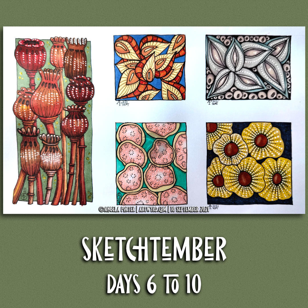
I’m delighted with this artwork/illustration. I love the colours, the silly, creepy, cute characters, and the whimsical nature of the design. There was a smile on my face, a giggle on my lips and joy in my heart as I gradually brought the characters to life. The joy also came from the sensuous pleasure of working entirely with traditional media.

I hope I’m gradually getting to grips with using crosshatching and textural patterns to add shadows to the designs. There’s a way to go before I work out all the intricacies and the way I like to do this, but I’m quite happy with it for now.

To add colour, I used Chameleon Color Tones and Color Tops alcohol markers, with a couple of Winsor and Newton Promarkers in places. The Chameleons worked really well for me. Also, I remembered to use tip-to-tip blending so I could fade the colours out with the Promarkers, too.

Today, I very much needed some time to work quietly in an artistic manner. I’ve burned myself out through too much ‘peopling’ in the past couple of weeks. I’d nearly recovered, but an encounter with scammers threw me into total emotional overwhelm yesterday and I now need a few days to recover. Well, at least I will after I phone my bank again tomorrow to start the fraud investigation.

I love to draw and create. My creepy cute critters are currently my favourite thing to do. They’ve followed on from the colouring book I finished at the beginning of this month – “Haunted”, which is due to be released towards the end of October 2024.

Actually, as I think about it, I was playing around with silly creepy creatures about a year and a half ago, but put them to one side for a while.

Of course, the artwork above was entirely for my own pleasure and exploration of how I’d like to create these critters. I already know that some, if not all of them, will be featured in their own artwork, perhaps with a story to tell or some lore about them. I wonder what kinds of things that will be. I don’t know for now, but I trust my imagination will come out in words too. That won’t be now, however. I’m now tired for today and need to prepare for bed, for me and my creepy weirdies to rest and sleep and to dream up some joyful tales. And names. They definitely need names!

Intuitive Art – Part 4

This is a drawing I started three weeks ago for a series of YouTube videos. Today’s video is part4 of the series.

I finished the basic drawing in part 3. It’s all about colour and contrast now before I add the final detailed textures/patterns.

To add colour and contrast, I used Chameleon markers.

Adding colour/shade is always a nervous time for me. Surprisingly, I’m not really confident with colour. I prefer to work with a limited palette of monochrome or analogous colours, maybe with a sprinkling of a complementary colour here and there.

That’s the case unless it’s one of my Doodleworlds, whimsical, colouring book page designs. Then the more colours, the better! But, for this kind of entangled art, I prefer a more limited and elegant colour palette.

I always seem to use grey undertones for the shadows. I think I may have to try complementary colours to see how they work to add shadows.

My Chameleon markers have been rather neglected for a long while. However, I remembered I had them last week, and in using them in limited palettes, I’ve found them pleasurable to use, more so than all the other marker brands I have and have tried. Also, I’ve not been tempted to return to watercolours, Inktense, watercolour markers, pencils or pastels all the time I’ve used them. That has surprised me!

Sketchbook Saturday | Sketchtember Day 11

In today’s vlog I show you my artwork of the past week or so, good and not so good!

Sketchtember | Days 6 to 10

Over the past three or four days, I’ve been quietly working at Sketchtember. I’ve veered away from the list of herbs to enjoy drawing, and colouring, all kinds of seed pods – real and more imaginative.

Working with alcohol markers – Chameleon and Arteza – is the only way to get to grips with them. Marker paper does make it a little easier to blend. But not much more than the drawings on the SeaWhite all media paper that I’ve been using.

Adding highlights, lowlights, and embellishments with various Sakura and Uniball gel pens is a lovely thing to do. I have, possibly, gone a bit over the top on the poppy seed heads! Still, it’s all experiencing and learning from it.

I have quite a few more seed pod drawings done to add colour to, though not enough to see me through to the end of Sketchtember. So, I may change my theme for daily sketches when I start to come to the end of them.

Entangled Art and Sketchtember

Entangled Art WIP

Adding more colour to the entangled drawing on the left has taken quite a bit of time this morning. As well as using the Arteza Ever Blend markers, I used some of my Chameleon Color Tones pens too. There were some colours that I wanted to use that aren’t in the Arteza set.

It’s going to take quite a few hours more to finish adding colour to this drawing. That bright green section in the bottom left is going to need toning down! But that’s easy enough to do by ‘glazing’ with a duller colour. I also went over the pods on the bottom right with the colours again to intensify them a little, and added some deeper shadows as I did so.

It’s coming along nicely, apart from that bright green! Ho hum, I really do need to pay more attention to which colour I’ve actually picked up to use rather than just assuming it’s the colour I wanted to use.

Sketchtember Days 7 to 16

Yesterday evening and this morning, I spent time drawing small drawings featuring various seed pods. I’ve decided to take a different direction for Sketchtember and abandon the prompt list I’ve been following.

Why? I was a bit bored with drawing leaves, the occasional whole plant, the odd flower and various enlarged views of the various parts of flowers.

I love plants. I do. But I really love capsules, pods and seeds! So, I went with this idea

After splitting the large 9″ x 12″ sheet of Arteza marker paper up into smaller rectangles and squares, I used Copic Multiliner, Tombow fudenosuke and Uniball Unipin pens to draw the designs.

When the drawings were complete, I went to scan the sheet in and realised it wouldn’t fit on the glass plate of my A4 scanner/printer! Duh! But not a problem, I just split the page up into smaller pieces.

Next, I spent some time adding colour to a couple of the designs using the Arteza Ever Blend markers to test out the Arteza marker paper.

This paper is noticeably thicker than the Canson XL marker paper I’ve been using. But it works just as well with markers. It’s also as nice to draw on with the various pens I used.

The only thing I wished is that I’d remembered my scanner takes paper that is a little bigger than A4, but not this big! Not a problem though.

Sketchtember days 4 and 5

Continuing with DeadlyDots’ prompt list for Sketchtember. Thyme was day 4’s prompt, and Basil is today’s. I’ve got the title for tomorrow done (Bay leaf).

Plenty of pen drawing and some coloring with Chameleon color tones markers. A little bit of messing around with patterns on the thyme page.

It’s an enjoyable process, though today I think I’ll take a little break from it and turn my attention to projects that need some work done on them, and maybe new drawings to be done.

Chameleon Color Tones Coloring

Link to today’s vlog on YouTube.

After filming yesterday’s vlog, I decided to try using marker pens with a drawing I’d done on a Distress Ink background. The drawing on the left is the result of this experiment.

To add colour, I used Chameleon Color Tones marker pens. I chose colours that would be similar to those in the background.

I really enjoyed adding colour to this drawing. I’d forgotten how much I enjoy using the Chameleon pens and the ease of achieving gradients with these pens.

I completed the drawing with embellishments of white and yellow Sakura Soufflé pens, muted Sakrua Gelly Roll Moonlight pens, and some shiny areas of clear Sakura Glaze pen.

I was so happy with the result, that I started work on the drawing to the right, some of which I do in today’s vlog.

I really love the way that the background tones down the brighter colours of the marker pens. Which shouldn’t surprise me as marker pens are transparent! But it did surprise me!

Something else that I was struck with was how similar using markers is to how I add colour digitally. I haven’t made that connection before, but it is likely to inform me on my way forward in adding colour to my artwork. I may be trying to force water-soluble media and coloured pencils into behaving like markers, which is something that they’re not meant to do. I find it hard to work with the looser, possibly more chaotic water-based media, even though I love the effects that other seem to achieve with them. No matter what I do, I’m never totally happy with the end result, something I’ve blogged and vlogged about an awful lot.

Working with alcohol markers has shown me that I can work well with colour, with the medium that matches my artistic style – precise and controlled. The more chaotic, loose, aspects of this work come from the Distress Ink coloured backgrounds.

Now, if only I can accept this and focus on using markers in my work more than other media. Well, apart from digital coloring that is!