Snack is a lovely pattern and Tomàs Padrós CZT has created a great step out for it, which includes lots of suggestions and variations.
I have to say, it is a motif I’m familiar with, probably early Celtic art or architecture. It was great fun for me to draw, and in keeping with my rather higgldy-piggldy arrangement I chose to use it in that way. As a nod to the architectural origins of this pattern, to me anyway, I’ve worked with shadow and highlight to practically ‘scuplt each ‘snack’ element. I particularly like the ‘half snack’ versions; again, they are familiar to me but not connected to Zentangle, and there’s nowt wrong with that at all!
FluxEcho, a lovely floral tangle pattern by Lynn Mead CZT, was a delight to draw this morning. you can see my variations of the pattern to the centre-left.
I had decided to stick to a monochrome colour scheme for my Inktober Tangles, but today I decided to go a bit analogous! I’ve added some purple and blue to the design. Analogous colours are next to each other on the colour wheel – so green, blue and purple work well together. Even more so as the background is a grey-green colour.
Something had to be done about the hand-lettered panel. I’d added some colour with Inktense pencils and a water brush, but I wasn’t happy with the finish. So, I filled the panel with black ink and added the hand lettering using a white gel pen. I’m happier with this.
I’ve added the next three tangles in the #InktoberTangles2022 challenge to my drawing. I’m fairly happy with how it’s looking, but not too chuffed with my photography/scanning skills! I seem to be able to do a fairly good job when it comes to steam locomotives, but when it’s my artwork… *rolls eyes*. But I’m sure you get the idea!
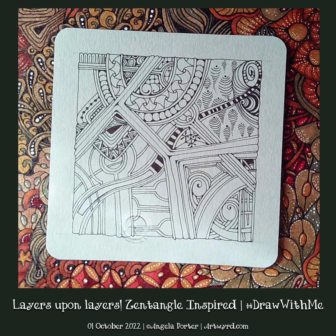
These are all lovely tangles. Souk caused me some problems and with them an unexpected variation. Molygon I’ve not been able to draw successfully before. Heartfully is a lovely tangle, but not as easy to draw as it seems!
I’ve added a lot of white highlights with either a Sakura Soufflé pen or an 05 Gelly Roll. I like the way the white seems to glow against the grey-green colour of the paper I’m working on (it’s not the pale green it appears in the scan above!). Also, I’m so glad I’m sticking to a colour palette of greens with a blue-green aquamarine.
I wish I hadn’t added colour to the title label, however. For some reason it’s really patchy. I’ll work out how to improve it, eventually.
I’m going to add background shadows/highlights when the whole page is complete. But I have added a background pattern to a couple of areas at the top of the design.
It’s Inktober! The annual month of ink drawing and other challenges of an arty crafty kind!
Last year, I did the #InktoberTangles2021 challenge. I explored each day’s pattern, often with an accompanying YouTube video. This year, however, I’m adopting a different approach. I’ve decided to look at each pattern and combine them into one big design!
The first three tangle patterns are Rain, from Zentangle Inc, Delwhy by Stephanie Jennifer CZT and Isea-u by Dory Peeters CZT. You can see my attempts at them from left to right.
One of my lovely YouTube subscribers asked if I could look at some zentangles by Patrica Aragon (myzenarts.ctz on Instagram) and see if I could do some artwork inspired by her work. As a YouTube drawing tutorial, of course, he asked.
Well, I looked at the artwork and then did my own version. It took a little over an hour to get to where it is in the drawing above. And there it remains until I decide how to complete the picture. If I’m going to, that is.
It was an excellent way to spend Saturday lunchtime.
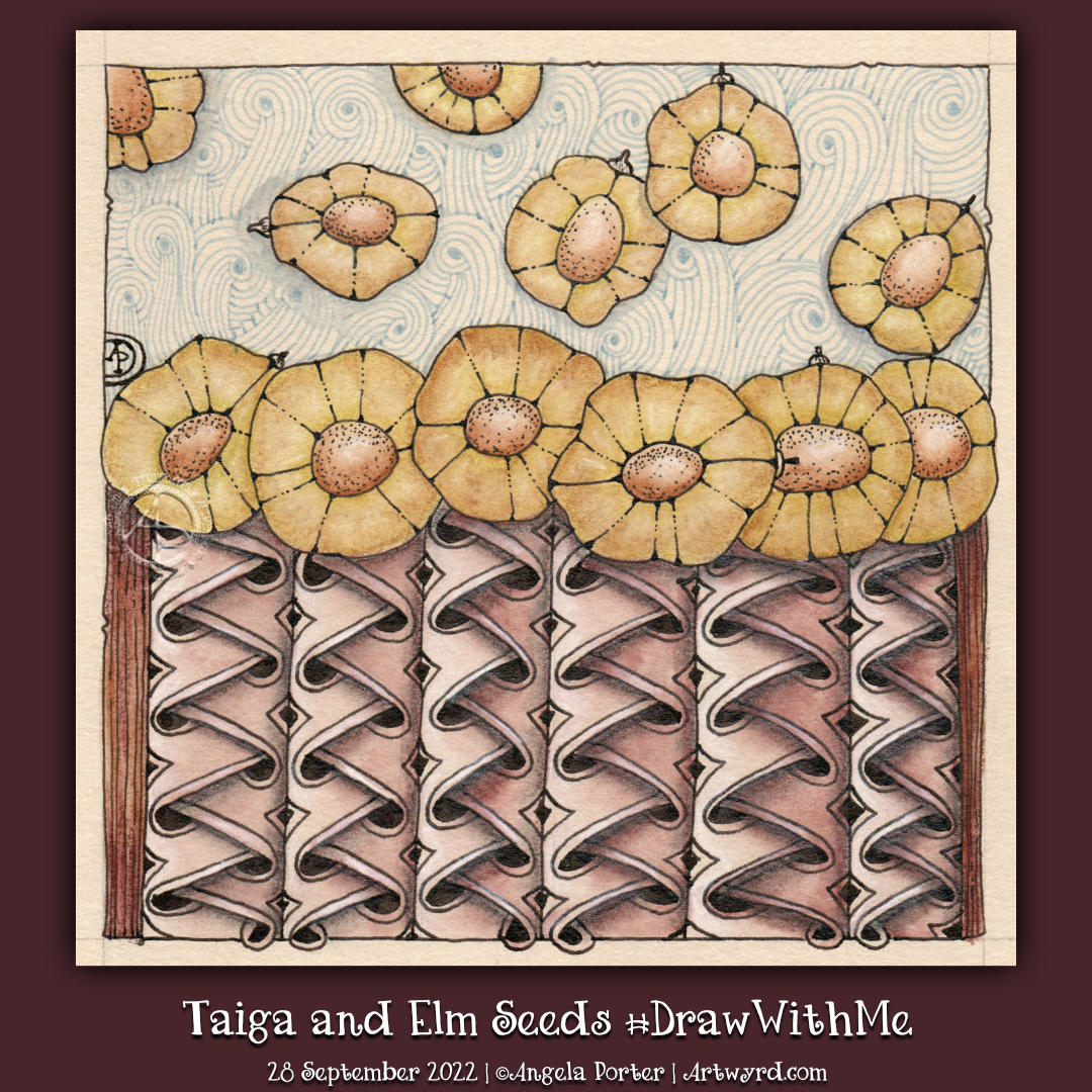
I do love seeds! There’s such a huge variety across the globe. Today, I chose some elm seeds to stylise for this drawing.
I also had a hankering to tackle, once again, Tomos Padros’ beautiful Zentangle pattern “Taiga”. It took me two attempts to work out how to do it, but I got there in the end. It is a beautiful woven pattern with so much volume when high contrast shade and light are used.
I love seed pods, and here is a small selection of my favourite ones, just pen sketches with some light washes of Inktense added to some.
I don’t know what it is about seed pods and flying seeds that I love so much. Maybe it’s their shapes, or the association with autumn, or the architectural and aeronautic nature of these seeds. Or it could just be they appeal to my sense of aesthetics!
Either way, they are fun to draw, adapt and use as focal points in drawings.
Carrying on with the theme of pumpkins and gourds, today I tackled the Zentangle tangle pattern “Gourdgeous” and drew this cute pile of pumpkin-ish gourds.
Of course, as they are drawn with a Zentangle pattern, it was only right that I filled them with some Zentangle patterns – Purk, Sattuck, Crescent Moon, and B’tweed.
I drew the design on a 6″x3″ piece of grey-green mixed media paper. Tombow Fudenosuke and Zebra flexible nib pens were used to draw the main black sections of the pattern. Then, I added the patterns with 0.1 and 0.4 fineliner pens.
To add shade and light, I used some Inktense pencils – Light Olive, Madder Brown, Iron Green and Iron Blue. Oh, and Antique white for the highlights.
The white dots were added with a Sakura Soufflé pen.
This was a lot of fun to do, especially playing with light and shadow to create volume! There’s some bits I’m not happy with – the tendrils are a bit clumsy looking, some of the highlights could be brighter. But on the whole it’s not too shabby!
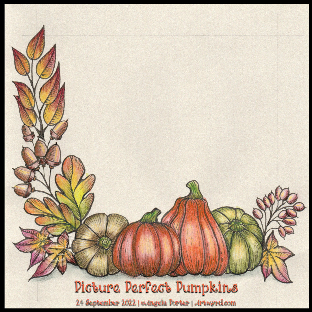
You can tell I love autumn! I just couldn’t resist another drawing with pumpkins and assorted autumnal motifs. In the video accompanying this picture, I get all the drawing done and start adding colour. This photo is of the completed drawing so far. There’s plenty of space for some more autumnal goodies!
As I worked on some warm, grey paper (‘Clay’ Toned Paper from Fabriano), the colours are muted and feel a bit washed out. Usually, Inktense pencils with a light wash of water are bright and vibrant, but the grey tones mute them somewhat. But I like that. It gives a vintage and nostalgic air to the artwork.
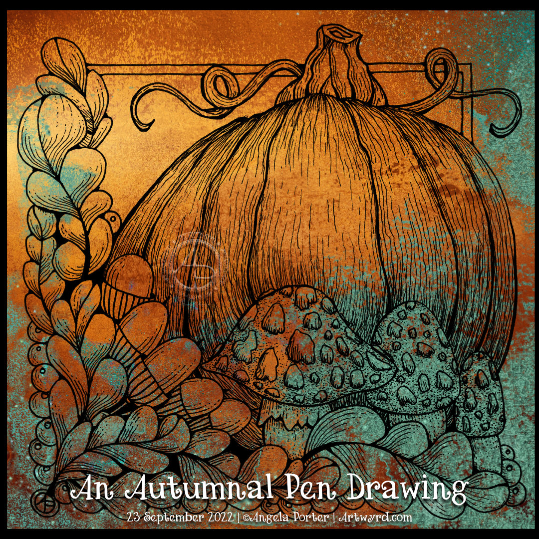
From time to time, I can circle back to drawing styles that I’ve not done for a long time. This kind of drawing, which has an etched ‘feel’ to it, is an example of something I’ve not done for what seems an age. I am, however, enjoying it very much. Exploring working on toned paper with various colouring media is fascinating for sure.
This morning, the first one of astronomical autumn, I felt the need to draw things autumnal. What better than oak leaves and acorns, mushrooms and pumpkins and a smattering of berries.
This wasn’t quite what I expected to flow out of my pen. Although the elements are stylised, there’s also a lot of contour line work and stippling to bring some volume and texture to the design. It’s a bit like an etching, lino cut or woodcut. A bit.
I can see where I started adding precise contour lines, but then they became much more expressive.
I’ve just added a coloured background to my drawing for now. I’m not sure about how to add colour yet. Do I risk messing it up by using traditional media? Or do I play safe and add colour digitally? At the moment, I don’t know. But there’s no rush. The image is scanned in and saved safely on my hard drive.
All I will say, for now, is that I really enjoyed drawing this. And I quite like it, even when considering the yeuchier areas of stippling.