Oysteroid and A Grid Pattern

I had a peaceful and content time this afternoon as I created this page in my sketchbook. Well, the pen drawing part with some examples of how I’ll colour it. And I filmed it too, and you can watch it on YouTube.

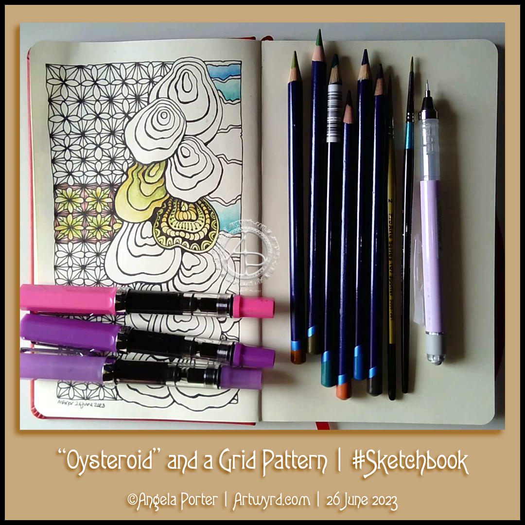
I started with the stack of Oysteroids, a tangle pattern that I particularly like. I decided that I’d like to use a geometric pattern as a counterpoint to the roundedly organic Oysteroid.

So, I did! I like the way that this instantly gives a feeling of layers or volume.

Colour always vexes me. So, I decided to stick with an analogous colour scheme, choosing Fern and Mustard Inktense pencils to create stripes on the Oysteroids. I carried this palette into the geometric pattern. That was fine until I foolishly decided to use some Red Oxide Inktense. I have no idea what I was thinking! However, it did give a very ‘earthy’ feel to the pattern, in contrast, perhaps, to the sea-related Oysteroid.

That led me to wanting to use colours that remind me of the sea on the right-hand side. I’ll hold judgement on those until more colour is added. If the red oxide doesn’t work out, I have a rather lovely gold ink that can hide it away! Or black with gold highlights…

I used my fine and extra fine nibbed TWISBI Eco fountain pens, which are filled with black Dokumentus ink.

As you can see, I couldn’t help adding some pattern and texture to one of the Oysteroids. I’m sure the others will be treated in a similar way!

Template Thursday…on a Wednesday!

It’s that day of the week once again. Wednesday. The day I draw the coloring page / coloring template for the Angela Porter’s Coloring Book Fans facebook group. And I video the drawing process too.

Today it’s only part of the template. Truly a sneak peek at a work in progress (WIP). I’ve used, so far, two Zentangle Patterns (oysteroid and flux) and a triangle leaf/seaweed kind of motif. I have no idea how this is going to finish, other than well, hopefully.

I’m drawing with a Tombow Fudenosuke brush pen on ClaireFontaine dot grid ‘Sketch’ paper. The pen dries quickly on this paper, there’s little to no feathering of the ink, and the dots I can remove digitally when I’ve finished the drawing. And then add colour…eek!

I started adding colour to another drawing early this morning. Mistake. A BIG mistake. You can see that drawing over on Instagram.

I have no idea why I keep inflicting the torture of colouring drawings in with traditional media upon myself. I don’t know how many times I say to myself I need to stop doing this, and then I go and do it again any way. “Insanity is doing the same thing over and over and expecting a different outcome”, is a quote mis-attributed to Einstein, but it seems relevant to myself and my colour struggles!

Today, I’m going to put it down to waking early for the weekly Abel & Cole delivery and being just plain tired. I had to return to sleep after that disastrous coloring session.

This template, when finished, will have some colour added to it digitally. I seem to do so much better when I work with colour in an art package, currently Clip Studio Paint Pro. I think it’s partly because I can make an awful colour choice and then correct/edit it easily. And I tend to stick to limited colour palettes a lot more easily than I do when I have a whole load of pencils, pens, or paints in front of me to choose from. Then it becomes a nightmare for me!

One day, I trust I’ll remember not to add colour when tired and to use limited colour palettes only. One day soon I hope!