This was a perfect, small and quick project to do this morning as I was waiting for my weekly delivery from Able & Cole.
Some practice of hand-lettering /hand-drawn typography practice, starting with roughing the design out in pencil on dot grid paper. Then, inking it in digitally in Autodesk Sketchbook Pro.
The addition of a rainbow background was the perfect way to bring a smile to my face this morning. When don’t rainbow colours cheer a person up? The bold, black letters on top of it really make the colours glow bright.
The quote is a perfect bit of wisdom for Wednesday, not that it’s a bad day for me at all. Apart from me suffering from a lack of sleep once again. The morning sunshine has lifted my mood, and the cool air flowing in through the open window is both beautifully fresh and wonderfully refreshing. I have bright and happy music on as I work, just to add to the upbeat start to the day.
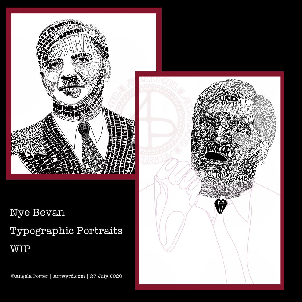
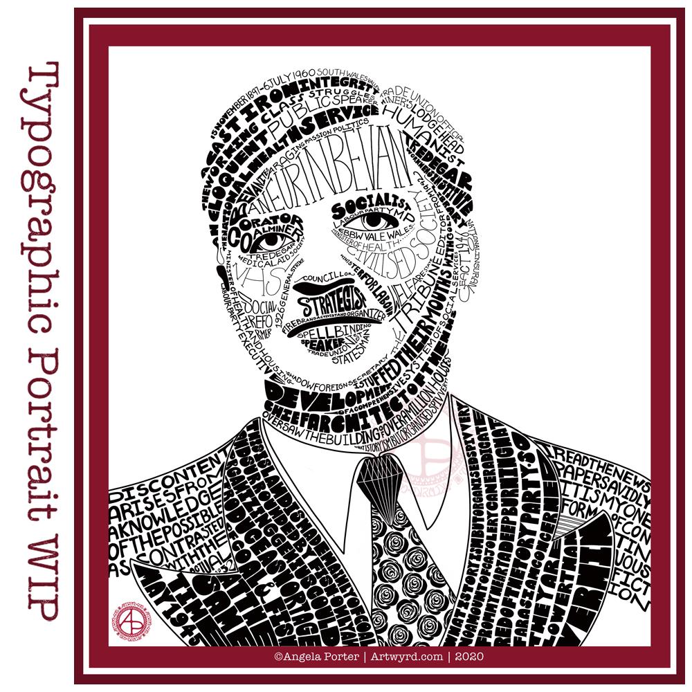
This morning, I decided to leave portraits alone for a little while. I woke with the idea of using typography to fill some typography!
So, I drew the outlines of ‘Nye’, for Aneurin Bevan. I then used wavy lines to split the outlines into interesting sections. Then, I pencilled in some quotes by Aneurin Bevan. This let me adjust size/ spacing so that the quotes fit and made sense. In some places I’ve stretched the letters as there wasn’t enough space for the next word. I could’ve made all the letters in the line wider, but thought the wider letters would add some interest and flow. Of course, I now realise I could’ve stretched some letters at the start of the lines too, but I can always do that as I ink in the lettering.
Anyway, my next step was to scan the sketch into Autodesk Sketchbook Pro so I could do the inking digitally, and you can see what I’ve done so far. I do need to adjust some letters, like the B at the start of the line I’ve started to ink. I will also need to go back and clean up some of the edges of letters.
It’s a nice project for me to do today. I didn’t sleep at all well last night; I was up and down to the loo. I had a sudden attack of anxiety yesterday, a really intense one. The pilot light on my boiler had gone out and I couldn’t light it, so I had to arrange for a breakdown visit. There was the stress of ‘what if they can’t fix it’ as well as a stranger in my home for the first time since most probably February.
Panic mode! And it didn’t abate all day, no matter what I tried to do. This kind of anxiety/stress always hits me in my digestive system, so it was an unpleasant night for me.
All needless of course. The gas engineer arrived this morning and he lit the pilot light first go. And it’s stayed lit. I felt like a right numpty. However, all is well, as I have now booked it for a service too.
I’m still feeling on edge, as well as really tired. So, working on a portrait wouldn’t be the best idea for me as at the moment they are frustrating and overwhelming me.
So, I thought I’d go for some hand-lettering or hand-drawn typography practice. Just practice. No pressure. However, the idea I had may turn out to be a fairly good one. Maybe.
I’ve been working on another portrait of Nye Bevan while I take a break from the first one. I really think I’ve gone over the top with detail in this one. I wanted to do one of him in one of his typical oration-giving stances, but I really do feel I’m messing it all up. I really think that’s because I am trying to get too much in the way of quotes into the portrait.
So, I’ll be going back to the drawing board (or in my case, the Surface Studio screen) to try this one again.
Having said that, I’ve had a lot of hand lettering /hand drawn typography practice and have played around with the brush settings to find one that will work for me!
I also have just noticed that there’s not much differentiation between the different weights of text in the second version, and that adds, I think, to the more confusing appearance of it.
I was struggling with the values of the gesturing fist in the second image. So, I put the photo into Affinity Photo and used the Posterise tool to simplify the areas of shade for me. There’s still a personal interpretation to be done on how I translate these areas into spaces of text.
Hands, feet and faces. These were always the parts of humans I struggled with when doing life drawing.
Drawing typographic portraits is a new endeavour for me. I’m learning, experimenting. One of the main lessons I have to take away today is to not over complicate such a portrait! But there is a fine balance betwixt having enough detail to capture the essence of the person, and having too much so that the essence of who they are is lost.
The first portrait I did, on the left, does look better, but I do think it lacks a bit of detail in the face.
The second one, on the right, is way too busy!
So, my task is to find that point where less really is more.
So, I’ll take a break from them, again, and regroup and try once more!
I did spend some time working on a second typographic portrait of Aneurin Bevan yesterday, using a photographic reference that had more detail in it in terms of grey scale.
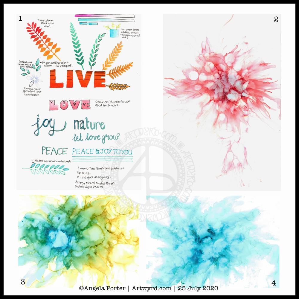
Before bed, I wanted to relax with some colour (1). For some reason, I pulled out my set of Tombow Dual Brush pens and tried working with them on an A5 piece of Arteza mixed media paper. Hand lettering with gradients, with and without black outlines resulted, and then I wanted to try drawing with colour gradients.
To create gradients, I held the tip of one pen on top of the tip of the other. I then used the lower pen to draw or write with. I used the bullet nib for the lower examples. I used the brush nib for the larger lettering and also the leaves and flowers and so on.
I made some notes as I went, to remind me what I did and what I liked about them. I used a Uniball Signo DX 0.38 pen to do this, which is also waterproof. So, I used it to add lines.
This morning, I wanted to start my arty day experimenting with alcohol inks, once again (2, 3 and 4). All because I’d watched a YouTube videos where people use a straw to blow the ink and alcohol blending solution/rubbing alcohol/isopropyl alcohol/propan-2-ol around the yupo paper.
One helpful piece of advice I heard along the way was it’s best to use only a small amount of alcohol ink. Which is what I did. One drop to start with and then add more ink of the same or different colour(s) as needed.
It took me a while to work out not to blow as hard as I could, and to try different angles to hold the straw at, as well as moving the ink in different directions.
I’m much happier with the results this time, though the scans have bleached the colours out a little. I really must work out the best settings on my scanner so that this doesn’t happen.
Anyway, I need to find a way to seal the alcohol ink so I can draw on top of it without wrecking the pens. I also want to do some better scans so I can make use of these alcohol ink backgrounds in digital art.
Today I want to continue work on the typographic portrait. This second one seems to be building up more quickly than the first one. I think that’s all due to me becoming familiar with the process and accepting that my hand lettering based on my handwriting is good enough. I’m also working out my own ways to fit letters to curves and the shapes at the ends of the sections.
So, all of these activities – using waterbased media, hand lettering, hand drawn typography, and alcohol ink backgrounds all have one thing in common – practice, practice, practice!
I’m not entirely sure that I’ve fully succeeded. I seem to have a lot of white space, and that is all to do with the photograph I used. I thought it had enough detail in terms of tones of light and dark. I guess not! Or maybe this is just part of my style.
There are areas on his jacket to the bottom left and right that need pattern or image put there. I have yet to work out what to do about the shirt. Also, I need to try removing the lines around the jacket and collar too.
Aneurin “Nye” Bevan was the main architect of the UK’s National Health Service after WWII. He’s also considered one of the best political orators of all time. There’s an Aneurin Bevan website if you’d like to know more.
While this is hand-drawn, I chose to work digitally. My Surface Studio allows me to work with a digital pen directly on the screen as if I was drawing on paper. This makes it easy to edit as I work.
I now need a break from this particular artwork, so I can look at it with fresh eyes (and any feedback people offer on it) and then return to it another day.