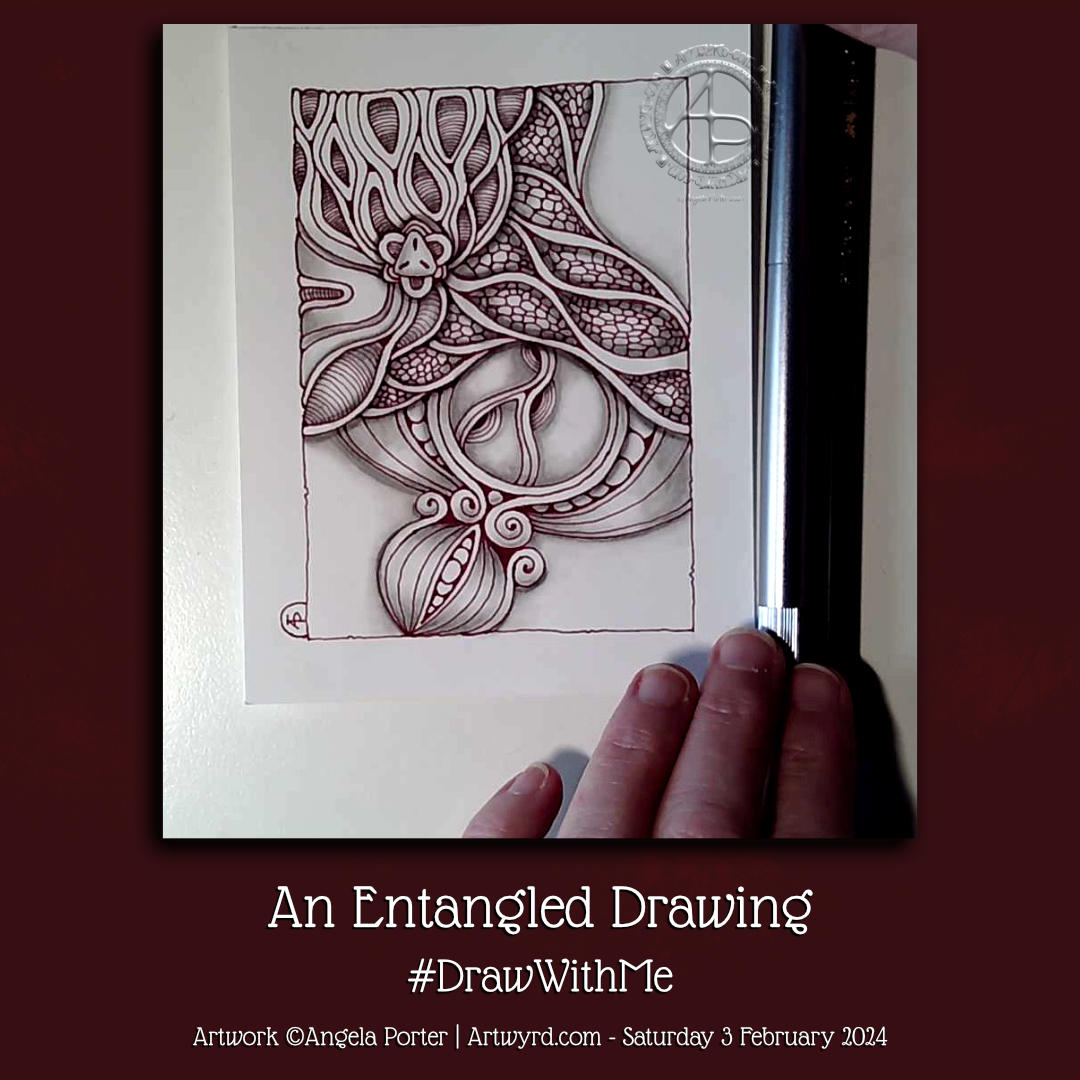
A new month today, and with it I’m adding colour to this drawing.
The drawing was done with pen on paper (05 Unipin fineliner). I’m adding colour with Clip Studio Paint. So, this makes this #tradigital – a combination of traditional and digital methods.
It’s taken me several attempts to settle on a colour palette to use. The brighter, more vibrant colours represent the way the world is starting to come alive this spring, for us in the Northern Hemisphere at least. Nature is quickening and lacy leafy green delicately cloaks the the skeletal winter trees and the ground. All the wonderful shades of green of spring make a beautiful tapestry , with texture added by the darker trunks and branches still peeping through. I delight in the variety of greens, that will soon darken to the truly monochrome green of summer.
This is the central panel from this week’s colouring page for the Angela Porter’s Colouring Book Fans facebook group.
It is a mandala, just not a round one! I enjoyed drawing this, and adding the softer colours too. It never ceases to amaze me what a difference colour makes to my line art.
A nice way to spend a few hours this and art always keeps me company.
This little pattern sampler has been fun to do! I’ve used patterns inspired by the work of Rebecca Blair, some Zentangle style tangle patterns, and possibly some variations of my own too.
I do love Rebecca’s work. I can see the influence of medieval manuscripts on her work and her love of pattern, texture and a wonderful use of textured lines too! The simplicity of her colour palettes and the myriad of ways she combines her signature patterns/textures is wonderful! I really do suggest you take a look at her work on Instagram.
I used a piece of Ohuhu marker paper that measures 4″ x 7″ ( approx 10cm x 1.7cm) and marked out the basic sections with a Uni Kuru Toga 0.3 mechanical pencil (and a ruler for the straight lines). The pencil lines were just a guide for me.
In the first video, I did most of the black line work using an 03 Sakura Pigma Micron pen. In part 2, I added colour using Winsor and Newton Promarkers in Ivory, Sandstone and Caramel.
After that, I added some fine line work and some colours using three Stabilo Point88 0.4 fine pens. These had olive-green kind of tones to them that worked well with the soft browns of the Promarkers.
I also added some black lines in places using a 0.1 UniPin fineliner pen.
Finally, I added highlights using white gel pens.
I really like the more monochrome, subdued colours of this finished drawing. The various panels really do have the feel of a needlework or cross-stitch sampler; hence the name!
I spoiled myself with a set of Promarkers last week, and I don’t feel a bit guilty about it! I was getting frustrated with the Ohuhu markers – way too many bright, in your face, vibrant colours and not enough subtler, less saturated colours.
I’ve also found that as nice as the Ohuhu marker paper is (and it is lovely and smooth and fab to draw on), I much prefer Winsor and Newton, Daler-Rowney or Canson Marker paper for my alcohol marker work; the ink doesn’t sink into the paper as much and the colours are more vibrant. Also, you use less ink in creating the artwork!
Organising a new pattern, texture and motif ‘repository’ and a bout of illness
I keep faffing about with this. After getting frustrated with a six-ring A5 ringbinder and the limited number of pages that can be stored within, I discovered there’s such a thing as A5 landscape lever arch files! So one was bought post haste! I still can’t draw/write directly in it, but it makes it so much easier to store paper and finished pages. So, I’m one happy bunny.
I’ve spent quite a bit of time in the last couple of weeks starting to put together my collections of patterns etc. Especially as I’ve not been too well. I had been in contact with some people who subsequently tested positive for Covid. I had a nervous few days wondering whether I’d get it. I didn’t. Instead I had runny nose, slight cough, and a mild case or tonsillitis!
I’ve not had tonsillitis for the best part of twenty years. The last time I was getting it 4 times a year and was referred to an ENT surgeon. Let’s just say he didn’t need to use the tongue pressor thing to see my tonsils – they’re permanently large and have lots of tunnels (crypts) inside them from all the tonsillitis I’ve had from a young age. Seeing the surgeon seemed to scare the tonsillitis away; I elected not to go through with surgery to remove the tonsils. There are potentially serious complications that can arise in an, ahem, older person.
Anyhoo, It was a mild case. All covid tests for over a week were negative. But I’m left feeling run down from being ill. I’ll recover gradually!
Losing myself in reorganising and redrawing patterns etc was just what I needed. I’ve barely made a dent in my collection, especially as I’ve added loads more variations as I go! I know it’s going to be a long term project, for sure.
Other arty stuff
I have done other arty projects since my last post here. But the fatigue has been strong and my concentration and focus weak. I will post a gallery of them in the next day or two!
It’s a lot of fun to use my artwork in an app called Repper and create new, geometric patterns from it.
I did have to redraw the basic unit (tile) of the pattern to clean it up and remove some tiny details. But that let me adjust the pattern a little too.
For my coloured example, I used a palette of medieval illuminated manuscript inspired colours – red, green, gold and blue almost jewel tones.
The colour really does help to make sense of the pattern. It also brings out different ways in which the different layers and motifs are joined together, which really makes me smile!
It’s not until I look at it now that I can see the way the contrast and highlights have added a lot of layers and depth to the design.
I may have to do more of these in the future; they’re just so much fun!
It’s been a while. First, here are three images of the videos I’ve made since my last post. They’re all exploring how I can make colour and colour pens work for me. There’s also been some exploring of filler or textural patterns too; some are zentangle patterns, others are more classic pen drawing textures, and others are inspired by the work of Rebecca Blair.
I’m not quite sure where this is leading…yet. But I do know I’ll work things out.
I do like drawing a design all in one colour ink, such as a rich red-brown, or olive green, or blue-grey. But I also like drawing in black over a coloured background (like the stylised flower drawing).
Figuring out what medium I like to use to add colour is a tricky one. Of course, tradigital art (design traditionally drawn on paper with pen, colour added digitally) is a way I love to work. However, I do enjoy working in sketchbooks on ideas.
Today, I settled on Karin Brushmarker Pro pens and a Kuretake Zig waterbrush. I like to use a waterbrush. There’s a steady flow of water to the brush. I find it much easier to achieve a nice gradient with this brush. I love the vibrancy of colours in the Brushmarker Pro palette, and there are enough earthy ones to keep me happy too!
As well as working in my sketchbooks, I’ve started to sort my collection of patterns, tangles, textures and motifs into an A5 six-ring binder. I thought it was time to make sense of it all and to have a more systematic way of organising them to help in finding inspiration.
And I’ve been sleeping…lots. I’m not sure if the sleep is part of the healing process from the burnout earlier this year, the antidepressant/antianxiety medication I’m taking. My emotions are more stable, my mind is calmer, in the greater part; that is a good thing for sure.
So, thank you for bearing with me while I’m managing the changes with me at this time.
Drawn with Unipin Fineliner pens on A4 Canson Imagine paper. Colour added digitally using ClipStudio Paint.
This is such a typical ‘Angela’ style of entangled art, kind of Zentangle Inspired too. Unusual colour choices for me. I particularly like the moss-green and cream in the arches towards the top right. Though the dusky blues filling in the basket weave pattern to the top left I find nice too. I felt like using coppery tones for the fine borders in the arches rather than gold this time.
In today’s video on YouTube, I share a look at one of my current sketchbooks. Then, I finish drawing this little design and start to add colour to it.
The drawing is only teeny – a little less than 3″ from side to side – but that makes it fun to do! The tiny floral background pattern just needed to have glittery shimmery gold pen added to the petals; it’s so reminiscent of medieval illuminated manuscripts.
It’s unusual for me to work on such a small scale, but when I do I really enjoy it! I think it’s something I need to do more often. Especially so as I’ve been watching videos showing mixed media grid journal/sketchbook spreads.
Mixed media really isn’t my kind of thing … usually. However, these videos are sparking off some ideas in my noggin. I’ll see how that pans out over time for sure.
As to other things… I’m doing OK. I’m feeling less off with the fairies for sure. A number of ‘peopley’ days last week left me exhausted and needing a lot of quiet time this week. My emotions and thoughts are much more even too, which is a good thing. Fortunately, I can still feel emotions, unlike my last periods of burnout when I had the same meds. So all’s looking better on that front.
I still have an interesting journey to make in knowing and understanding myself better. Slowly is the best way to do that after the confusing and unsettling revelation at the end of last year, yet it was a relief for sure too.
The longer hours of daylight are helping too, though some more sunshiny days would really help! It feels like it’s been raining here in Welsh Wales forever! It hasn’t, but some sun would be welcome for sure.
Until that time, I shall enjoy my times of art and creativity for sure.
This was a fun ‘Draw With Me’ drawing tutorial on YouTube. Unusually, I used a lot of Zentangle tangle patterns – Arukas variation, Crescent Moon variation, Tipple variation, Quabog, Sez and Mooka. Plus a couple I like to draw – the flowers within circles and the mechanical kind of things under the hand lettering.
It is a work in progress, however. I have no idea what will appear next on it…intuitive art is a wonderful thing to do!
I love drawing mandalas. I love the symmetry, the flow, the sense of calmness that they bring when being drawn or coloured. I am fascinated with the never-ending possibilities of mandala design. They also make it easier for me to arrange motifs and patterns when my head is filled with pink fluffy and sparkly fairy dust (all due to prescribed medication).
This one was fun and a bit different, with some new kinds of motifs in it. The colour palette is soft and soothing, with the splashes of gold give those sunshiny-joyful accents that lift it.
Yes, I know I’ve not finished adding colour. But I really, really need to finish the social media stuff and then go and get something to eat!
I’ve finished adding all the main patterns on the cover page for my Entangled Samplers collection. I’m happy with the result, which is something I rarely say!
However, I needed a regular grid pattern to contrast with the more organic patterns and motifs. So, I added the gridded tangle to the top right.
At the bottom right is a variation of the Zentangle tangle pattern ‘Rixty’. The plain white paper behind it was crying out for some texture. So, I added some ‘Printemps’ spirals using a 0.1 light grey Unipin pen. As a subtle reminder to use colour and line thickness variations to bring interest into a drawing, this was a good idea.
I have a couple of things to decide before fully finishing the page. Firstly, how do I want to add shade/highlight/contrast to the drawing? Secondly, do I want to add a pattern to the wide border around the title text?
There’s no rush for me to decide. What’s the saying? ‘Act in haste, repent at leisure’? I can let these issues wander around my noggin until the perfect methods come forward.
Exploring ‘Lunaria’ by Ute Andresen and a wavy leafy pattern
I had some time and energy left to do some more drawing. So, I grabbed (gently) a fresh sheet of A5-ish paper and used some patterns from last Tuesday’s Tea and Tangle With Tracy.
The first one is based on waves with leaves. I like the very graphic, high-contrast leaves, for sure. Adding colour between them helps to make sense of the pattern as well.
The second one is my take on a tangle pattern by Ute Andresen called ‘Lunaria’. I like branching and organic patterns. In this drawing, I wanted to explore variations on the ‘fruits’ at the end of each branch. This is always a fun thing to do! No doubt I’ll do another branch of Lunaria explorations in the space beside this one at some point.