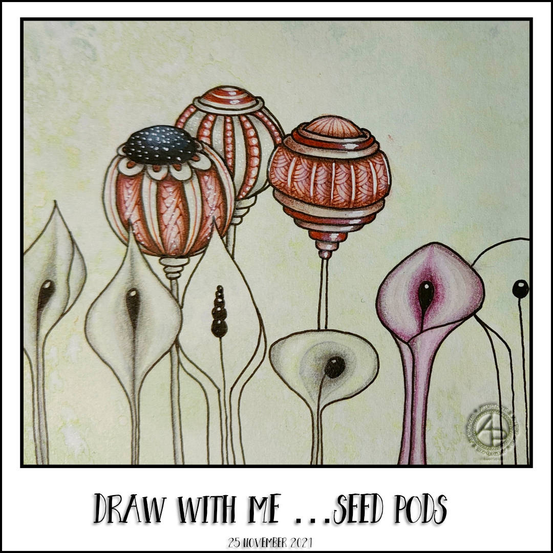
I took a break from drawing Adorable Dogs coloring templates (nearly all done, at least in sketch form…) to do some art just for fun. And that means, at this moment in time, seed pods. The three to the top right are today’s creations.
I couldn’t remember what plant they reminded me of. I thought mullein, but that’s not right. The closest I could figure out is Banskia seed pods, and these may be a very stylised interpretation of them. But not the stems. Weird stems are my own imagination in overdrive.
Of course, the drawings need shadow, colour and highlight to bring them to some kind of life. So, as I’m enjoying using graphite pencils for shading and watercolour pencils to add colour so much, that’s what I did.
I also tried adding some black line patterns to intensify the contrast and add interest to some of the shapes that make up the pods. That was just to see what happens. After all, this page is part of a sketchbook full of pattern explorations. It’s about giving myself permission to experiment, not to have to finish anything. The end result, I hope, will be something I dip into for inspiration at times when I don’t seem to have much of it.
In the spirit of the day, I’m so grateful for everyone who supports me in my artistic journey, who so kindly communicates with me, who brings my drawings alive in so many, different, wonderful ways. Thank you once and all!
There are so many other people in my life I’m grateful for too. And, there’s so much else I have to be grateful for.
Draw with me … Seed Pods
My day started with, unsurprisingly, some drawing. This time of some seedpods that turned out rather ornate and fancy-schmancy! Of course, I created a video showing how I did these.
Even though I’m feeling totally overwhelmed by Adorable Dogs at the moment, I still think it’s important I take the time to do art that is entirely for me. Making these videos, sharing my thoughts, materials, methods is part of that practice now it seems. I’m so grateful to all who watch, comment, subscribe, like and/or share these videos.
The humble 2B and 6B graphite pencils (the Pitt Graphite Matt versions) were used to create the shadows, the illusion of folds and curls, curves and edges. It took me a while to remember how to do this, to work out the effects I wanted to create. This is, however, like riding a bike – once learned you may be rusty, but you never forget!
There is a simple pleasure in using just the grey of graphite to give more form to these designs. Adding colour over the graphite added to this. I really am enjoying the way the careful shadowing with graphite works with transparent watercolour. Then, there’s the use of white charcoal and/or white ink to bring out the highlights.
If I use ink, I much prefer to use dots white, rather than a solid line or shape. I enjoy the subtle texture it gives as well as that brightness too. I find the white charcoal tends to bleach the colour out way too much, it feels not quite right. I will eventually work out how to do this in a better manner I think. Perhaps trying other colours of chalk pastel pencils maybe, or really making sure that the colour is barely there in the highlights. It’s a work in progress for me, that’s for sure! I may just stick to white ink dots, perhaps trying other colours that work with the colour of the motif.
Using various grades of graphite helps me to get that intensity of shadow that I like, without struggling with watercolour. I can vary the intensity of one colour (and I even tried two colours in one motif!), and let the graphite do the work of darkening the shade of colour.
The metallic looking result I find quite pleasing, now that it’s becoming familiar to me. I find I like the effect far more than adding graphite on top of the colour. The pigments in the watercolour pencil seem to sit over the graphite when they’re activated with water, tinting the graphite in a way that is pleasing to me.
I do love the Graphitint pencils very much, but this method gives me a way of getting more vibrant colours, which are pleasingly toned down by the under-shadowing of graphite.
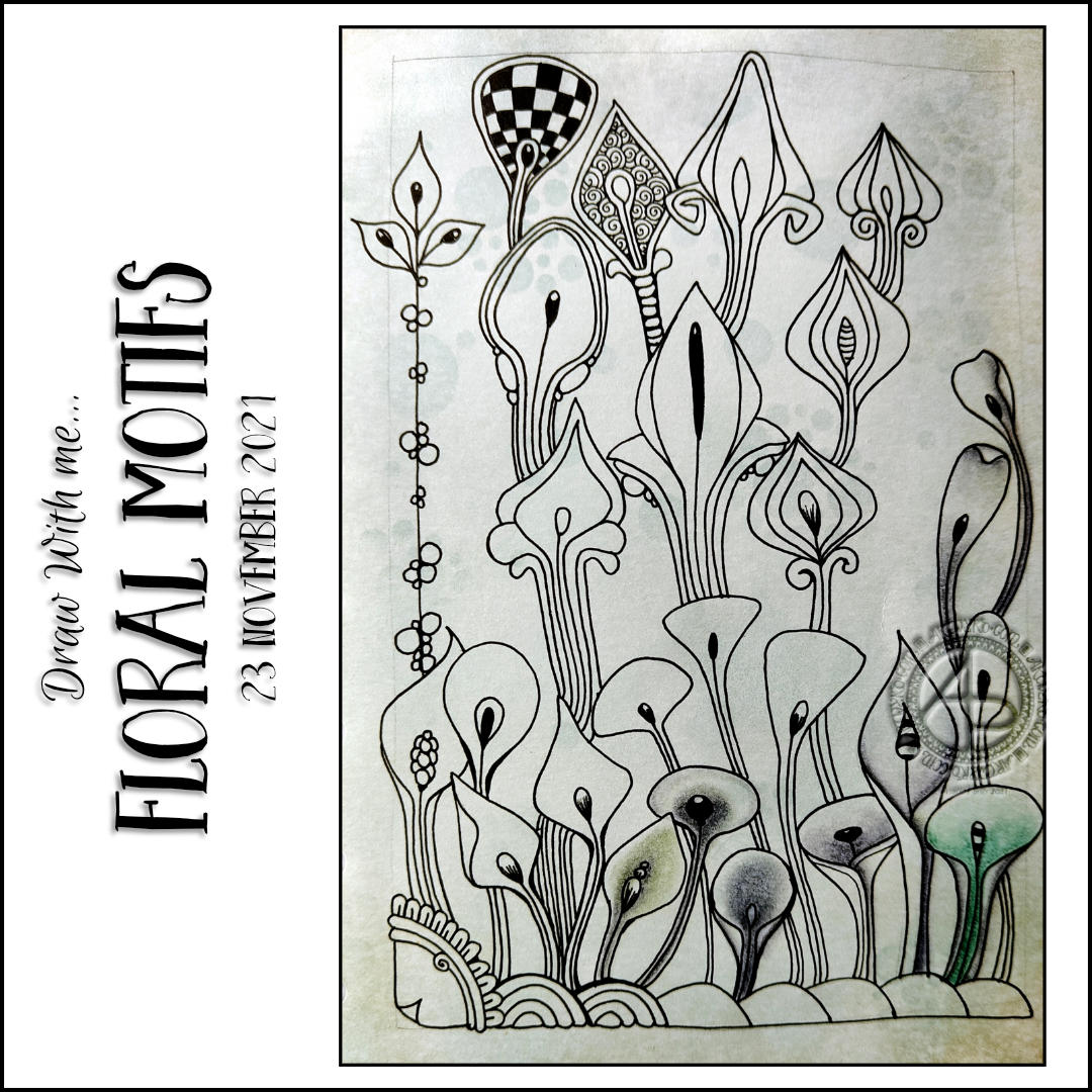
It’s taken me a long time, but I’m starting to appreciate how important open space is in a drawing. I completed a drawing at the weekend. I hadn’t left much in the way of open space and it just felt really cluttered and confusing. So, progress made!
Even though I knew I wanted to leave some open space, I still needed to make sure that the other collections of seed pods and so on felt like they worked together, that there was a flow and connection. So, I tackled that in this video too.
I knew I wanted to put some texture and pattern in the background. So, I used a white Sakura Souffle pen to add some simple, fairly airy patterns.
Now, I just need to decided how much of this drawing to complete. It’s an exploration of patterns and techniques, a sketchbook page. It’s freeing to accept that I can do as much, or as little, as I wish to this page. It’s a chance for me to practice and experiment with different media and techniques with no pressure on creating a polished, finished piece of art.
Today is the third session of work on this drawing. I’ve added some more ornate seed pods, based on the same simple form as the original ones, and some foliage. Here’s the link to today’s video.
I wanted to see how Graphitint pencils worked with the Albrecht Durer water colour pencils. Mainly, I wanted to see how the graphite in the Graphitint would add shadow to the colour. I did this on a couple of the new flowers at the bottom left. I’m not entirely sure what’s going on, but it’s something for me to experiment with more.
I had a ‘ta-da!’ moment as I was talking about where to place the next collection of motifs. I realised that I do think about this, very quickly and not in words. There’s some kind of analysis that goes on that I don’t quite catch, probably because it is in symbols/abstractions rather than words. Having to put words to the thoughts and decisions I was making had two effects. One, my thoughts were slowed down. Two, the words let me realise that I do think!
I’ve mentioned this before, but there seem to be two styles of inner monologue – one is in words, the other rather abstract. Apart from my inner critic, my thoughts tend to be of the abstract kind it seems.
“As in, some people’s thoughts are like sentences they ‘hear’, and some people just have abstract non-verbal thoughts, and have to consciously verbalize them And most people aren’t aware of the other type of person.”
mymodernmet.com/inner-monologue/
I certainly have to consciously verbalise my thoughts, either by writing or by having to speak them out loud. The weird thing is, I’m often not aware of any opinion or idea or thoughts I have until I do verbalise them. That means I constantly surprise myself!
Anyway, by making YouTube videos, I’m having to vocalise my decisions and thought processes as I draw and that means I’m becoming more aware of what is going on in my head, well in terms of putting words to it. So, this ‘ta-da!’ moment is one of many I’ve had whilst being an arty vlogger. That is a very valuable experience for me.
So, this drawing is coming along quite nicely I think. I’m really enjoying these times to experiment and try stuff out without being invested in a finished, polished artwork. I’ve finally found a way to give myself permission to try things out when I think of them, without worrying about whether they work or not, whether I spoil an artwork or not. It’s a very freeing experience for the hyper-perfectionist part of me.
It’s really nice to draw and share the process with others, allowing them to draw along with me.
In this design, I started with a simple seed pod design, and it’s morphed into other forms, including flowers.
It’s fascinating how one basic form can be the blueprint for so many other designs, often just by making a simple change.
I tried an experiment today – to add shadows with Faber-Castell Pitt graphite matt pencils before adding colour with watercolour pencils and a water brush. The result is rather interesting. It’s kind of metallic without the shine of specific metallic paints, if that makes any sense. I’m thinking about drawing designs in graphite and then adding colour washes over them. Maybe I’ll start with individual motifs though!
Today, I spend some gentle time drawing some seed pod motifs. Actually, they’re all variation on one motif. But just one simple difference can have a big effect on their appearance!
The day started off with working on the revisions of template sketches for the Adorable Dogs book. It’s a kind of fussy and detailed process. Erasing, altering and/or adding to the templates can take a lot of focus. And a lot of kneadable eraser to pick up the eraser dust from a soft polymer eraser! Still, all that needed revisions were seen to and sent off for review. I did get one more new template drawn as well.
It was then time to pop out in the car. Binky, my SmartCar, hadn’t been out for over a week. So, a longer drive was needed to make sure the battery is topped up.
It was lovely to be driving around and seeing the autumnal colours. The skies were a dull grey and drizzly. The dampness made the colours shine all the more brightly against the gloomy skies and dark trunks and branches. So beautiful.
I also braved a local-ish supermarket to get some supplies. And I do mean braved! I’m so anxious to be out around other human beings it’s quite a stressful thing. Luckily, the supermarket was quiet and I was able to whizz around and pick up what I needed, and some treats too.
After lunch, I turned my attention to today’s video, which is a bit different. I’d had a request from a viewer of my videos to put close up images of the patterns at the end of the video. I’d been thinking about doing zoomed-in pattern drawing on a larger scale in a step by step manner.
I actually really enjoyed the drawing process and the insights it gave me into patterns. I’m not quite sure I’ve worked out the best way to do it yet.
Another day, and another small clutch of borders are added to this page. Most of these patterns are inspired by Romanesque chevron and diamond patterns, some with a twist. Though there’s a couple in there that are reminiscent of Medieval floor tiles. And poke root managed to push it’s way into one section!
I really, really am enjoying adding patterns based on a theme to this page. Not just creating the patterns, but seeing how colour, shadow and highlight bring them to life. It’s a fascinating process for sure.
I’ve also made a decision to leave the case-bound A5 sketchbook to keep my pages in an A5 discbound system. I was getting frustrated with pages not lying flat, the awkwardness of turning the book around. The discbound system allows me to use individual sheets of paper, of many different kinds and colours. It’s flexible in it’s organisation too. I’ve flip-flopped ‘twixt traditionally bound sketchbooks and discbound sketchbooks for a while. My experience with this pattern exploration project has made me aware that the ability to work on a single sheet has become so important for many, many reasons.