This design does make me smile gently! I’m rather pleased with the end result. If you’d like to #drawwithme, then the accompanying YouTube video goes live today, 3 June ’23, at 18:00 UK Time.
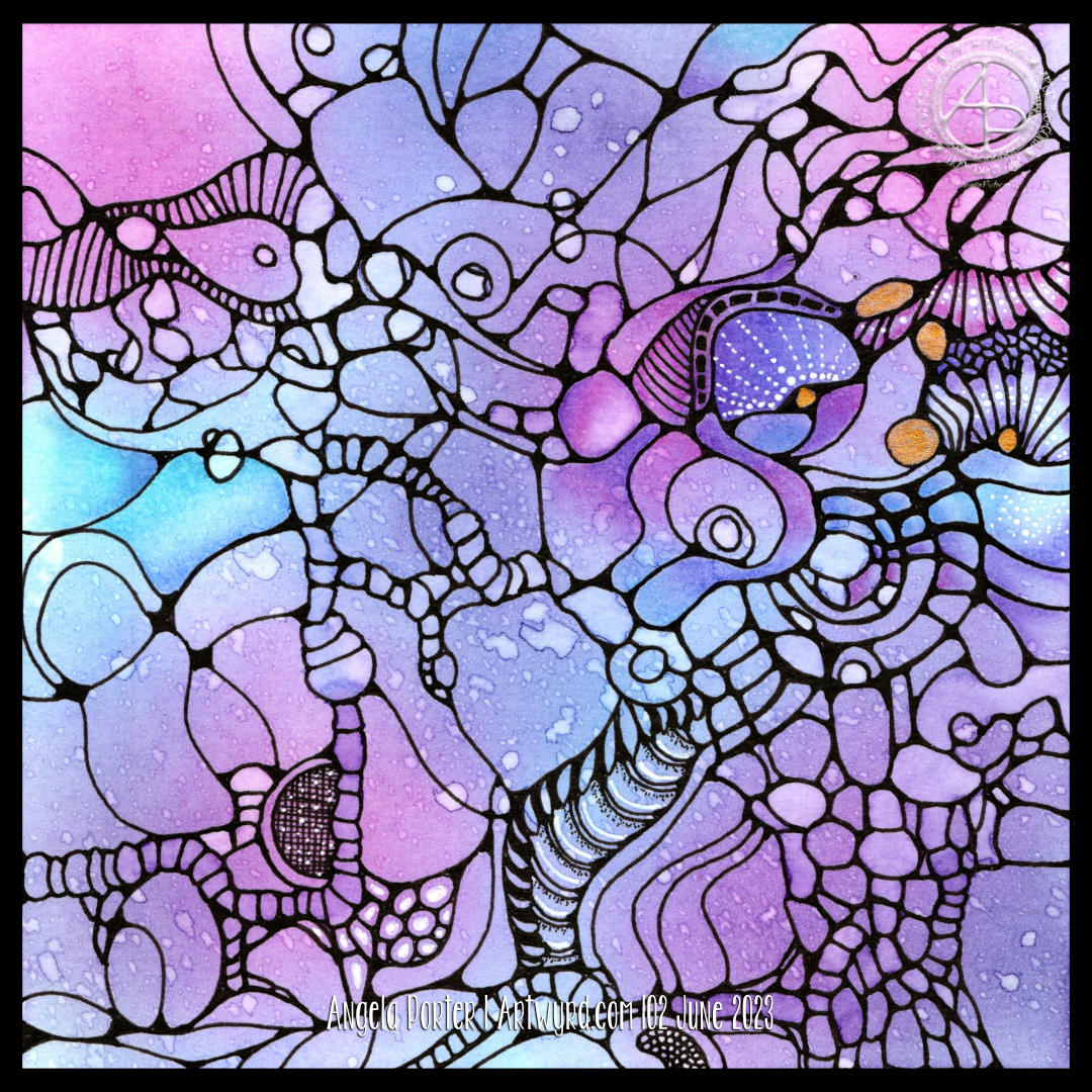
Distress Ink background. Design drawn with black Dokumentus ink in a TWISBI Eco EF fountain pen. Extra colour/shade added with Derwent Chromaflow pencils and Gamsol. Highlights/shimmer added using a white Uniball Hybrid Gel DX pigment ink pen and gold Winsor and Newton Calligraphy Ink applied with a brush.
I decided to add colour to this artwork using Derwent Chromaflow pencils and Gamsol with tortillons/paperstumps.
I loved the colour as it was, but the design looked rather flat; there was little sense of ‘volume’. So, I hope to bring that out.
So little of the coloured pencil is needed when it is blended out with Gamsol, and it is translucent enough that the underlying waterdrop texture is still visible.
Although I mostly used pink, purple and blue to create the background, I thought that teal would make a good addition. That was a good decision, in my humble opinion!
White dots and lines from a Uniball Hybrid Gel DX pen add highlights that show up much better on the more intense colours. Spots and lines of gold will also add some interest, but I need to be conscious of not overdoing it!
I was really nervous about using Gamsol with linework drawn with Dokumentus ink. I had no real need to be; the Gamsol didn’t affect the ink. I let out a huge ‘Phew!’ at that!. My TWISBI Eco fountain pen with Dokumentus ink and an extra fine nib worked beautifully on areas where coloured pencil and Gamsol had been added.
I have a lot of work to do until this design is complete. I am, however, in no rush to do that. I can work on it a bit at a time. I am likely to post updates from time to time though!
If you’d like to see how I added colour with pencils and Gamsol, then a YouTube video will be available to view from 16:00 UK time on Friday 2 June 2023.
Neurographic art is an intuitive method for making art. “Neurographics is a way of drawing that recreates the outer from the inner.” – From Neurographic.art.
Intuitive art? A no brainer for me me to work with. It’s my most natural way to create art. So, I had to try it out, and I videoed it for my YouTube Channel (video available from 18:00 UK Time on 1 June 2023).
I started by creating a colourful background. I think Neurographic art usually starts with the ink lines. But Bettina used the shapes and lines created in the random colour background to draw the basic structure of the design from.
Instead of using watercolours, I used Distress Inks in various shades of pink, purple, blue and blue-greens. Splashes and a light spritz of water created interesting watermarks and I preserved the dark edges of these areas by drying them with a heat tool.
Then the real fun began. I started by drawing a kind of oval-ish shape around an area at the top left. All I did next was look for shapes and borders between colours to help me draw more lines and shapes. I made sure I ’rounded the corners’ with ink as I went, though there are, no doubt, some areas where lines connect what I’ve missed.
I wasn’t only fun, it was fascinating. I tried not to think too much, to just let the lines flow and go where they needed to in a shape that seemed ‘right’.
Once I’d got the main structure completed, which took just over an hour, I started to add texture and pattern and some white highlights. There’s a lot more to do. I may even use coloured pencils to add shade to the design. And I just have to use gold ink or paint to add some luxury and shimmer and shine to the finished design!
What do I think of it? It’s fun. It’s a personal expression. I love it’s abstract nature for sure. I think I’ll be doing more of this in the future. Indeed, I plan to work on another this afternoon (it’s 14.40 here in the UK!)
I also want to try making background with other media – watercolours, Inktense and Neocolour II come to mind! And more Distress Ink backgrounds for sure! I’m also thinking that creating these backgrounds may be a way to get me to experiment more with digital painting and textures.
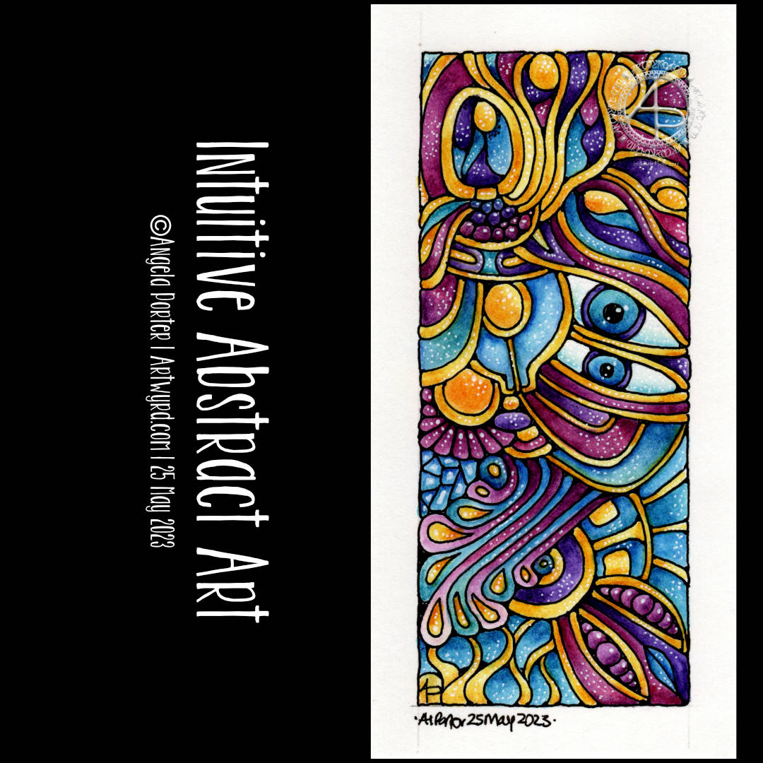
The last couple or so days I’ve been immersed in drawing intuitive, abstract art. I really wanted to bring one to life with colour, but the ones drawn on A4 paper just felt too much to do.
My solution? Cut some paper into smaller pieces and use one of them! So I did. The paper is 14cm x 7cm and is Canson Imagine mixed media paper. To draw the design I used a TWISBI Eco filled with black Dokumentus ink and fitted with an extra fine nib.
I just let the lines flow as they needed to, each one leading to the next, doing whatever felt right.
Then, it was time to add colour and I dug into my Inktense pencils. This time, I layered colours to get the intensity of colour I wanted and added highlights with a white pigment gel pen from Pentel.
Oddly, I didn’t want to add much in the way of patterns or details in the sections. I just thought they were just fine as they are.
I’m left puzzling a little as to why eyes so often appear in my intuitive art. I don’t even realise I’m drawing or have drawn them until the drawing is done!
As it’s intuitive art, it speaks for what is going on within me. The shapes and lines and colours chosen represent my inner wellbeing in terms of my mind and emotions. Or maybe they speak about what I need at this time. Blue for peace, calm, tranquility. Pinks for gentleness, compassion and kindness towards myself. The purple is more to do with the wonders there are in nature and the universe and life. The threads of gold … well … light, warmth, sunshine that supports the vast majority of life on this planet…child-like joy, pleasure, wonder with what I have in my life, the things that are precious, golden, to me.
It’s easy when the traumas of the past rear their heads and do their best to drag me down into a dark abyss of the heart and mind. I think I needed to do this drawing today to help remind me of what there is in me and what I need at this time.
My intuitive, entangled, abstract art is perhaps the most personal kind of art I share with people. It comes from within, from my heart and soul, not my head. And today was the day I fully realised that this is why I create art like this, and almost face palm at how long it’s taken me to realise it! Almost facepalmed…as I also know these insights and realisations come when we’re ready for them.
All the same, I feel kind of exposed when I share this kind of art as you get to see past the mask I wear to try to fit into a world where I feel out of step, awkward, clumsy, weird, different, a square peg in a world that only has round holes for round pegs. I’ve always felt that way and I’m on a journey to discover why that is.
Through this kind of art, I get to express my sense of wonder and emotions that aren’t easy to access. The visual-hoard of patterns and shapes and forms that is stored in my subconscious flows out naturally and easily in ways that are pleasing to me, and I’m really chuffed if you find them pleasing too!
The design was drawn with a medium nib TWISBI Eco fountain pen filled with Documentus Ink on an A4 sheet of Canson Imagine mixed media paper.
I’ve added colour digitally, so making this tradigital art! Why digital colouring? Well, partly because I can, but also I can try different colours out.
Adding colour was interesting it seems. I started thinking I’d use softer, more muted, less saturated colours. But that soon changed, without any conscious decision, to richer and glowing jewel-like or metallic colours.
As I tend to work very intuitively, whether drawing or adding colour, what appears in my creation is an expression of my unconscious, inner self. I’m sure there’s a message of some kind here for me about me!
I easily forget how much I enjoy drawing ‘small art’. A small piece of paper is less overwhelming, and the creativity is no less soothing to heart, soul and mind.
Drawing with pen on paper is never overwhelming. It is a contented, peaceful, delighted experience for me, especially when I work intuitively. The flowy, abstract patterns, with various patterns and textures are always a joy to draw and work with. Starting with just one shape and allowing the design to form, not knowing what will appear from the nib of my pen, is a think of wonder, surprise and magic.
I lose myself in the intricacy of the drawing. then, there’s the addition of colour and contrast to bring the drawing to life. What was flat now appears to have volume to it. The colours may evoke emotions or memories. There is a story to be told in the drawing, but not one that is obvious as an illustration would make it. This is an inner story, an inner expression of my creativity, emotions, thoughts, and what shapes, lines, patterns, textures and items that make me smile.
If my art makes you smile, or brings you joy, peace and/or calm, then it’s done it’s job. There is enough in this world to make us think, to make us feel uncomfortable. We’re assaulted by such things constantly through the media. Time and space to have a break from all of that, to remind us that there is still wonder and beauty, kindness and compassion and creativity in this world is important. It’s also important to remind ourselves that us humans have a great capacity to create these important qualities that heal and soothe and connect us, help us to feel we belong as a member of humanity.
I’m not sure I got all the words I could say out there. Hopefully you’ll understand what I’m trying to get across.
I think what I’m trying to say is that I hope my art reminds you that beauty and wonder, times of peace and contentment, joy and belonging are essential to each of us. That’s still not right. Perhaps once day I’ll manage to express these feelings succinctly in words.
Adding colour, however, is a another tale. I get overwhelmed by the process at times. I doubt my choice of colours, and soon regret what I’ve decided to do. I always try to remember to scan my drawing in before I start to apply colour with traditional media; if I mess up at least I have a clean copy I can add colour to digitally.
Also, there are many times where I just get fed up of the process of adding colour and give up before completion. I can find it a very tedious process. Yet, when I complete the process and it all comes together I’m often really surprised and pleased with the end result. The frustration comes in because it takes so much longer to add colour than it does to draw a design!
Having said that, there have been a couple of pieces of artwork I’ve done recently where I’ve partly coloured them and I really like the effect, especially one where I’ve added shade first. That is something for me to consider going forward for sure.
There is a ‘Draw With Me’ video on my YouTube Channel, available to view from 1900 UK time this evening (19 May ’23).
Here’s a list of the materials I used in the video.
Canson Imagine mixed media paper – 6.3cm x 21cm (2.5″ x 8.25″)
TWISBI Eco fountain pen, extra fine nib
Faber-Castell Pitt Graphite Matt pencil, 4B and a paper stump (tortillon)
Derwent Inktense Pencils – Madder Brown, Red Oxide, Sienna Gold, Willow, Mustard, Shiraz, Poppy Red, Leaf Green and Fern.