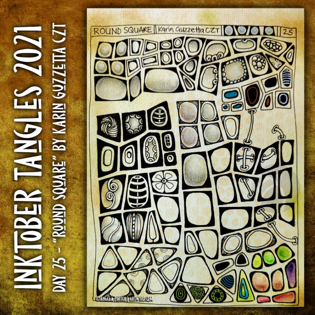
Inktober Tangles 2021 Day 25 “Round Square”

Round Square, by Karin Guzzetta CZT, has turned out to be an interesting pattern to try variations out on.

At first sight it seems a rather, well, boring pattern. However, with just a little creativity, it’s become fascinating rather than boring. From adding ‘auras’ and patterns, to threading laces through the pattern, to inverting the dark and light areas, and even changing the shape from square-ish to triangular, this has become a pattern full of possibility.

I’ve just realised that I didn’t try adding white (or coloured) patterns to the darker borders in some of the patterns.

Will it make it’s way into my artwork? I don’t know. I can see some interesting optical illusions going on in places. A bit more forward planning with the ‘laces’ running through the pattern could have a really interesting effect, maybe.

However, these will have to be shelved for now as I do need to turn to other work for the day.

Inktober Tangles 2021 Day 23 and Sketchbook Saturday

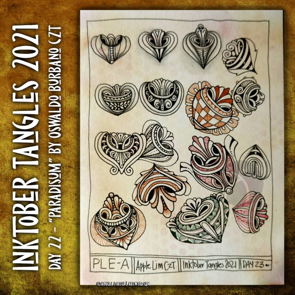
Inktober Tangles 2021 Day 23 “Ple-A” by Apple Lim CZT

This was a new tangle to me, but not any more!

It took a while for me to understand it’s basic structure. Then, it was experimenting with it to fill (mostly) a page of my A5 sketchbook with just a few possibilities.

I did start adding shadow and highlight, but went on to focus on patterns in both black and colour. I may return to add those shadows and highlights to increase the illusion of volume.

Sketchbook Saturday – My week in art

It took nearly an hour for me to look back on my week in art. I didn’t think I’d done this much as I’d been unwell for a few days and needed to sleep a lot.

In the video, I share with you my observations, reflections and lessons from all of this work.

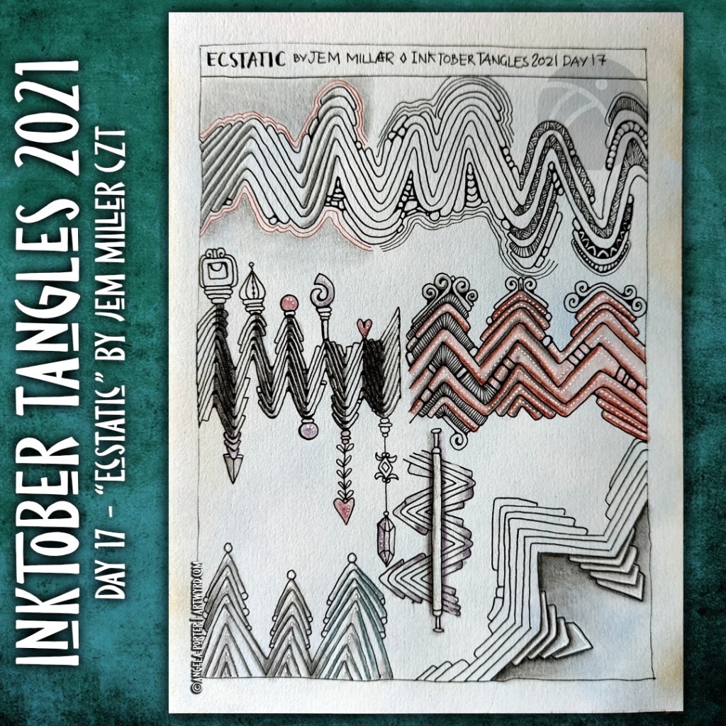
Inktober Tangles 2021 | Day 16 “Ecstatic” by Jem Miller

I wondered what I was going to be able to do with this tangle, which is essentially a series of zig=zags that become broken and smaller so that they seem to be wearing ‘hats’.

Surprisingly, I found it a really interesting tangle to work with, especially with the addition of shadow and highlights. They really bring the tangle alive.

It is, however, fun to add ‘dangle’ elements to the peaks of the design, both above and below, or ornaments that act like finials atop roofs.

I think there’s a lot more exploring of this pattern.

Inktober Tangles 2021 Day 16 “Moonesque” and Saturday Sketchbook – My week in art.

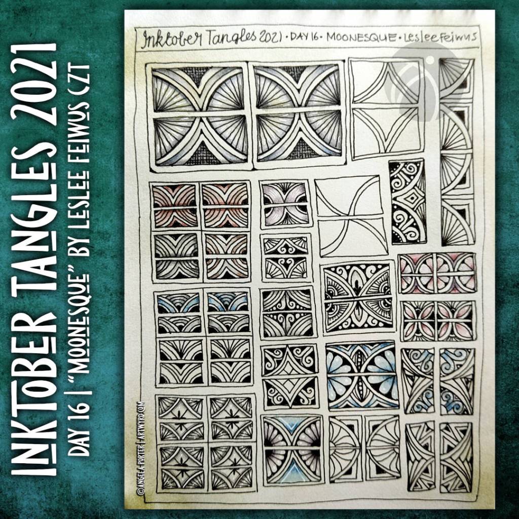
“Moonesque”

Today’s tangle pattern is the lovely grid based tangle ‘Moonesque’ by Leslee Feiwus CZT.

Grid based tangles are often my favourites, though during Inktober I’ve discovered that I really like other tangles too.

All grid based tangles are full of opportunities for variations, and so a page full of them was the most natural thing for me to do. And there’s only a few possible variations here.

Sketchbook Saturday – My week in art.

It’s become my habit to take a look back at my week in art with you via a video. It’s a really good way for me to reflect on my recent art and insights gained about myself and my arty journey.

This week, I think it’s discovering how valuable it is to work on variations of a motif or pattern. This aids in understanding the design, but also leads to variations that, perhaps. are more my style. I really think I’m going to do this with more of my favourite motifs and patterns going forward too. The result could be both a library of inspiration for myself, and a regular art practice too.

I wondered if people would like me to share that daily (or almost daily) practice with them, explaining how I draw various patterns and motifs. If it’s something you’d like to see, leave me a comment!

It’s also been a surprise that I’ve enjoyed drawing motifs and patterns on a larger scale than I would usually. That gives me much more space, both on the page and in my mind, to explore and experiment. That’s saying something from me, who tends towards the small and highly detailed, fussy kind of line drawings!

Discovering that using graphite pencils for shading can be useful and attractive is another surprise of the past couple of days. I’m not entirely convinced it will be something I use regularly in any work I do; I think it’s likely to depend on my mood at the time as well as the colours/media upon which I add it. Still, it was a surprise!

Inktober Tangles 2021 | Days 14 and 15

C-Knots by Valli Ganti CZT

This is an absolutely lovely tangle. Curves that are interwoven. Those delightful c-shaped arcs that create fan shapes that remind me of ginko leaves. The finished tangles remind me so much of medieval brooches.

It took me a little while to work out how the placement of the starting grid influences the final shape of the pattern. That was an interesting way to give my analytical mind a bit of a work out.

I did struggle finding different ways to complete the design, though I have started on a second page in my sketchbook just for this tangle. I also haven’t tried turning it into a border or repeating pattern…yet. As much of my signature art includes motifs rather than patterns, it’ll be a really useful pattern going forward I think.

Ing by Zentangle Inc

This is a rather angular pattern, which are not my favourite types. About the only thing that can be done with Ink is to fill the triangular spaces with patterns. That’s what I chose to do, not sticking to one pattern on each ‘ing’, but different ones to see how they worked (or didn’t) in the spaces.

I did, however, try to use a wavy line rather than a zig zag as the foundation of the pattern. It actually worked out, which surprised me. Whereas the zig-zag ing can look like folded paper, the sinuous version is much more like a ribbon, depending on the patterns that are placed in the sections.

I took this pattern as an opportunity to work on shading and highlight. I could kick myself with the lines of gel pen I used as stark highlights on this page. Goodness knows what I was thinking! Most probably not thinking is the more correct statement. Still, it’s only by doing can I learn, eventually, about what works and what doesn’t for me.

Some reflections…

I’m surprised how much I’m enjoying drawing the patterns much bigger than I would usually do. Despite my reticence about using other patterns to fill spaces, I think I’m learning that it just depends on what pattern you choose to fill the space.

In the ING wavy variation, I really like the nested tear-drops towards the bottom of the pattern. They really seen to give a lot of volume to that part of the design. I’m sure I could use nested triangles in the ziggy-zaggy version. However, I’m not sure the effect would be quite as dramatic.

Previously, I’ve used my finger to smudge white Gelly roll lines, which gives a softer edged highlight that is brighter than white charcoal. Today, I didn’t do that. I wish I had, or at least used broken lines or dotty lines.

Surprisingly, I’m using a 2B pencil more and more for shading. Today, I didn’t seem to have that ‘it looks grimy and I don’t like it’ thought. Maybe it’s just my mood today that appreciates that kind of shading. It’s certainly useful for adding shadow around motifs/patterns if nothing else.
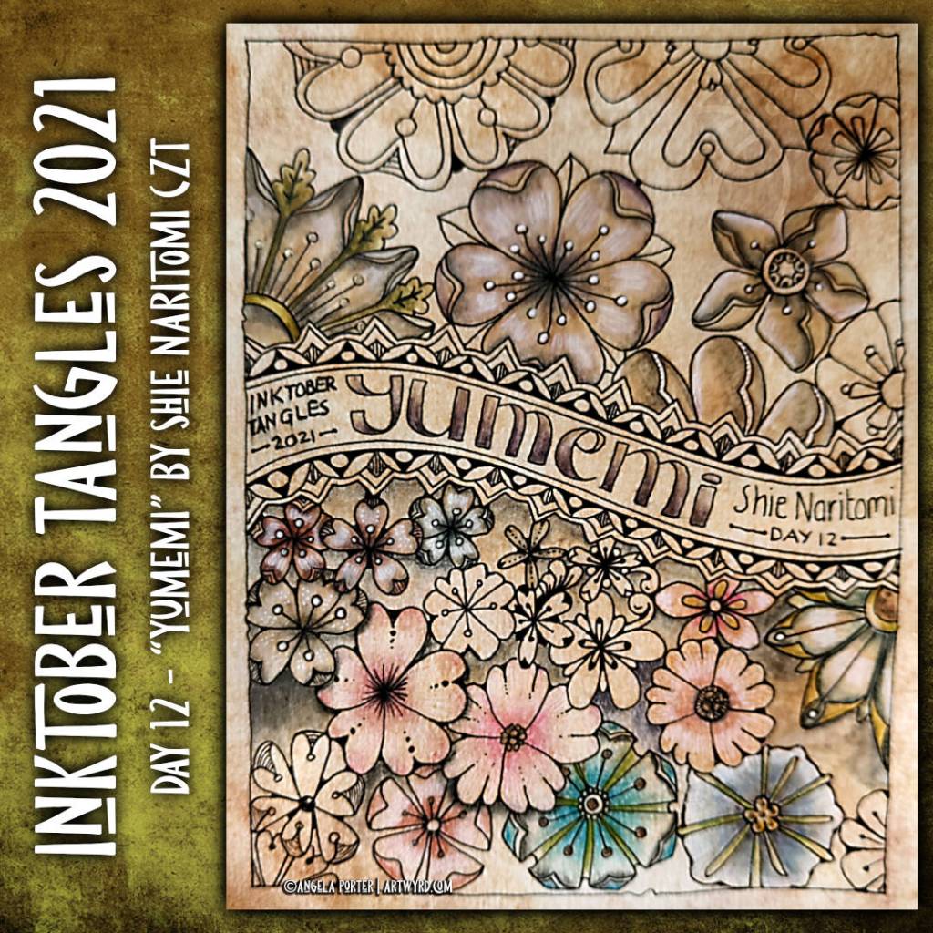
Inktober Tangles 2021 – Day 12 “Yumemi”

Pretty flowers, yeuchy colours.

Yumemi is a lovely floral tangle pattern by Shie Naritomi. I enjoyed drawing not just the original form of the pattern, but working with variations too. Things went downhill when I started to add colour.

I know I used a piece of cut ‘n’ dry foam to add distress ink to the paper. The colour looked as soft as it does when I use make-up brushes to add distress ink. I discovered today that cut ‘n’ dry foam lays down a lot more ink, and it coloured everything.

In the flowers that look grungier, it actually reminded me of the effect you get when you use water with black Quink fountain pen ink. But not quite as colourful. I used graphitint pencils and a waterbrush for these flowers.

I switched to chalk pastels for the more colourful ones, which were a bit better but … well.

As unhappy as I am with the colours, I can learn from the process, even if it seems to be a repeating pattern for me where colour is concerned. And this reminds me of the value of working in a sketchbook – the permission to experiment, explore, make art that I’m not happy with, and even record it in writing for future reference.

Inktober Tangles 2021 | Day 7 and 8

I’ve had a lovely tangle-y, arty, creative morning. Some good stuff. Some experiments that worked, some that didn’t quite. Either way, I have two more pages in my sketchbook filled with explorations of Zentangle patterns.

On the left is the page of explorations of Morrisseau by Cheryl Moote CZT. The white lines in the wavy border are just … too stark and a clear line/edge that I don’t like much, at the moment. I much prefer the dotty embellishments! Having said that, the white lines that turn areas of the design into shell-like fragments work rather nicely. The more I play around with Morrisseau, the more it’s becoming one of my favourite tangle patterns. I have a lot more exploring to do with it, no doubt too.

On the right is a page of explorations of today’s tangle, Zenith, by Zentangle Inc. This was kind of fun to play around with, some ideas more successful than others. less colour on this page, but plenty of dots and white highlights!

As these are pages in my sketchbook, I feel no need to finish them completely. They’re there as a reference for ideas growing forward. Also, they’re a record showing how I’m working at developing both patterns and addition of colour, shadow and highlight.

For colour, I’ve used Graphitint pencils with a damp brush to activate the colour and gently spread it out. I like the earthier tones much more than the bright and intense colours of the Ecoline pens at the moment.

For shadow and highlight on the Zenith page, I used charcoal pencils. Now, these I like far more than graphite pencils. They don’t add any shine at all. Hurrah!

For white highlights, a white Sakura Soufflé pen was used, both before and after adding colour/shadow/highlight. With the charcoal pencils it really needs to be added afterwards as the charcoal is abrasive enough to stick to the dry pen. With graphitint it doesn’t matter. Indeed, the way colour pools around the white dots/lines adds depth and interest to the colour.

I’ve also used some metallic paints that are fairly opaque in some of the drawings. I enjoyed doing this, especially as I could add different shades of gold to add a highlight. I think I’ll be using these more going forward; they give a much smoother finish in large-ish areas than a metallic gel pen would. I like smooth finishes with metallics. The uneven colour that results from spreading the graphitint pencils pleases me too.