A Verdant Border – 4 September 2023

It’s been a week! But first, the arty stuff…

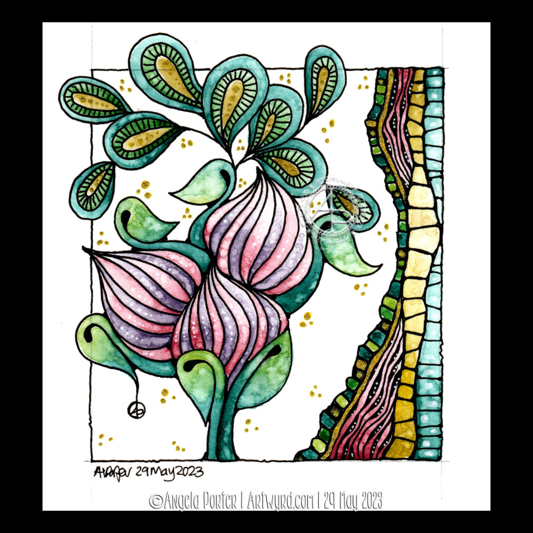
I thought creating a journal page with a border would be nice. So I did! And this is the result. It ‘feels’ very Arts and Crafts to me. What do you think?

I completed the design by using a dark green Staedtler 0.4 Triplus fineliner and Faber-Castell Pitt Pastel pencils. Let’s not forget white dots for highlights courtesy of a Pentel Hybrid Gel dx pen!

When the line art was finished, I wasn’t sure whether I liked it or not. But, as I added colour and the resultant shade and light, I started to warm to it. When I’d finished, I realised I really did like it, lots!

There is a ‘Draw With Me’ video for this design available on Youtube and here’s the link:

#DrawWithMe video on Youtube from 8pm UK time, 4 September 2023

The last week…

I’ve been struggling with energy levels for a while thanks to anaemia. So, I’m taking the iron and B12 supplements as prescribed so I hope it will improve.

However, on Tuesday last week, I was diagnosed with a case of shingles and put on a course of antiviral tablets for a week.

I’ve just been feeling more meh, or MEH, than usual, so tired and unable to think straight. So, I’ve been quiet, resting up and needing a lot of naps.

I was warned it would get worse before it got better, and it did. Also, it will take at least 4 to 6 weeks to fully recover, though that could be longer.

So, that’s the reason for the lack of posts

Flower Buds – 29 May 2023

Flower Buds

I absolutely love the Kuretake Gansai Tambi Art Nouveau set of watercolours! I just had to get that off my chest!

I love the texture created by the watercolours – how uncontrollable it is, but it adds so much to the final drawing and it actually makes my arty heart and soul smile a tad.

This is a drawing completed, for once, in today’s YouTube video, due to premiere at 18:00 UK Time on 29 May 2023. In the video I show how to draw the design, add colour and gold and white details.

After doing this artwork, I really do think the Kuretake Gansai Tambi’s are the watercolours I’ve been searching for. They work with me, helping me to express myself. Also, embracing the imperfections of the textures in the colours as part of my self-expression rather than searching for the unattainable.

I used single colours for each section, except for the larger leaves. And that seems to have worked out well for me.

I love how the gold and green to the right seem to glow like sunlight shining through stained glass.

The only thing I wish I’d done was coloured the paper with Distress Inks before starting the drawing. I know that so little Distress Ink is added to the background that it won’t affect the colours in a noticeable way. So that will be my next arty experiment today!

Oh, and I wish I’d remembered to erase the pencil line before starting to add the watercolour!

Again, I used Canson Imagine mixed media paper(9.5cm x 10.5cm or 3.75″ x 4.25″) and it seems to make it so easy for me and the Gansai Tambi paints to work well together.

I’m absolutely amazed that I’m embracing imperfection! I never thought I’d get to that point, or let it be part of my artistic voice.

I’m actually smiling here. I really am. And a smile that is felt in my heart and soul too; something I’ve not done much for a long while.

A sudden realisation

I had a sudden revelation today, of a practical nature. I suddenly realised I tend to create art in sizes that require custom made frames and/or mats. So, I thought I should try to get a selection of ready cut mats in standard sizes and use them to cut paper and create the right sized art to fit the mat. So that’s what I did.

I can be such a numpty, feeling quite daft it had taken me this long to work that out! But then again, perhaps the time wasn’t right before now. I’ve thought for a while now that I could sell my art, particularly the more abstract, flowy, intuitive art. Next step is to work out how to do that and ‘promote’ it/me. And that is the problem, the promotion… it fills me with horror. But maybe I’ll work it out. Time will tell for sure.

Medieval Inspired Botanical Bookmark

I have no idea why, but tall, thin drawings (bookmarks) just appeal to me. Indeed, they always have.

I enjoyed drawing this one, and I’m fairly pleased with the chosen colours. There’s a soft, muted, vintage palette along with the flowers, seed pods, berries and leaves mainly inspired by Medieval Illuminated Manuscripts and the work of the Arts and Crafts Movement artists.

If you’d like to follow a #comedrawwithme video for this design, just click on this link!