It’s been a long while…again…

The explanation…

It’s been a good couple of months since I last added an entry to my blog. It’s not that I haven’t tried to; it’s just that I’ve not been able to. Let me explain.

Since I had Covid back in October 2024, I’ve been experiencing chronic fatigue, a scattered and unfocused mind, and an inability to stay focused on a task for much time at all. Even as I type this, I’m losing my train of thought and have to pause often to try to work out what I was about to type or to find the words that just won’t come to the forefront of my mind.

I can spend 10 to 12 or more hours a day sleeping and still not feel refreshed. Taking part in everyday events or tasks is overwhelmingly tiring; not so much physically but mentally and emotionally.

Everything physiological has been ruled out. Covid coincided with me being prescribed a new medication. I’ve stopped that medication, with the blessing of my doctor, so to speak, to see if that was the cause of this fatigue. It’s not and I’m awaiting a review with the doctor soon. I think they mentioned a review to a post viral syndrome clinic or long covid clinic.

I can get really frustrated. Even my art isn’t as prolific as before. Though I get lost in it quite easily, I can’t do much more than 30 mins to 45 mins in a stint, if I’m lucky. Even now, I’ve spent less than an hour scanning in a couple of drawings, creating the images for social media, and getting this far in my blog and I could just fall asleep again. Not even perimenopause/menopause has been this bad…

So, this is the state of my health currently, fine and good apart from this pesky fatigue.

Arty stuff

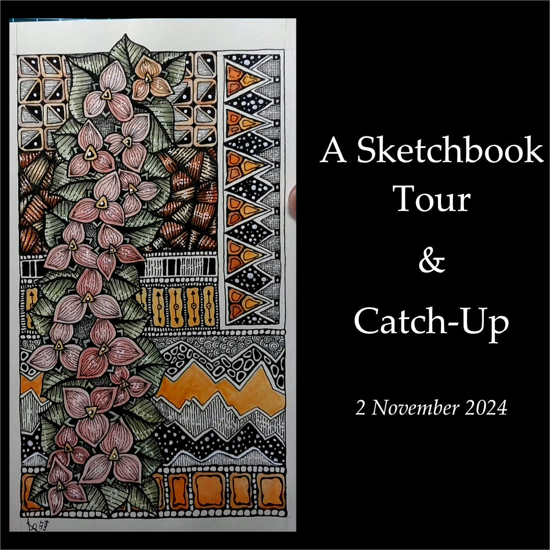
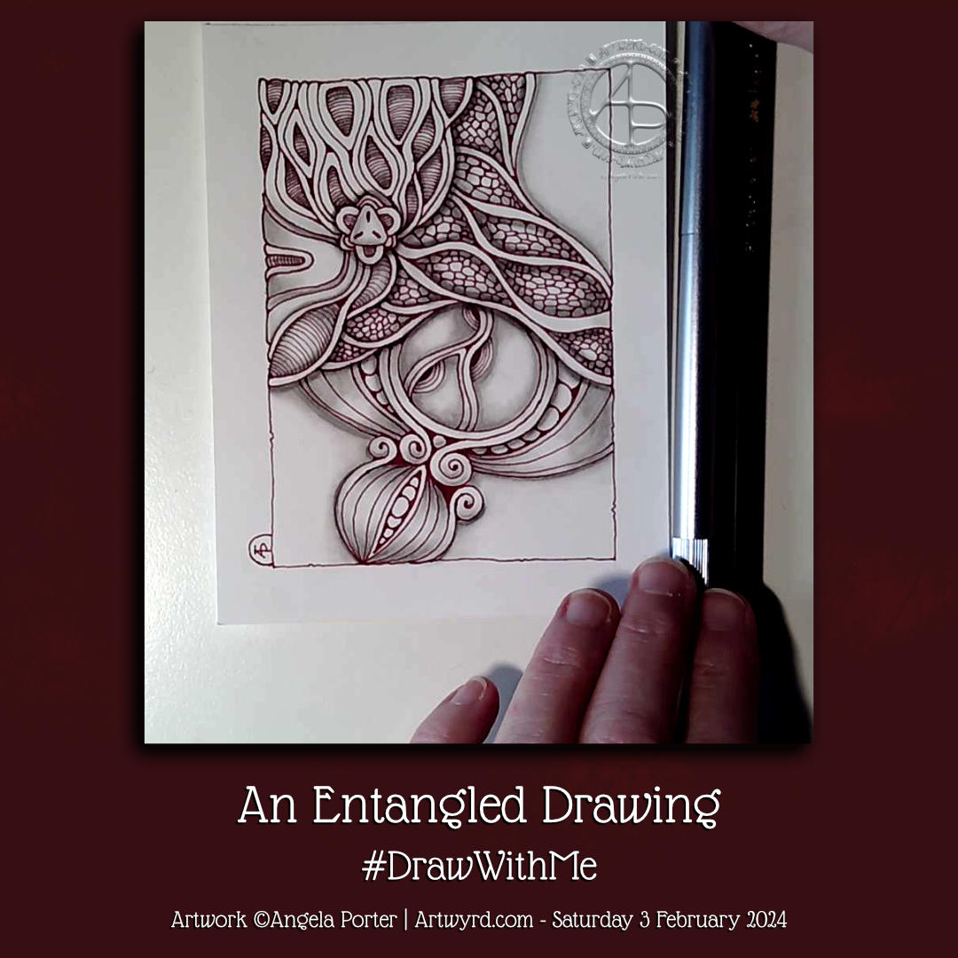
I have been drawing, but not as much as I usually would have been doing. The two images above are just two that I have completed in the last couple of months or so.

The one on the right resulted in some enquires about buying it. However something weird was going on with the contacts and nothing ever came of it. But, when I’m up to focusing on what I need to do, I will be posting some artwork either on Ko-Fi or Etsy for sale. I wish I could say when, but …

So, I’m still creating, as the fatigue allows.

And so…

…it’s time for me to end this post and go and rest again – I feel so tired and sleepy and unfocussed once again.

All I can say is thank you for bearing with me. I’ll share when I’m able to, but I don’t think there’ll be any YouTube videos for a while as they are just too much for me to accomplish at this time. Hopefully, recovery is occuring, albeit slowly. Only time will tell, that’s for sure.

Catch up and an upcoming YouTube video

I’m free of the dread lurgy as far as the virus is concerned, but I’m not free of its lingering effects—weak voice, cough, easily fatigued and breathless, and a foggy mind. I will get better—I will. How long it will take? I don’t know, but I was surprised at how quickly I became tired as I recorded today’s video (available from 6pm UK time today, Saturday 2 November 2024).

Despite being unwell, I’ve continued to be creative. In this video, I show a few drawings I’ve done in a new A5 sketchbook from Sakura.

Quite a few of the pages have been heavily influenced by the work of the fabulous Rebecca Blair. I love how she uses patterns, textures, and simple colour palettes to create richly decorative work. Her use of collage is simple yet effective, something I need to learn from!

If you know me, you know I love patterns, textures, and motifs. I like stylised, abstract, intricate art. I usually let my work grow quite organically, yet there is something delightful about creating a tapestry or memory map of patterns, textures, and motifs that bring joy and using colour that creates a certain feeling.

Rebecca Blair uses quite simple colour palettes, often monochrome-ish, and I have found that this works for me, kind of, in the pages I’ve created so far.

I’m not saying I’ve cracked it yet, nor have I found a way to incorporate all of this into my art. I’ve clumsily used watercolour to add colour to the floral elements, but I love how I’ve used colour in the various sections.

Looking back on these pages, I remember when I created drawn collages of elements from, say, an abbey I was visiting. This involved not drawing the entirety of the building but the parts that caught my attention. I’d sketch the patterns, shapes, and sculptural elements so that they flowed from one to another. In this way, a kind of sampler of my visit was created, a record of what fascinated me that day.

I like this idea of creating memory hoards of patterns, textures, colours, and motifs. It’s a revisit, yet a start of something new. To link with this, I intend to create my own hoard of favourite elements, such as ATC-sized cards, stored in pockets in a ring binder for when I need inspiration. This project can be done when I feel the need to be creative but don’t have the energy/focus to do anything else. That’s the plan, anyway.

So, I really need some tea before I even think about tackling this, maybe a nap too.

Twiddly Art…

The Art

Shells, spirals, foliage and arcs. Things that make me smile!

This drawing was a departure from my recent, more whimsical work—a much-needed change. Indeed, change is as good as a rest. Not just a rest, but the change brings a different kind of energy to my drawing and to myself.

I’ve found it very difficult to settle to do art for more than half an hour or so for a few days. I’ve felt a bit ‘bored’ with the whimsical things. Perhaps jaded is a better description. I’d become frustrated with watercolours, with colours, with my hand lettering.

So, it’s time to take that break from the whimsy and spend some time with pen and paper and some abstract twiddles.

One thing I’ve taken from the whimsical drawings is the use of 01 and 005 fineliner pens to draw with. These are much finer than I’d usually work with. However, they were a delight to use! I like the more delicate lines that result.

I’ve not quite finished this drawing, however. I’ve decided to add some crosshatching to the background. Not solid black, but very fine crosshatching. It’s going to take a while to finish that though.

My Mood

I’m out of sorts today. In fact, I have been for a few days. I’ve been sleeping a lot more than usual. I think I know what’s the matter, and it’s something only I can do something about, even though I don’t know how to do anything about it…yet.

The change in art style, a return to something that is kind of familiar yet a little different, is comforting and a solace for me. It’s like visiting with old friends. It’s giving me a break from the whimsical work that has pushed me towards discomfort with it. So, it’s time to rest in some comfort. As I do so, I will gather my wits and strength to continue the exploration of whimsical people when I’m good and ready to do so.

There is nothing wrong in retreating from discomfort, unease, and that which results in becoming jaded and ‘bored’. In fact, it is essential to find the pleasure once again, to delight in a familiar style of art and remind myself how I need to feel with any creative endeavours.

The areas of discomfort allow progress and new things to be learned. However, it’s a fine line between discomfort being a positive thing, and discomfort becoming a ‘boredom’ that is a sign that the discomfort and dissatisfaction with the work being produced is just too much and counterproductive.

I’ve worked that out, kind of. All I need to do is remember this lesson in the future. That may be difficult, as I tend to focus so much on something new that I find it hard to set it aside for a while. The hyperfocus can be strong! However, I will return to the whimsical art, when I’m ready to. When I’ve refreshed my creative soul and my mood lifts too.

It’s good that I have art styles to fall back on that always bring my contentment and relaxation. Remembering this is the hard part!

And Another …. Pen Drawing and Witter!

YouTube Video showing the creation of this drawing.

This afternoon was sunny and gusty-breezy. The shiny leaves on some rose bushes sparkled and shimmered as the wind danced with them. The wind was noisy as it blew the branches and whistled past buildings, yet the sound was soothing. The energy of the wind and sun uplifted my spirits, and I felt it was time to do an impromptu YouTube livestream.

I knew I wanted to do something similar to my previous video—a pen drawing, graphite shading, and a watercolour background in the ‘white spaces’. So, I did that, and I shared my thoughts and joy with those who found their way to the livestream.

I can’t remember what I wittered about during the 2 hour or so livestream, but I know it mentioned finding joy in small things, a childlike wonder of the world and life, taking breaks from the pressures and responsibilities of adulting wherever possible.

One thing I can say is that even in the darkest times of my life, I’ve always been able to find joy and wonder in nature, books, films and more. It may only give me a sparkle of light for a moment, but that sparkle is a reminder that it will fully return and hasn’t gone anywhere – it’s merely clouded by the dark and low mood that gathers around my heart and mind.

If anything, the darkness allows me to enjoy the sparkles more; they are more vibrant when surrounded by gloom. It would be hard to recognise the sparkles and joy if all was bright. Contrast is needed.

Perhaps that’s why I love using high contrast in my art. In today’s drawing, the darkness of the watercolour background really lets the pen drawing almost glow. The texture in the watercolour reminds me of the subtle patterns seen in glowering clouds or the ripples in a darkling sea. Either description works for the constantly shifting and changing emotions and thoughts; not all are gloomy, as the lighter areas show.

The birds in the left-hand column were a surprise! I certainly didn’t plan that. In fact, I didn’t plan any of this drawing. I just let it grow, one line at a time. Sometimes, a line, or combination of lines, suggests a recognisable motif, and I go with that.

Working intuitively always surprises me; though I may make some decisions along the way, they are instinctive. Speaking out what I’m doing just expresses in words what my hand/eye want to do next.

Turquoise is definitely the colour of the moment with me. This time, however, I added rich indigo to it to intensify the colour and depth of shadow. I let the watercolours play with each other as they will, just allowing the end result to be what it will be.

It’s not easy for me to let go of control in this way, but watercolour is showing me that it is possible. And when I let go, the results are always a wondrous surprise!

It’s Been A While…

About the drawing…

I’ve been away from social media for quite a while (I’ll tell you a little more later in this post). So today, I had the energy and time to record a YouTube video in which I drew the design in the photo. The video is due to be available to view at 20:00 UK time today, 14 June 2024.

I started with a 6.75″ x 5″ piece of Ohuhu Mixed Media paper. For those of us who prefer metric, that’s 17.5 x 12.7 cm. I like this paper. It takes watercolour nicely enough for my limited ability to use it. It’s also nice to draw on with a pen or pencil, with its light texture.

The next step was to draw a square, approximately 4″ x 4″ (10 cm x 10cm), in pencil. I like to frame my drawings as if they’re a small glimpse into a much larger imaginary world of abstract and stylised wonders.

Then, it was time to wield my UniPin pens (0.5, 0.3 and 0.1).

I knew I wanted to leave some empty space for watercolour. I also knew I wanted to use a 4B graphite pencil with a tortillon to add shade. Other than that, my mind was empty of any plan. Working intuitively called to me, so I followed that calling.

So, I started with a bit of a wibbly wobbly circle. Then, I just let the design flow and grow using my favourite lines and shapes. I added details as I went, starting to bring the design to life using the density of ink to add some shadow and highlight.

Once the penwork was finished, it was time to add shade. My aim was to bring out a feeling of dimension to the drawing. I’ve long loved playing with contrast more than numerous colours in my work. My goal was to give the appearance of the design floating above the background.

The graphite shadows partly completed that goal. I used turquoise watercolour to add intense colour to the empty spaces. It also allowed me to play with the magic blooming of watercolour dotted into the damp areas to provide more texture.

I love to watch watercolours bloom and spread in this way. Having no control over this blooming and spreading is good for me; I can be too controlling about how I draw and create.

Little by little, I’m learning to allow a little more imperfection into my art to make it more ‘human’ It becomes not wrong but charmingly imperfect. At least, that’s how I like to think of it, and perhaps myself too. Maybe learning that I’m charmingly perfectly imperfect is a personal goal.

I really enjoyed the hour or so I spent creating this small piece of art. I did think about adding some gold, black, or white pen to the turquoise parts to bring out some of the beautiful textures that are there. I’ve decided, however, to err on the side of caution and to leave well alone.

Overall, I had a lovely time, and I hope you enjoy watching the video if you choose to do so.

Why have I been missing for a while?

For around 18 months, I’ve been struggling with my health – nothing serious. Between anaemia (iron and B12), peri-menopause, and IBS, I’ve been so tired a lot of the time. My concentration hasn’t been what it could be. All the energy I had needed to be put into my latest book for Creative Haven – Haunted – and is full of creepy cute characters.

I thoroughly enjoyed doing the book, even though I got tired quite quickly.

Then, my main computer, a Microsoft Surface Studio, unexpectedly died. So, after much thought, I switched to using a 24″ XP-Pen graphics tablet and my new-ish laptop to do the same job. I had a lot to learn and a way to set up Clip Studio Paint that would work efficiently for me on this new device, But I got there.

In the process of using the new gadgets, I’ve realised how much I love to draw on pen and paper. I think I’ll be doing much more of that going forward for my work on colouring books and moving more towards tradigital working.

That was a bit of a meandering journey through what happened. It’s not the only stuff. I needreevaluate my view of myself as being ‘broken’ to being ‘different’ and accept these revelations. There are a lot of ‘OH!’ moments as I recognise things in my past that point to my differences. There’s also some grieving for what could’ve been if I’d only known sooner about them, But it really does help me accept myself and adjust the wrong beliefs I’ve held about my life forever. It’s an acceptance of who I really am, not what I’ve been led to believe. That’s progress for me, for sure. I ama always amazed by the feeling of some tension in my body being released as I recognise a memory for what it is-a new understanding of myself with the new information I have.

All of this has been both exciting and draining in many different ways. It has been totally necessary. This self-acceptance is working its way into my artistic style, too.

Circle Motif Variations

I spent some lovely, peaceful time today recording a video showing how I work to create variations on a theme.This theme is motifs based around circles and how I go from simple to more complex, possibly over complex.

You are welcome to come and #drawwithme as the #YouTube video is published at 19:30 UK time today, 4 April 2024 – https://youtu.be/tCHrlWi

A texture pattern sampler

This is my latest work, though I may add some metallics to it. May…

It strikes me that it’s a sampler of sorts, of texture patterns. Many of these are inspired by the work of Rebecca Blair.

I’m not sure if the end result is “me”. But it’s been a lovely way to spend over 20 hours over the past few days.

It’s been something that I’ve been able to do in bite-sized pieces, which has been helpful as I’m still experiencing fatigue due to burnout, anaemia and menopause.

The artwork is on an A4 sheet of Fabriano mixed media paper.

The pens used were 0.5 and 0.1 Uniball Unipin fineliners, and a white Uniball Signo gel pen.

Colour was added using Karin Brushmarker Pro pens and a fine Kuretake Zig water brush.

Intricate Intuitive Art | 24 Feb 2024

These three works show my love of intricate, intuitive, flowing art. I continue to explore the use of colour to work on gaining more confidence in using it. I can appreciate how colour brings the drawing to life and sets the mood, too. I find using a fairly limited palette really helps me appreciate this.

I’ve worked on these over two or three weeks, give or take. It’s been a slow process as I’m recovering from a period of burnout from too much adulting and peopling. None are finished yet as I still have to indulge my love of pattern/texture to create more volume in the designs. Also, dots of gold acrylic paint have been added for that little bit of glitz and glimmer – something that makes my raven mind happy!

An Entangled Drawing 3 Feb ’24

YouTube video is published at 19:00 UK Time today, 3 Feb 2024

It’s been a few weeks full of adulting, leaving me drained of energy. Dealing with fraudulent use of my PayPal account lasted a week, and I still have a couple of things to sort out that I’ve not been up to doing. Thankfully, it was all mostly sorted, my account is as secure as possible, so phew!

I’ve also had a lot of ‘people-ing’ (for me) to do, which has been lovely but has also left me drained.

I have had enough sense to take time for myself to sleep, rest, and do things that relax and soothe me. The last thing I’d want to happen is another burnout like I had last year at almost this exact time. I seem to have mostly avoided that this time. Seems that I’m finally learning to take care of my energy/stress levels.

I have done some art, some that are landmark pieces for me. I will scan and share them over the coming days/weeks. These works have taken a week or more of work to do, an unusually long time for me. But it was worth it.

The drawing above I did earlier today for a YouTube video. It was lovely to do. A small drawing. Detailed. Intricate. Diamine Oxblood ink and a Tom’s Studio Lumos duo refillable fineliner pen – I used 05 and 02 nibs.

I have to say that the Lumos pen was a delight to use! The weight of the barrel actually stopped me from pressing so hard with the nib; there’s some kind of counterbalance effect going on, methinks.

I may just have to invest in another of the Lumos pens (the duo version again). That way, I can have a range of nib sizes in just two beautifully made pens.

Although pricey at £99 (including P&P), I expect to save money on buying Sakura Micron or Uniball Unipin disposable fine-liner pens. That has to be a good thing.

The pen comes with 9 different nibs. It’s unlikely I’ll use all of them, though you never know! But I know I can order more nibs and new ink reservoirs as needed.

Oh, and the ink reservoirs are easy to fill; when you want to change to a new ink colour, you just wash them out with water.

Only water-based dye inks with no glittery bits in them are recommended. Though Rohrer and Klinger SketchINK was mentioned in the information that came as working well in the pens. I believe SketchINK is waterproof. It is after it’s thoroughly dried – I just checked! So that is something I may consider experimenting with, especially as it comes in a range of lovely colours!

William Blake Quote and some Entangled Art.

This drawing has taken a bit of an unexpected turn, to say the least.

Two black ink-filled Parker Jotter XL fountain pens, one with an M nib and the other with an F, were used to draw the structure of this drawing and add some patterns and textures.

I then decided to use some Zebra Sarasa gel pens with vintage colours to add more patterns and textures. All was fine, but it all looked flat and not finished in any way.

So, I added some flat colours with softly coloured alcohol markers. This improved things a little, but it wasn’t quite right. The drawing was missing contrast and dimension.

A deep breath was taken as I broke out a graphite pencil and tortillon and set to adding shade to the design. And that really did help, much to my surprise. Even more surprising was I actually preferred this way of adding shade to using alcohol markers, and it was easy to remove any overspill of shading with an eraser!

Next, I added some layers of the colours I’d already used to intensify the colour in some areas. I also added some more darkness with pen textures.

Finally, I was happy-ish with what had been created on the paper, so much so that I felt it was finished!

Yes, that’s right, I’m happy-ish with this! Using less saturated alcohol markers to add colour also works for me, especially the more muted, vintage and less bright and garish.

What works for me is seeing the drawing scanned in, as scanning seems to improve how I view the graphite shading.

So, is this an onward process for me? Yes, I think so. I think the graphite shading needs to be added last. Also, I think the use of Pitt Graphite Matt pencils will improve how I view the use of graphite in this way. Maybe coloured fineliners would work better for me than the gel pens. Things to consider (and make a note of too!)