I really enjoyed trying out different shapes in the leafy Tagh. There are just so very many possibilities for this kind of pattern. I’ve long used this pattern in my artwork without knowing it was a Zentangle pattern!
Walk the line reminds me so much of eroded rock strata and microscopic images of cells. It’s a lovely contrast to Tagh. Again, it’s a pattern I’ve often used in my own art, and it’s nice to find it’s also been added to the ever-growing library of tangle pattern step-outs!
Noom, or Noom Repus, is a lovely interlinked tangle, a chain, leaves, or shells if you will. It is a tangle that vexed me until I saw a tutorial video a long while ago, and suddenly the pieces fell into place.
I have to say, it’s not a tangle pattern that I’ve used often in my work, but after playing around with it in this video, I’ll try to use it more often!
I tried out some variations with Noom and found that it does lend itself quite well to embellishments, particularly in ‘auras’ around it. Adding colour to create shade and light does bring out the curvy nature of each part of this design.
Of course, this is for my sketchbook, so it’s not finished. It really was just working with the pattern to see what I could do. And of course, that sparks off lots of ideas for other variations further down the line.
Although not all the ‘hats’ worked out well, they were still fun to explore as possibilities. As this is a sketchbook page, the permission to experiment, explore, and try things out is implicit. A sketchbook is a place to do all these things and more. You can finish a piece of art or not. You can show people or not.
A safe place to be artful, that’s how I think of my sketchbooks more and more. I put too much pressure on myself to always finish a drawing, to have it polished and “imperfectly perfect”. If I don’t finish something, I can beat myself up. But I’m learning that in a sketchbook, I can do all I need to learn, grow, and develop. And sometimes that includes knowing when enough has been done!
It may take me a long while to be able to set aside my perfectionism to fully embrace this, but like everything in life, it is a work in progress!
I’m having one of those days, it seems. You know, the kind of day when you’re careless in deleting files, thinking that the video that’s processing is today’s. The reality is different. I managed to delete today’s video, and reprocess yesterday’s video as today’s!
I’m not going to repeat what I called myself when I discovered that… but at least I discovered what I’d done before I uploaded it to YouTube!
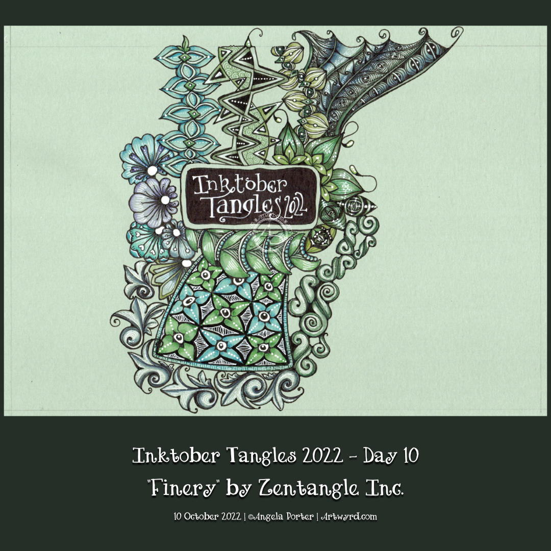
Inktober Tangles Day 10
I added ‘Finery‘ to the top right of my Inktober Tangles ‘sampler’ today, using its sections as a ‘reticulum’ to contain other patterns. To fill one part of Finery, I used Isea-u from day 3. I also used Well and B’tweed for two other sections. The last one is one that is a bit of a nod to one of the sections of ‘Souk‘, the tangle pattern for day 4.
I used Finery as a kind of reticulum (grid or net for a repeating pattern of fragments) as I, yet again, struggled with this tangle. I don’t know what it is about it, but I always mess it up somehow! However, if I hadn’t messed up this time, I may not have got the idea to fill the spaces with other tangles! So, it worked out fine(-ery) in the end!
It’s a shame I managed to send the file into the netherworlds of the recycling bin, never to be recovered or seen again. I realised my mistakes (yes, there were more than one!), but persevered saying that I had to trust I could recover from it(them). I think I did. As Adam Savage would say, I managed to ‘hide the crimes’!
Suma (to the bottom and left of the drawing) is a lovely, lovely pattern, deconstructed by Lin Chiu CZT. It very much reminds me of Medieval manuscripts and architectural sculpture. So, it was a given that I’d love it, just like Tomàs Padrós’ “Snack” in Day 8 of the Inktober Tangles 2022 challenge.
Although Lin Chiu has given many possible variations, just as Tomàs did for Snack, I kept it simple, repeating the basic form around the bottom and left of the Heartfully ‘rug’. It also had to have that architectural, sculptured, carved ‘feel’ to it. Not sure I’ve quite managed it, but it’ll do!
My design is looking a bit higgledy-piggledy at the moment; I’m just going to trust the process and see how it works out at the end of Inktober.
It’s Inktober! The annual month of ink drawing and other challenges of an arty crafty kind!
Last year, I did the #InktoberTangles2021 challenge. I explored each day’s pattern, often with an accompanying YouTube video. This year, however, I’m adopting a different approach. I’ve decided to look at each pattern and combine them into one big design!
The first three tangle patterns are Rain, from Zentangle Inc, Delwhy by Stephanie Jennifer CZT and Isea-u by Dory Peeters CZT. You can see my attempts at them from left to right.
Aquafleur is a lovely, organic tangle pattern that creates layers as you draw. The result is reminiscent of a flower, coral, seashell or sea plant. It’s also a bold, high-contrast tangle with a lot of dimension. It’s not a tangle pattern I can remember tackling, and the version you see above is actually my second attempt! I misunderstood the Aquafleur deconstruction by Zentangle Inc.
Like most tangle patterns, Aquafleur is quite easy to construct once you’ve made sense of the pattern’s step out (deconstruction).
I used a graphite pencil and a paper stump to add shadow to the purks (nestled orbs). Highlights I added using white charcoal on the purks and a white Gellyroll on the black sections.
But this design needed something a bit more. So, I got a dip pen and a bottle of gold acrylic ink and added stripes of gold to the Aquafleur. Then, I added a few sprigs of golden leafy loveliness to the design and called it done.
I rather like how this has turned out. I particularly like the opulence of the gold against the very graphic black and white. I decided to leave this motif and the sprigs as they were, nothing else added to fill the piece of paper. I could add a drop shadow around the Aquafleur to lift it up. However, I like it just as it is!
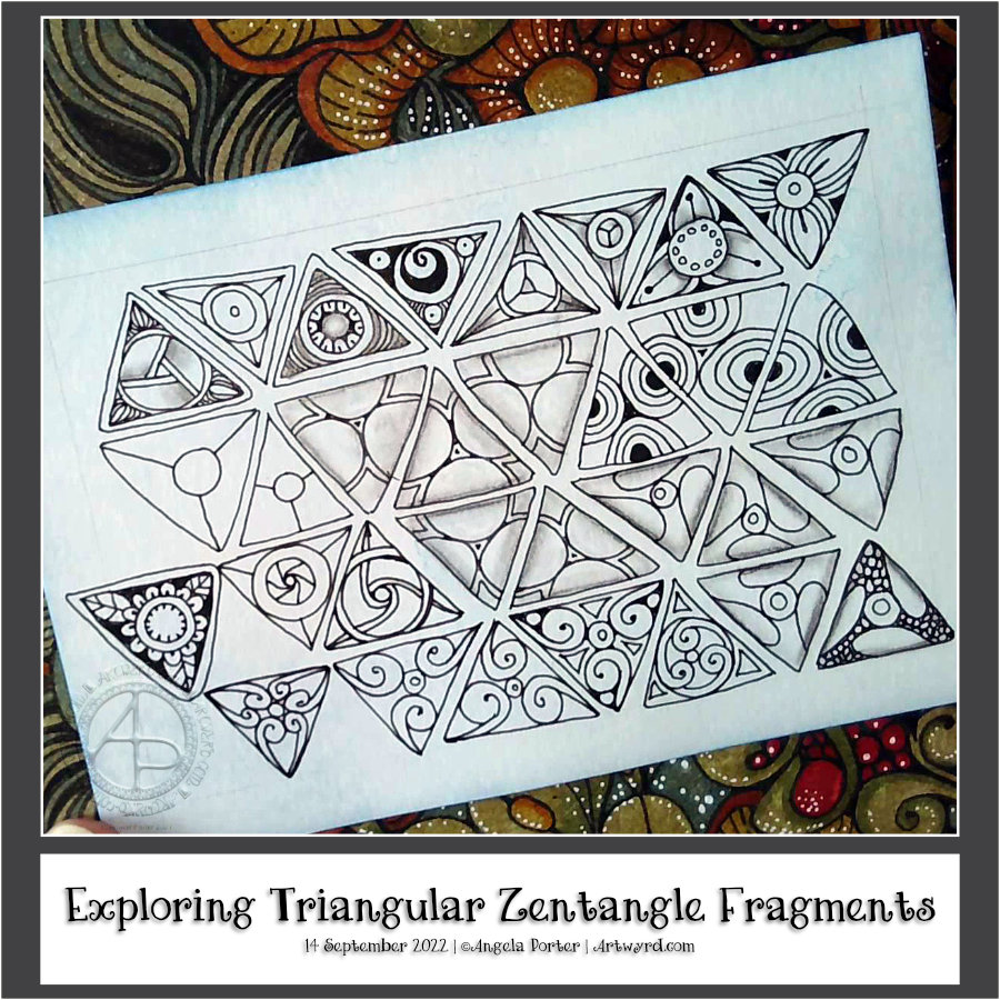
This morning I just wanted to mess around with some fragments, and triangular ones seemed the way to go! ‘Fragments’ is the Zentangle term for the cells that make up a repeating pattern.
I started with a simple fragment of a circle (orb in Zentangle-speak) inside a triangle. All of these fragments have orbs as part of them, and I’m not sure if I’ve done many of them before.
I’ve written it before, and no doubt will again, that exploring both fragments and tangle patterns is an absorbing activity. No matter how often I look at one particular fragment, there are endless variations that can result. Some may be of use in a ‘reticulum’ (Zentangle-ese for the grid upon which a pattern is formed), others may just be for the experience of being curious and seeing what happens if I do x, y or z…
This is also a great warm-up activity. It gets my hand-eye coordination and fine motor control working well. My creative brain gets flexed and exercised too. It is also an opportunity to try out new drawing tools and media.
Another big benefit of this practice is that there is no pressure to complete a finished artwork. There’s the implied permission to make mistakes, for things to not work out. Indeed, I learn more from those that don’t work out or where a mistake is made than anything that works out well.
I’m always amazed by how many fragments can be made from a simple start. In this case a circle within a triangle.
Carrying on with the flowy pattern theme, I explore the Zentangle tangle pattern “Narfello” today.
This pattern is based on wavy lines and is easy to construct. The fun lies in all the variations that are possible. The first three steps in setting the tangle pattern up give an unusual grid that can be filled in so very, very many ways.
I always enjoy exploring patterns. It is, for me, a way of practising creativity, giving myself permission to draw without the end product being as nearly perfect as possible. It’s about trying things out to see what happens; if I don’t like what I’ve done, it’s no biggie! I can learn from it or, even better, work on how to change what I’ve done to make it something I like.
It doesn’t matter how many times I explore a pattern or fragment (the basic cell of a repeating pattern); there are always more things to discover and to use. It is quite addictive at times, that’s for sure!
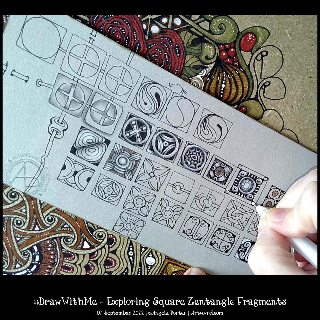
Time seems to fly when I get engrossed in a task. Today, that was exploring a simple Zentangle fragment – a circle in a square.
In Zentangle terms, a fragment is the basic unit of a repeating pattern, whether repeated as is or rotated/reflected.
It is always a lot of fun to see what kinds of fragments I can develop using the chosen one to spark some creativity.
It’s always lovely, too, to work on toned paper, in this case, it’s from Fabriano and is in the colour ‘Clay’. Whenever I use toned paper, I realise I’m drawing in shadow and light; the paper is the mid-tone. This is why I love to colour plain paper with Distress Inks or NeoColor II water-soluble wax crayons. The colour immediately becomes the backdrop for dark and light and a strong contrast ‘twixt the two extremes.
In art, chiaroscuro is the term used for the use of high contrast between light and dark in a composition. In drawing, this is affected by using a coloured background, and black and white ink or media are used to create the drawing.
As I was typing this, I realized I’ve long loved working in this way. Since my early days of exploring my artistic nature that started some 20 years ago, I discovered I loved to use coloured paper with white and a black or much darker tone of the paper to draw with. It was far more fascinating to me to draw in light and shade rather than tones of grey graphite on white paper. It was my chosen way to work when I did some life drawing. When I go out and about sketching, I will colour the pages in my sketchbook with Distress Inks and use black and white pens/pencils to draw on them. The shapes of shadows and highlights fascinate me; everything becomes very architectural.
I’ve often mentioned the only oil paintings I’ve ever done and how three-dimensional they appear. When people see them for the first time, they’ll touch them because they think they are dimensional and are always surprised to find out they are totally flat. The high contrast I favour in my work creates the illusion of volume.
This little journey down the pathways of memory has allowed me to make some connections. I’m smiling as some pieces of the jigsaw puzzle that is me fall into place, clicking together satisfyingly.
There are times when I have to work with black pen on white paper, but there are many times when I can choose what colour paper to use. And going forward, I think much of my entangled drawing that isn’t for colouring books will be done on toned paper.