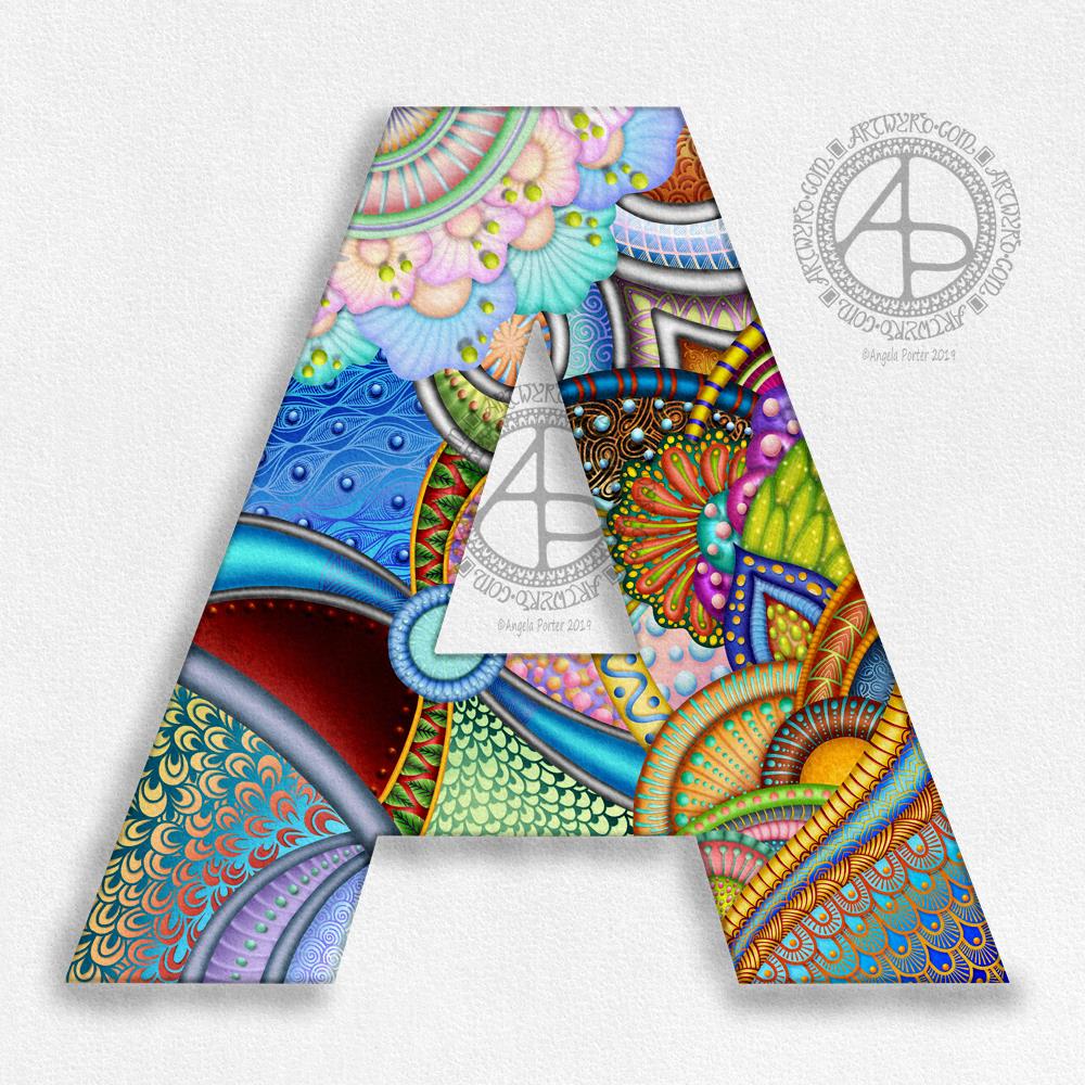
Yup, that’s right; I’ve finished it!
It’s definitely a sampler of patterns, ideas, and playing around with digital techniques.
It is, however, quite an accomplishment – at more than one point along the way I just wanted to give up on it.
Looking at it now, there are parts I’d want to change, such as that ‘waterfall’ of green scales in the bottom centre of the A.
I have learned quite a few things, and put together other stuff too in a simpler way.
I’ve also learned that starting with a sketch may be a good idea in future – a sketch with at least the main beams of the supporting structure and main design elements in place, even if just in outline shape form.
At one point, I’d had an idea about continuing some of the ‘tubes’ to the edge of the canvas, maybe making them appear as if they were diving down into the paper, and popping up along their path, acting like laces holding the crazy A down.
However, I didn’t do that this time. Matching up colours, shading, patterns etc would be a tad awkward and frustrating for me, especially if I just wanted to carry the ‘tube’ on from the edge of the letter.
It is, however, something I can consider trying to do in the future.
Despite me thinking it yesterday, I haven’t left any white space in the letter itself, just leaving the white space around it. I tried, but it just didn’t feel quite right in this particular design.
I have no idea how many hours I’ve spent on this – many tens of hours I would think – with very few frustrations along the way.
I think I have some fish to finish along with the ‘Be Brave’ design I was working on before I wandered off to have a go at this idea for a crazily entangled monogram.
So, between them and work for the next colouring book I have quite a bit of stuff to keep me busy for sure.
All I need to say now is that I used my usual trio of tools – Autodesk Sketchbook Pro, Microsoft Surface Pen and Microsoft Surface Studio.
