I drew this design in my latest YouTube video, which premieres today, 16 July 2023, at 21:00 UK time.
It’s a draw with me video, where I show you how to draw this design, step by step. I also do some colouring, shading, highlighting and addition of texture patterns. I don’t, however, complete the drawing in the video.
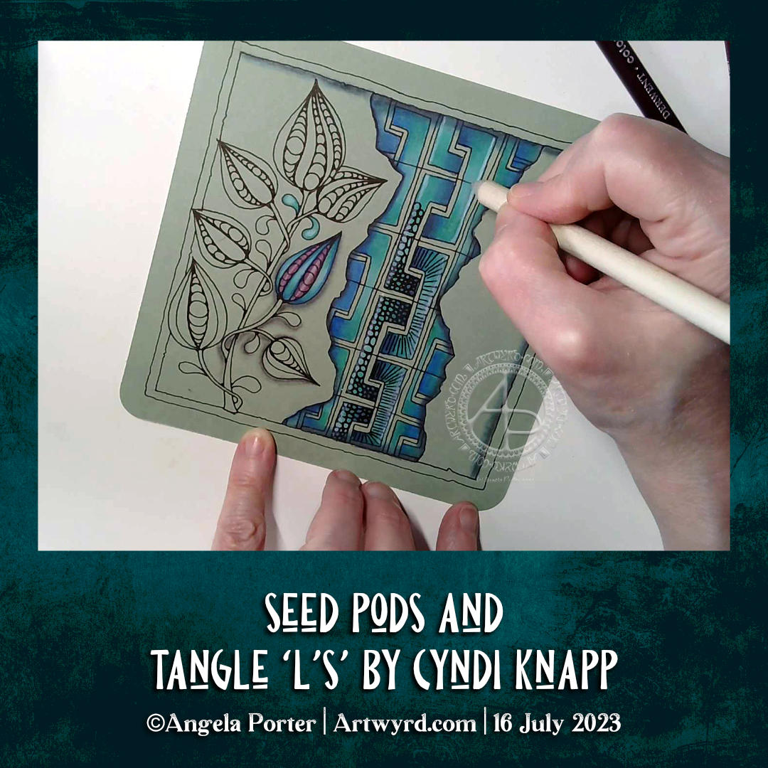
Currently, I really enjoy drawing designs where there are layers included, like a collage or a break and the floor or wall to see what lies beneath or behind them.
Seed pods are one of my favourite things to draw. There are so many different kinds, both based on reality and imagination. Today, I stuck with the familiarity of plump, teardrop-shaped pods. The tangle pattern between the faux ripped edges is called L’s, and it’s by Cyndi Knapp. It is a bit of a challenge to draw, well, for me at least. It does result in a curious interweaving pattern, however, and is worth the time spent mastering it.
I used a piece of grey-green PaintOn mixed media paper from Claire Fontaine. The colours almost glow against the paper. To add colour, I used Derwent Coloursoft pencils along with tortillons and Gamsol to blend them.
Although I haven’t finished this drawing yet, I’m quite happy with how it’s working out.
I have needed a couple of days of quiet time this weekend. I over-stretched myself last week in some ways. When I find inspiration lacking, I know I’ve overdone it. Hopefully, these two quiet days will give me renewed energy to carry on with the illustrations for Daydreams, my next colouring book. The self-doubt and fear that I’m not good enough – imposter syndrome – has awakened for some reason, and it robs me of my oompf. I will push through it, however. I always do.
I had a lovely couple of hours this afternoon drawing and then adding colour to this small artwork. And small it is; the paper I used is an approx 10cm x 10cm (about 4″ square) piece of Canson Imagine mixed media paper.
I chose this paper as I enjoy drawing on it with a fountain pen. Today’s pen was an extra fine nibbed TWISBI Eco pen filled with black Documentus ink. This particular ink is archival and waterproof. Perfect as I had decided to add colour using Inktense pencils and a waterbrush.
The more muted, earthy tones do suit my present mood. I’m feeling rather tired, flat and disconnected from everything. Perhaps the earthy tones represent a need to spend more time with the physical world rather than in my head, imagination and creativity?
I do know what has caused this mood – too much adulting, people-ing and a couple of other things that I’m not going to share (sorry!). Out of sorts is what I am and have been for a while. I know it’s a temporary thing for me, a readjustment to changes that are ongoing.
The daily dose of anti-depressant/anti-anxiety meds keep me from sliding down into a dark pit of despair and tsunamis of tears. I know they only mask the anxiety I feel when I’m around people, whether one or many. My hands shake, my vision is different as the hypervigilance kicks in. Getting home means time relax and rest and it can take me days to recover from each people-ing.
All I’ve wanted to do for the past couple of weeks (or even few months) is to lose myself in art, audiobooks, music, and interesting tTV.
And, to circle back, my art tends to reflect this in one way or another.
I am learning to embrace the imperfections that appear as I use Inktense pencils and a water brush to add colour. I’m starting to accept that the imperfections create intriguing textures.
Discovering interesting shapes and patterns in my drawings is also fascinating to me. I need to remember to use a ‘viewfinder’ as I did two decades ago when my art journey began. Isolate a section of a drawing to re-draw on a bigger scale and work on developing it as a new work.
Hanging on my walls are three oil paintings I did about twenty years ago. They are abstracts of patterns from the robes of a Romanesque angel sculpture, the cogs from a diesel locomotive and the worm screws from a steam locomotive. I used a view finder to isolate the sections of my photographs/drawings to enlarge and recreate as abstract paintings. The colours I used for each painting reflected my emotional response to the original items and places where I found them.
Each of these oil paintings have a lot of contrast and trick the eye into thinking they are three dimensional. I didn’t realise I’d done that until the art exhibition at the end of my AS course. People kept touching these paintings and I didn’t know why. So, I asked a friend. She said she expected to feel ridges and valleys and was surprised to find they were totally flat and the illusion was purely optical.
Once she’d pointed it out to me, I could see what she meant!
That love of using high contrast to bring out dimension hasn’t left me. I’m not sure I’ve achieved a great level of contrast in this small drawing; there are some areas where shapes appear to curve up or down and where layers are more apparent. I may revisit this little artwork to increase the contrast at some point in the future. Maybe.
I’m really enjoying creating pages in what I had been calling an illustrated journal. But, in today’s video, it came to me that they are akin to a needlework sampler, so Entangled Samplers the collection will be called!
In the video, I drew a couple of elements but focused on using texture patterns to fill the spaces. And that was when the idea of a sampler came to mind.
I’ve yet to decide what goes in that awkward central space. Journaling? More patterns or motifs? I really don’t know at the moment. I will figure it out though!