Intuitive, Abstract, Neurographica Style Art – Adding colour WIP

I decided to add colour to this artwork using Derwent Chromaflow pencils and Gamsol with tortillons/paperstumps.

I loved the colour as it was, but the design looked rather flat; there was little sense of ‘volume’. So, I hope to bring that out.

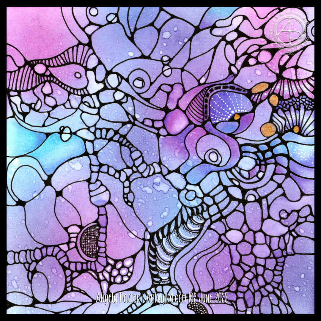
So little of the coloured pencil is needed when it is blended out with Gamsol, and it is translucent enough that the underlying waterdrop texture is still visible.

Although I mostly used pink, purple and blue to create the background, I thought that teal would make a good addition. That was a good decision, in my humble opinion!

White dots and lines from a Uniball Hybrid Gel DX pen add highlights that show up much better on the more intense colours. Spots and lines of gold will also add some interest, but I need to be conscious of not overdoing it!

I was really nervous about using Gamsol with linework drawn with Dokumentus ink. I had no real need to be; the Gamsol didn’t affect the ink. I let out a huge ‘Phew!’ at that!. My TWISBI Eco fountain pen with Dokumentus ink and an extra fine nib worked beautifully on areas where coloured pencil and Gamsol had been added.

I have a lot of work to do until this design is complete. I am, however, in no rush to do that. I can work on it a bit at a time. I am likely to post updates from time to time though!

If you’d like to see how I added colour with pencils and Gamsol, then a YouTube video will be available to view from 16:00 UK time on Friday 2 June 2023.

Abstract, Intuitive, Neurographic Style Art

Earlier today, I watched a couple of videos by @_bettina_fernandez on YouTube, I really enjoyed how she created neurographic art her way, and thought I needed to give this a go.

Neurographic art is an intuitive method for making art. “Neurographics is a way of drawing that recreates the outer from the inner.” – From Neurographic.art.

Intuitive art? A no brainer for me me to work with. It’s my most natural way to create art. So, I had to try it out, and I videoed it for my YouTube Channel (video available from 18:00 UK Time on 1 June 2023).

I started by creating a colourful background. I think Neurographic art usually starts with the ink lines. But Bettina used the shapes and lines created in the random colour background to draw the basic structure of the design from.

Instead of using watercolours, I used Distress Inks in various shades of pink, purple, blue and blue-greens. Splashes and a light spritz of water created interesting watermarks and I preserved the dark edges of these areas by drying them with a heat tool.

Then the real fun began. I started by drawing a kind of oval-ish shape around an area at the top left. All I did next was look for shapes and borders between colours to help me draw more lines and shapes. I made sure I ’rounded the corners’ with ink as I went, though there are, no doubt, some areas where lines connect what I’ve missed.

I wasn’t only fun, it was fascinating. I tried not to think too much, to just let the lines flow and go where they needed to in a shape that seemed ‘right’.

Once I’d got the main structure completed, which took just over an hour, I started to add texture and pattern and some white highlights. There’s a lot more to do. I may even use coloured pencils to add shade to the design. And I just have to use gold ink or paint to add some luxury and shimmer and shine to the finished design!

What do I think of it? It’s fun. It’s a personal expression. I love it’s abstract nature for sure. I think I’ll be doing more of this in the future. Indeed, I plan to work on another this afternoon (it’s 14.40 here in the UK!)

I also want to try making background with other media – watercolours, Inktense and Neocolour II come to mind! And more Distress Ink backgrounds for sure! I’m also thinking that creating these backgrounds may be a way to get me to experiment more with digital painting and textures.